


-
Living Room Colour Ideas
All Living Room Inspirations Blue Living Rooms Brown Living Rooms Grey Living Rooms Green Living Rooms Orange Living Rooms Purple Living Rooms Pink Living Rooms Red Living Rooms Yellow Living Rooms White Living Rooms
-
Bedroom Colour Ideas
All Bedrooms Inspirations Blue Bedrooms Brown Bedrooms Grey Bedrooms Green Bedrooms Orange Bedrooms Purple Bedrooms Pink Bedrooms Red Bedrooms Yellow Bedrooms White Bedrooms


Light, and Life to India's Homes.
At JSW Paints, we believe true beauty is not just about looking good, but about thinking and doing good.
thoughtful is beautiful.
That is why we have infused thoughtfulness in every drop and detail.
How to Create Colour Harmony Using the Colour Wheel
Choosing the right colours for your home can be tricky. But there's a simple tool that designers rely on every day to create colour combinations, and that is the colour wheel. If you're trying to find the best colour schemes for interior walls, understanding how the colour wheel works is the first step to creating balanced, beautiful spaces.
In this post, we'll break down how to use the colour wheel to create harmony in your home. Whether you're decorating a single room or planning an entire house palette, these tips will help you get it right.
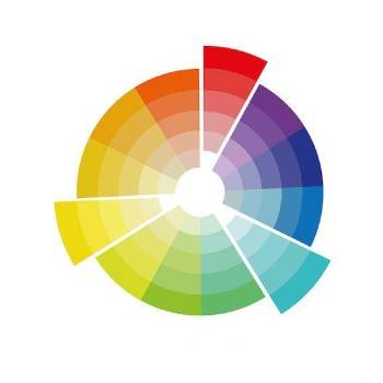
What Is the Colour Wheel? The colour wheel is a circular diagram that organizes colours based on their relationships. It includes:
- Primary colours: red, blue, yellow
- Secondary colours: green, orange, purple (made by mixing primary colours)
- Tertiary colours: red-orange, yellow-green, blue-purple, etc.
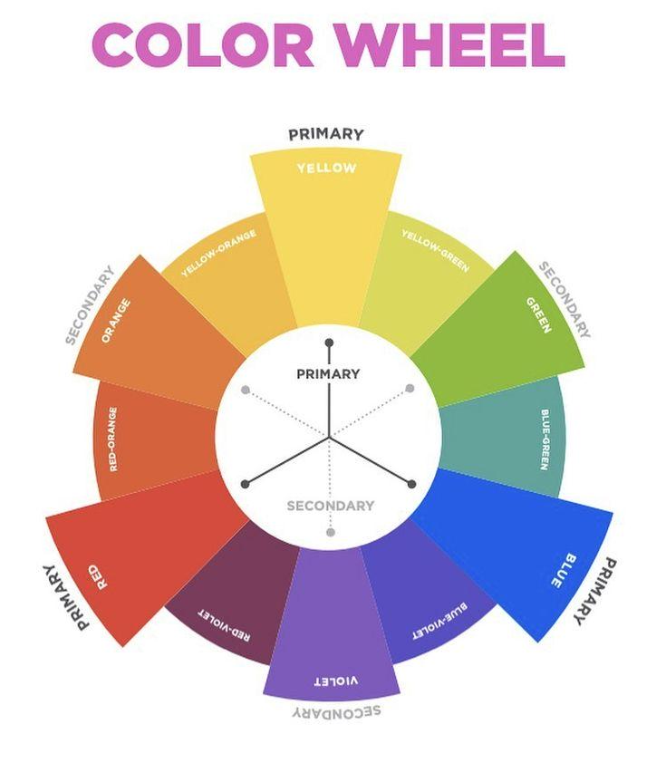
The colour wheel shows how colours relate to one another and helps identify which combinations work well together.
Key Colour Schemes for Interiors
Here are some common colour schemes that you can build using the colour wheel:
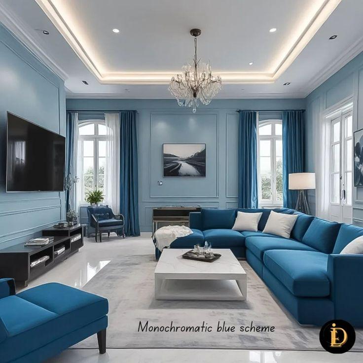
1. Monochromatic Colour Scheme - This scheme uses one base colour in different shades, tints, and tones. For example, a room with soft grey walls, dark charcoal furniture, and light silver accessories follows a monochromatic scheme.
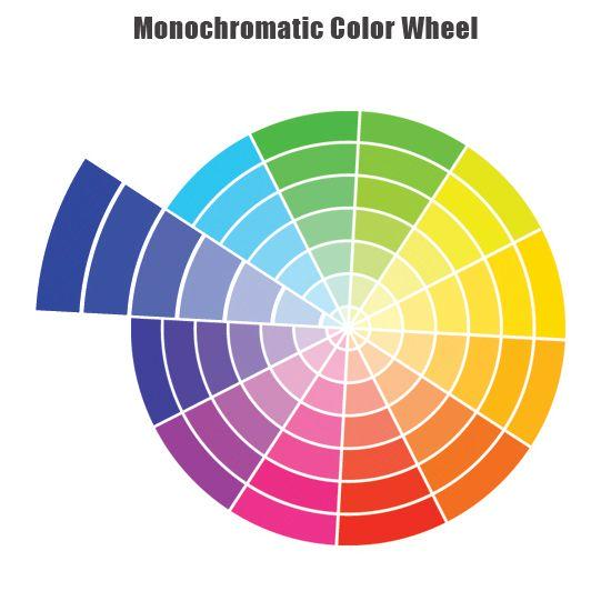
- Feels cohesive and calming
- Ideal for minimalist or modern interiors
Tip: Use texture and layering to keep it from feeling flat.
2. Analogous Colour Scheme - Analogous colours sit next to each other on the colour wheel, like blue, blue-green, and green. These schemes feel natural and pleasing to the eye.
- Creates a harmonious, soothing atmosphere
- Perfect for bedrooms, living rooms, or any relaxed space
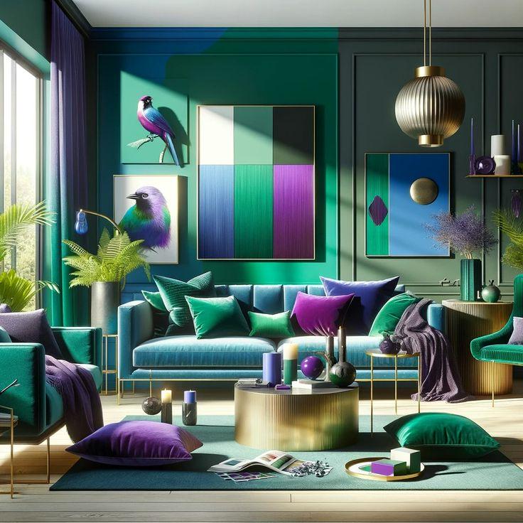
Tip: Pick one dominant colour and use the others as accents.
3. Complementary Colour Scheme - Complementary colours are opposite each other on the colour wheel, such as red and green or blue and orange. This combo offers high contrast and energy.

- Creates visual interest
- Great for bold, lively interiors
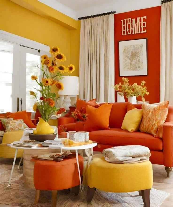
Tip: Choose one colour as the main tone and use its complement sparingly for impact.
4. Split-Complementary Colour Scheme - This variation uses one base colour and the two colours adjacent to its complement. For example, if you choose blue, the split-complementary colours would be yellow-orange and red orange.

- Less tension than a straight complementary scheme
- Offers colour variety while staying balanced
Tip: Ideal for beginners who want a bold yet controlled palette.
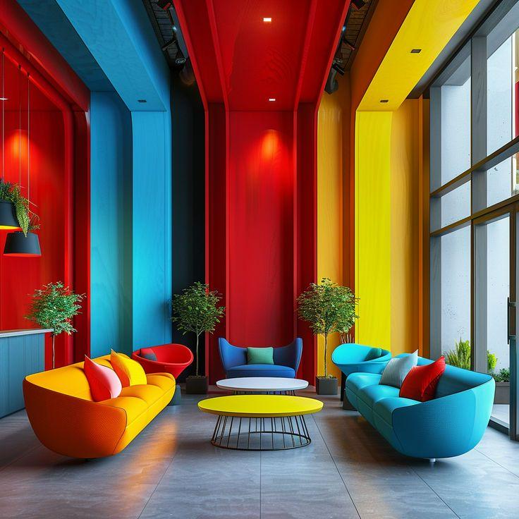
5. Triadic Colour Scheme - Triadic schemes use three colours evenly spaced around the wheel, like red, blue, and yellow. These palettes are lively and well-balanced when applied thoughtfully.
- Creates vibrant contrast without chaos
- Suits eclectic and artistic interiors
Tip: Use one dominant colour and the other two as accents.
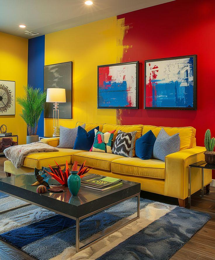
6. Tetradic (Double-Complementary) Colour Scheme - This scheme involves two sets of complementary colours, like blue and orange plus green and red. It's rich and dynamic but requires careful planning.
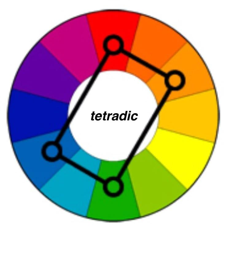
- Offers lots of variation and contrast
- Great for larger rooms or open-plan areas
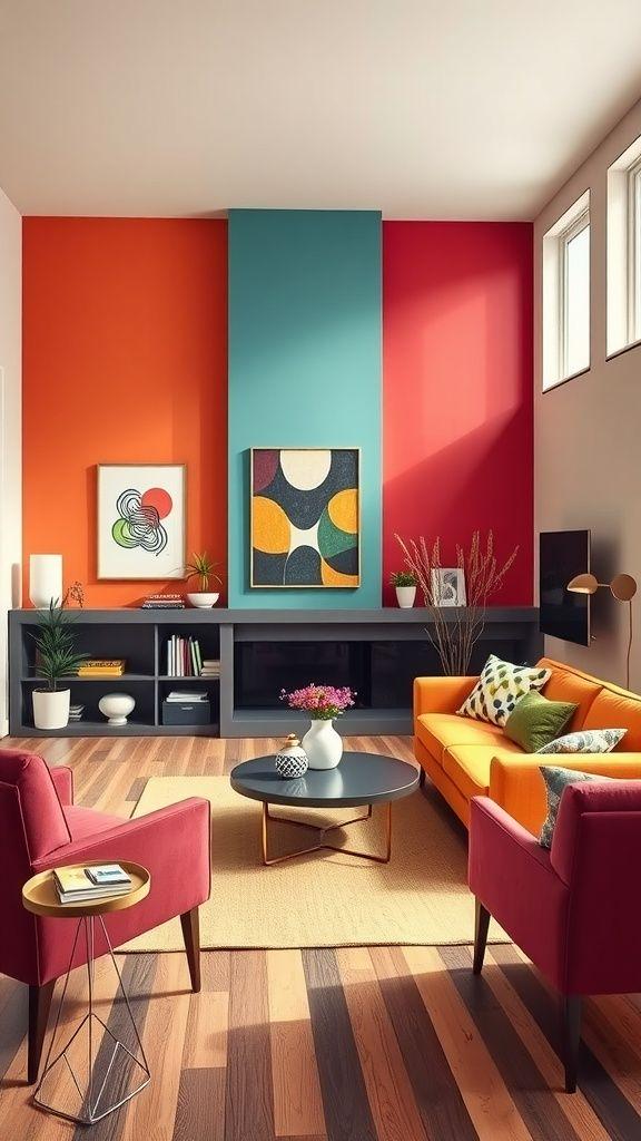
Tip: Anchor the space with neutrals to avoid overwhelming the eye.
Using Neutrals to Balance Bold Colours Even the most colourful room needs balance. That’s where neutrals come in: white, grey, beige, and black can tone down bright palettes and give the eye a place to rest.
Best practices:
- Use white to brighten up darker schemes.
- Add black for sophistication and contrast.
- Mix in wood tones for warmth and natural texture.
Steps to Create a Colour Scheme for Your Interior
- Start with inspiration: Find a photo, artwork, or fabric you love.
- Pick a base colour: Choose a colour you want to dominate the space.
- Choose a scheme: Use the colour wheel to build your palette.
- Add neutrals: Soften the look and create visual breathing room.
- Test it out: Sample paints and fabrics before you commit.
- Layer in texture: Use materials and patterns to keep the palette interesting.
Examples of Colour Schemes for Interiors
- Soft and serene: Pale blue, light grey, and white (analogous)
- Bold and modern: Navy, mustard yellow, and white (complementary)
- Earthy and warm: Terracotta, olive green, and beige (triadic)
- Romantic and cozy: Blush pink, burgundy, and gold (monochromatic with metallic accents)
Using the colour wheel isn't just for artists or designers. It's a practical guide to help anyone build colour schemes for interior walls that feel balanced and beautiful. With a bit of planning and creativity, you can turn any room into a space that feels just right.
Experiment, have fun, and trust your instincts—the colour wheel is just the beginning.
FAQs
1) How to use the colour harmony wheel?
Use the colour harmony wheel to select colour combinations—like complementary, analogous, or triadic—that visually work well together.
2) What are harmonious colours on the colour wheel?
Harmonious colours are those next to each other on the wheel, such as blue, blue-green, and green (analogous scheme).
3) What are the 7 harmonies of colour?
The 7 colour harmonies are: Complementary, Analogous, Triadic, Split-Complementary, Tetradic, Square, and Monochromatic.
4) How to create a colour wheel?
To create a colour wheel, arrange the 12 basic hues—3 primary, 3 secondary, and 6 tertiary—in a circular format based on their relationships.