


-
Living Room Colour Ideas
All Living Room Inspirations Blue Living Rooms Brown Living Rooms Grey Living Rooms Green Living Rooms Orange Living Rooms Purple Living Rooms Pink Living Rooms Red Living Rooms Yellow Living Rooms White Living Rooms
-
Bedroom Colour Ideas
All Bedrooms Inspirations Blue Bedrooms Brown Bedrooms Grey Bedrooms Green Bedrooms Orange Bedrooms Purple Bedrooms Pink Bedrooms Red Bedrooms Yellow Bedrooms White Bedrooms


Light, and Life to India's Homes.
At JSW Paints, we believe true beauty is not just about looking good, but about thinking and doing good.
thoughtful is beautiful.
That is why we have infused thoughtfulness in every drop and detail.
How to Choose Wall Colours Based on Natural Light and Room Size
A fresh coat of paint can completely transform the mood and character of your home. However, choosing the right shade takes more than picking a colour that catches your eye in the store. As daylight changes throughout the day, the same shade can look slightly different. A room's size and layout also affect how spacious or cosy it feels.
This article explains the relationship between room dimensions, natural light and paint colour, helping you create a balanced and inviting space.
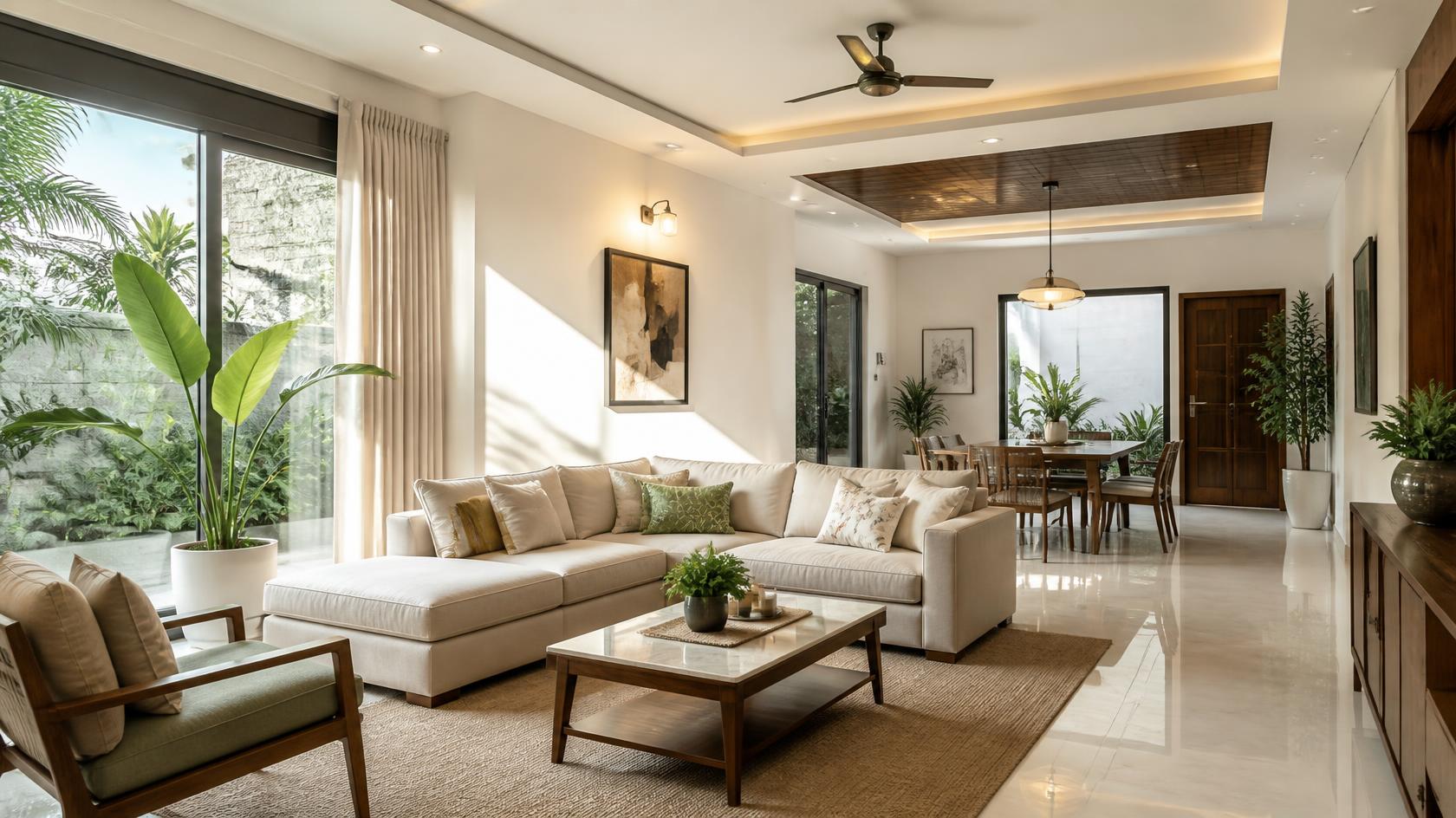
How Natural Light Affects Paint Colour Perception
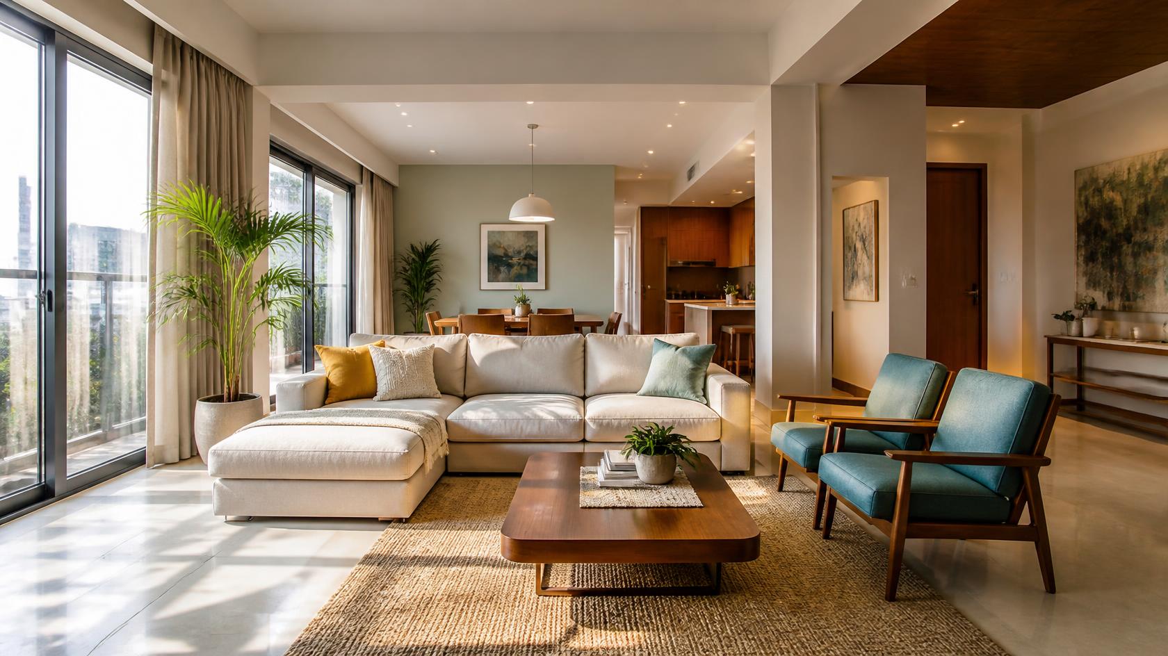
Natural light changes in direction and intensity from morning to evening, which can affect how paint colours appear on your walls. Morning sunlight gives colours a more delicate look, midday light brings out their undertones, while evening light gives them a warmer glow.
Daylight can also affect how colours appear in a particular room. Shades that suit these light variations help your rooms look appealing at every moment. For example, warm sunlight has a golden tint that softens colours, while cool daylight has bluish tones that make walls appear crisp and clear.
Best Colours for Rooms Facing the Four Directions
North-Facing Rooms
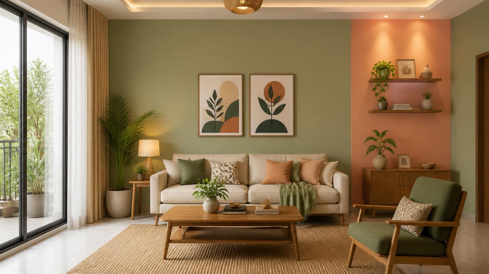
Rooms facing north receive indirect light the entire day, which can make the walls look cooler and slightly dull. Warm shades can counter this effect, making the room feel more vibrant and welcoming.
Ideal Colour Combination: Earthy green, such as Gurgling Spring (2627), serves as a natural base, while peach, like Saffron Turban (2105), adds warmth, making them some of the best colours for low-light rooms for a harmonious look.
South-Facing Rooms
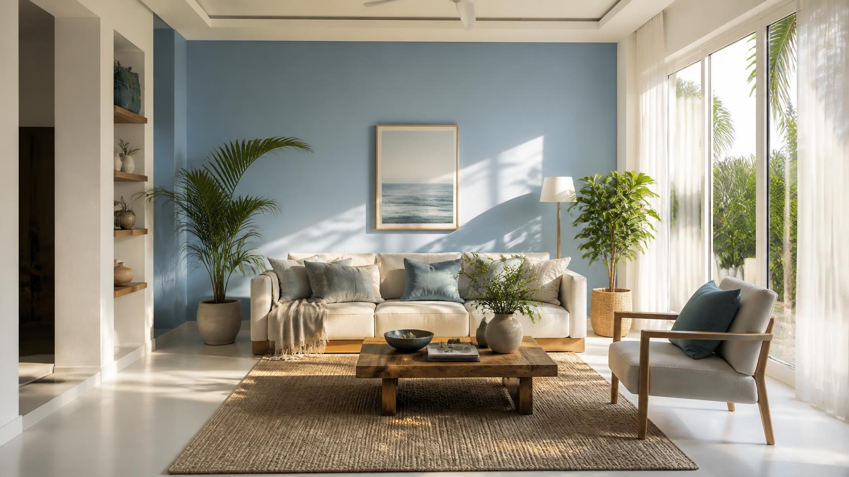
South-facing spaces receive direct sunlight for most of the day, which can make wall colours appear more intense. They work well with cooler shades that reduce the glare and keep the room feeling light and refreshing.
Ideal Colour Combination: Soft blue Arabian Sea (2386) creates a calm, breezy backdrop, while chalky white, such as Screen of Light (1051), complements it beautifully to soften the strong golden daylight.
East-Facing Rooms
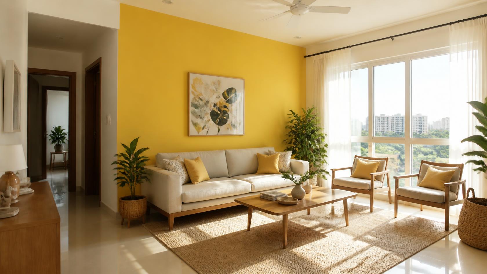
East-facing rooms receive bright morning sunlight that slowly softens as the day goes on. Cheerful tones help make the most of the morning illumination while keeping the room warm later in the day.
Ideal Colour Combination: A vibrant yellow like Fresh Harvest (2026) keeps the room sunlit throughout the day. An off-white like Floral Garland (1034) brings a minimalist touch while making the space feel more open.
West-Facing Rooms
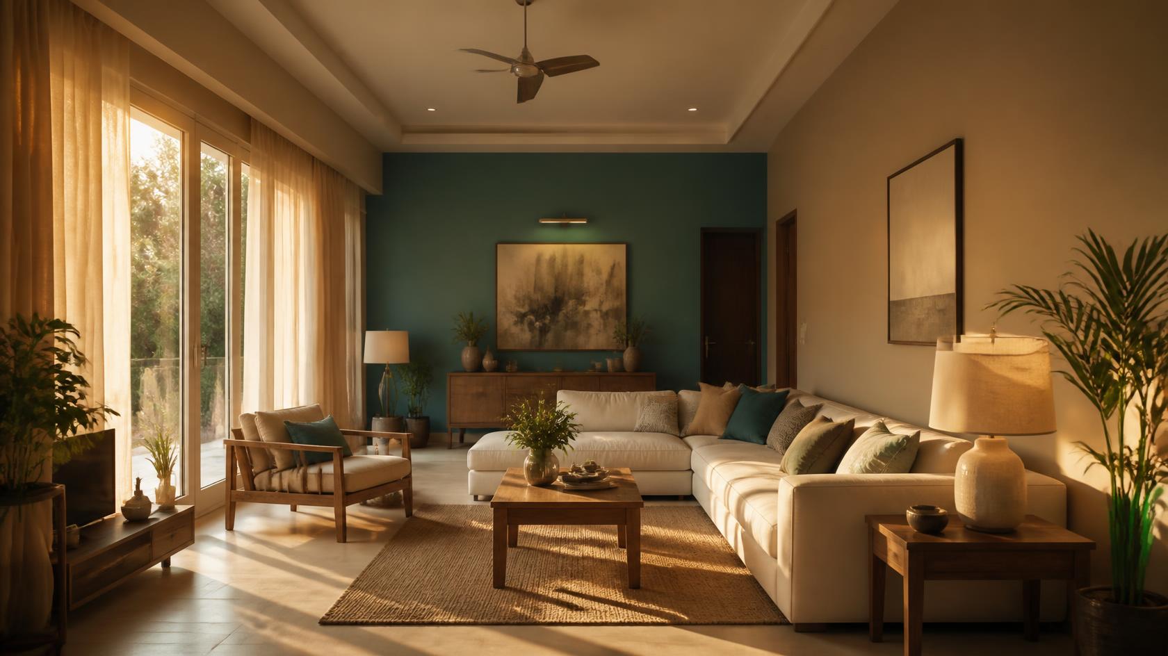
Rooms facing west receive gentle morning light, followed by intense sunlight in the late afternoon and evening. They work best with balanced colours that can soften the evening light while still feeling fresh in the morning.
Ideal Colour Combination: A combination of warm taupe like Carved Seal (3022) and deep teal like Turquoise Waters (3427) absorbs the sunset glare while keeping the room peaceful and refined throughout the day.
Also read: Understanding Warm vs. Cool Colours for Interior Spaces
Choosing Colours for Small vs Large Rooms
The right paint colours for small rooms can make them feel more open and elegant. Light shades reflect natural light and help soften corners, making the space feel less enclosed.
For a smaller room, blush pink such as Play Time (2264) pairs well with a soft sage green like Green Haze (2642). This reflects light while creating a calm, comfortable setting that doesn't feel crowded.
Large rooms can sometimes feel empty or disconnected when painted entirely in plain, pale shades. Deeper colours can make the space feel more cosy by bringing the visual boundaries closer.
A welcoming combination for larger rooms is Terracotta (3188), paired with warm cream, such as Sunshade Cream (1126). It adds warmth and helps furniture and architectural features feel seamlessly connected to the entire space.
Common Mistakes When Picking Wall Colours
- Choosing paint colours only from digital screens, where screen brightness and settings can make the actual shade look different.
- Not checking test patches at different times of the day to see how changing daylight affects the colour.
- Overlooking the existing tones of your flooring, woodwork and large furniture when choosing a colour palette.
- Using the same shade in rooms facing different directions without considering how the changing light will affect the colour.
- Painting an entire room without first testing physical swatches against existing trims, fabrics and decor.
Tools to Test Colours Before You Paint
Before buying full tins of paint, test your chosen colour shades in your home. Check them on different walls in the morning, afternoon and evening to see how the changing light affects each tint.
For a quick preview, digital tools are also useful. The JSW Paints AI Visualizer lets you upload room photos and try different colour combinations. You can preview feature walls, ceiling colours and matching shades before you start painting.
Conclusion
Choosing the right paint colour starts with understanding your natural light and room size. By balancing warm and cool tones, you can create spaces that feel comfortable and well balanced. JSW Paints offers a wide range of shades, durable finishes and visualisation tools to help bring your ideas to life.
FAQs
Which paint finish is best for north-facing rooms?
Satin or silk finishes work well in north-facing rooms as their slight sheen reflects natural light and makes the space feel brighter.
Can deep wall colours work well in small bedrooms?
Yes, deeper colours can work well in small bedrooms and make them feel cosy. However, you can follow room size paint colour tips with a lighter ceiling and warm evening lighting to maintain a balanced look.
How does artificial light affect room colour alongside daylight?
Warm artificial bulbs can bring out yellow and red undertones in paint, while cool white lighting can make grey and blue undertones more prominent after sunset.