

-
Living Room Colour Ideas
All Living Room Inspirations Blue Living Rooms Brown Living Rooms Grey Living Rooms Green Living Rooms Orange Living Rooms Purple Living Rooms Pink Living Rooms Red Living Rooms Yellow Living Rooms White Living Rooms
-
Bedroom Colour Ideas
All Bedrooms Inspirations Blue Bedrooms Brown Bedrooms Grey Bedrooms Green Bedrooms Orange Bedrooms Purple Bedrooms Pink Bedrooms Red Bedrooms Yellow Bedrooms White Bedrooms


Light, and Life to India's Homes.
At JSW Paints, we believe true beauty is not just about looking good, but about thinking and doing good.
thoughtful is beautiful.
That is why we have infused thoughtfulness in every drop and detail.
Kitchen Wall Colours as per Vastu Shastra for a Balanced Home
In Indian homes, the kitchen is much more than a functional space; it is also considered a vital element in Vastu Shastra. The kitchen is the seat of Agni (the fire element), and within Vastu Shastra, there are various suggestions on direction, layout and colour that can be used to create a sense of balance and comfort.
This guide shares kitchen wall colour choices aligned with Vastu-inspired principles, while keeping the advice practical for modern homes and easy to execute.
Vastu Basics for the kitchen
Vastu texts and contemporary Vastu guides commonly place the ideal kitchen in the South-East, which is the Agni Kon associated with fire. North-West and West are often considered the next viable options.
Even if you can’t change your kitchen’s location, colour is one of the easiest ways to lift the room’s mood and comply with Vastu principles. Warmer tones can feel energising and appetising, while softer neutrals can make a small kitchen feel calmer and cleaner.
Best kitchen wall colours as per Vastu
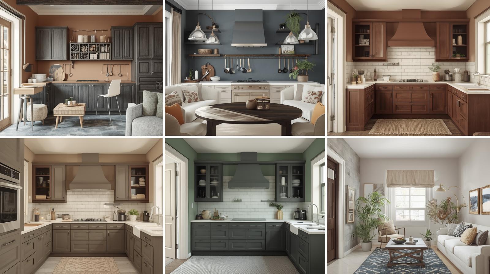
Think of these as traditional, commonly recommended Vastu palettes, not strict rules. Multiple mainstream home interior and Vastu resources repeatedly recommend the following shades for kitchens: yellow, green, white/cream, beige, orange, soft pink, and limited use of red.
1) Yellow: warmth, optimism, “sun” energy
Yellow (5022- Happy Go Lucky) is one of the most suggested kitchen colours in Vastu-oriented guides because it’s bright, welcoming, and pairs well with natural light. It also works beautifully in Indian kitchens where food colours and spices already create visual richness.
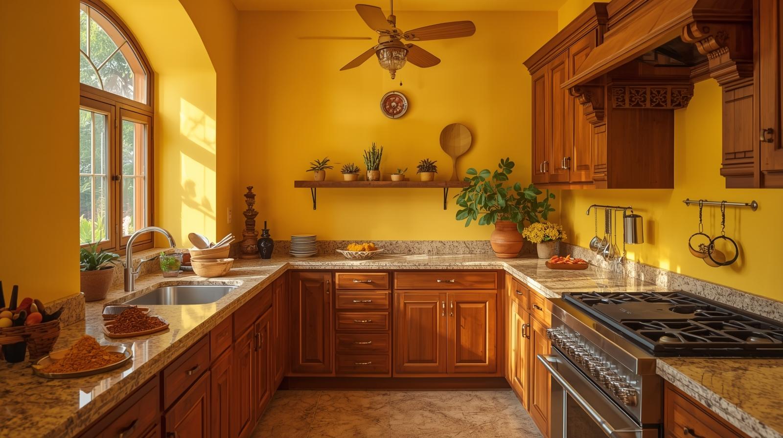
JSW Paints styling tip: Use a soft buttery yellow on walls, then balance with white cabinets or light stone countertops to avoid visual fatigue.
2) Soft green: freshness and balance
Green is often recommended as a balancing colour, especially helpful if your kitchen feels hectic or crowded.
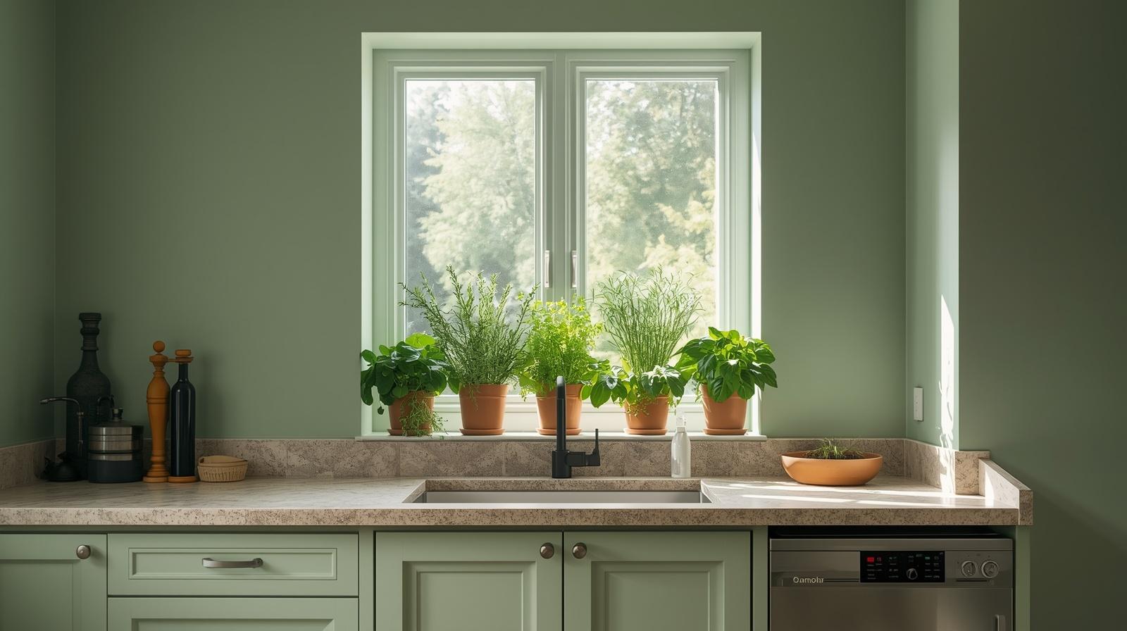
Best use: muted sage (3555- Monsoon Green) or pastel green on walls; add indoor herbs on the sill to reinforce the “fresh” feeling.
3) Off-white, cream, beige: clarity and cleanliness
Neutral shades (are popular in Vastu colour lists because they keep the kitchen airy and reduce visual “heat,” especially in compact apartments.
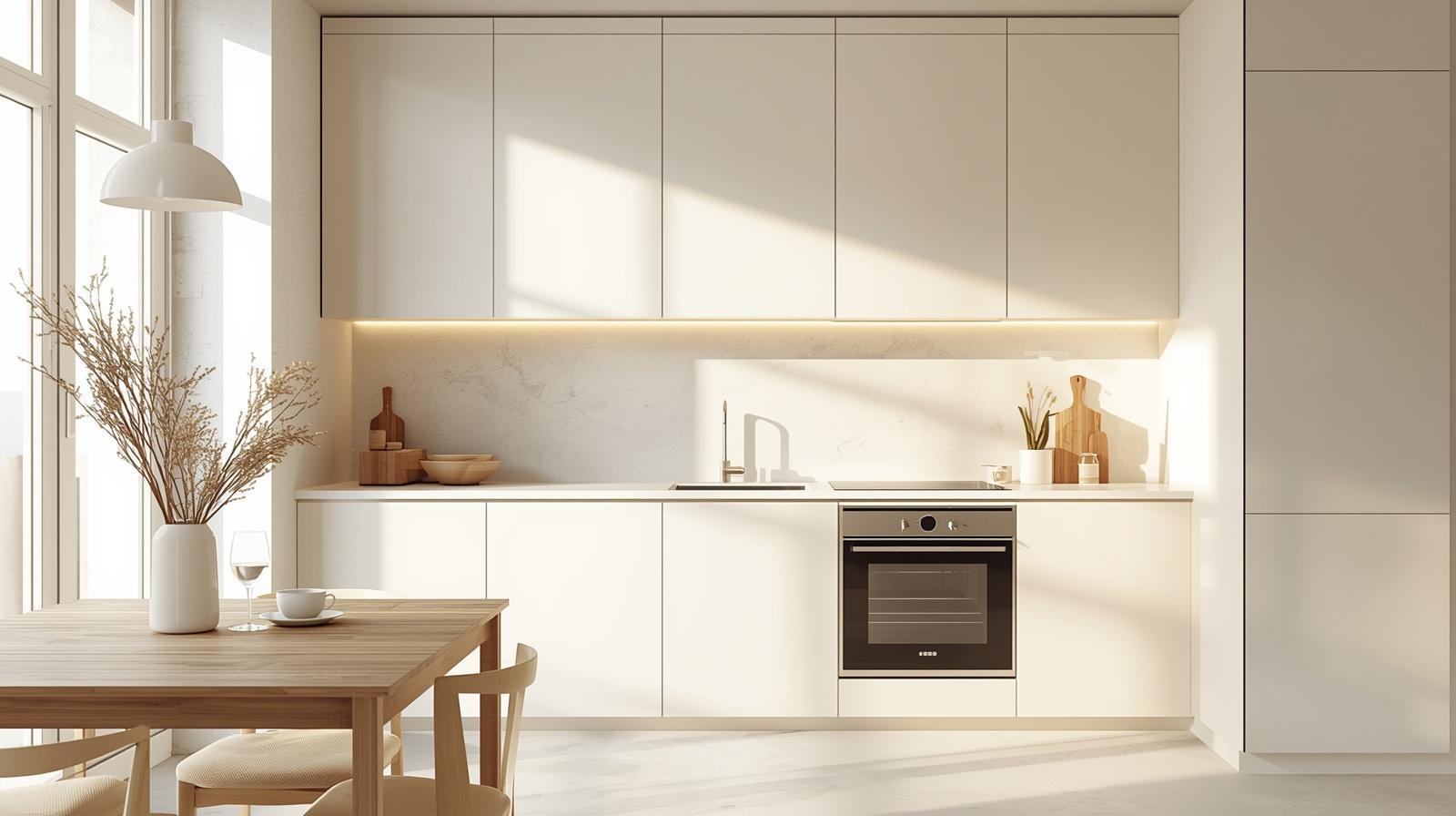
Pro tip: If cooking fumes are a concern, choose a washable finish and keep the undertone warm (cream/beige) (1048 – Beachside Retreat) rather than stark white.
4) Orange/peach: friendly fire element without harshness
Orange (3096- Layered clay) is frequently mentioned as a kitchen-friendly shade in Vastu colour advice—lively, appetising, and aligned with the fire theme.
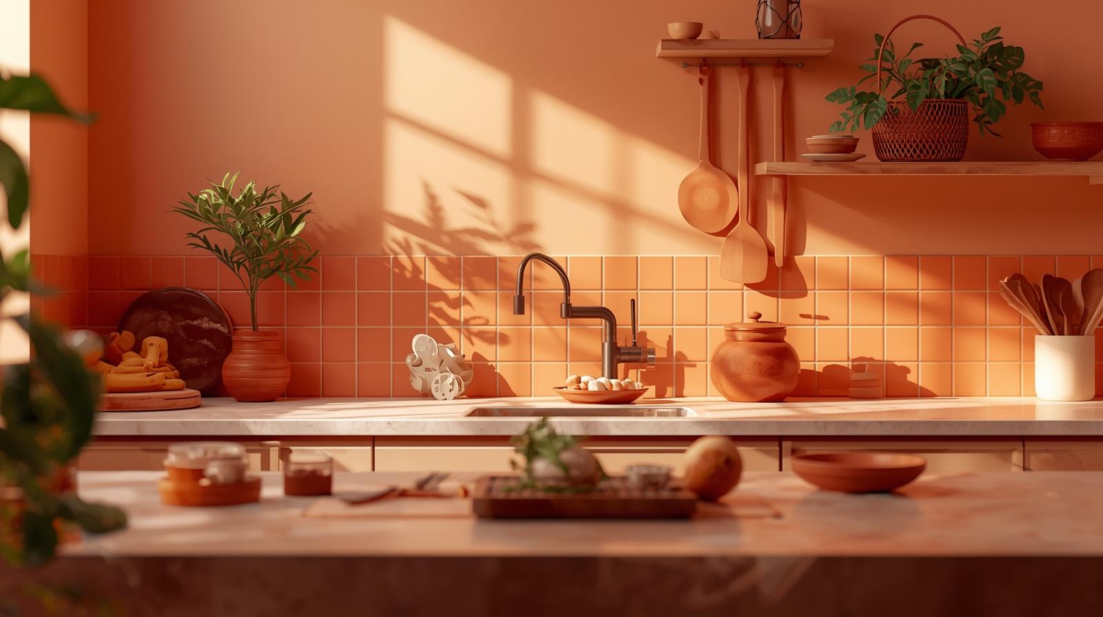
How to do it right: If full orange walls feel too bold, try a peach wall with terracotta accents (tiles, planters, utensils).
5) Soft pink/rose: gentle warmth
Many Vastu-oriented lists include light pinks (2175 – Peppery Pink) as a softer alternative to red, which is still warm, but less intense.
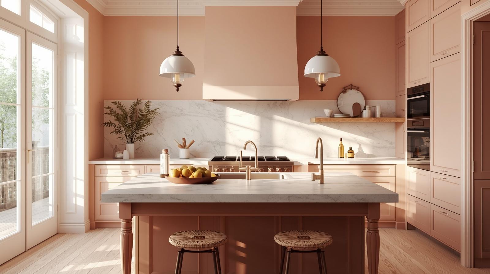
Works best in: kitchens that get strong sunlight, where pink can look elegant rather than sugary.
Colours to Avoid as per Vastu and Why People Avoid Them
Across multiple Vastu colour guides, black and very dark shades are commonly discouraged for kitchens, often described as heavy or energy-absorbing. Similarly, deep blues are sometimes used cautiously because blue is associated with water seen as opposing fire in element-based explanations (many modern Vastu articles treat light/pastel blue as a compromise if you love the colour).
Practical Angle: very dark walls also show grease splatter, fingerprints, and dust more easily, so maintenance can become the real downside.
Vastu-inspired colour choices by kitchen direction
If you know your kitchen’s direction, use this as an easy starting point:
- South-East kitchen (ideal zone for fire): warm shades like peach, light orange, soft yellow (avoid overly aggressive bright red on all walls).
- North-West or West kitchen: cream, beige, soft yellow, with warm wood tones to keep it grounded.
- If your kitchen is not in an ideal zone: go for light, balanced colours (off-white/cream, a warm accent wall) and focus on lighting, ventilation first. Contemporary Vastu tips also emphasise basic maintenance (cleanliness, repairs, clear separation of fire and water zones).
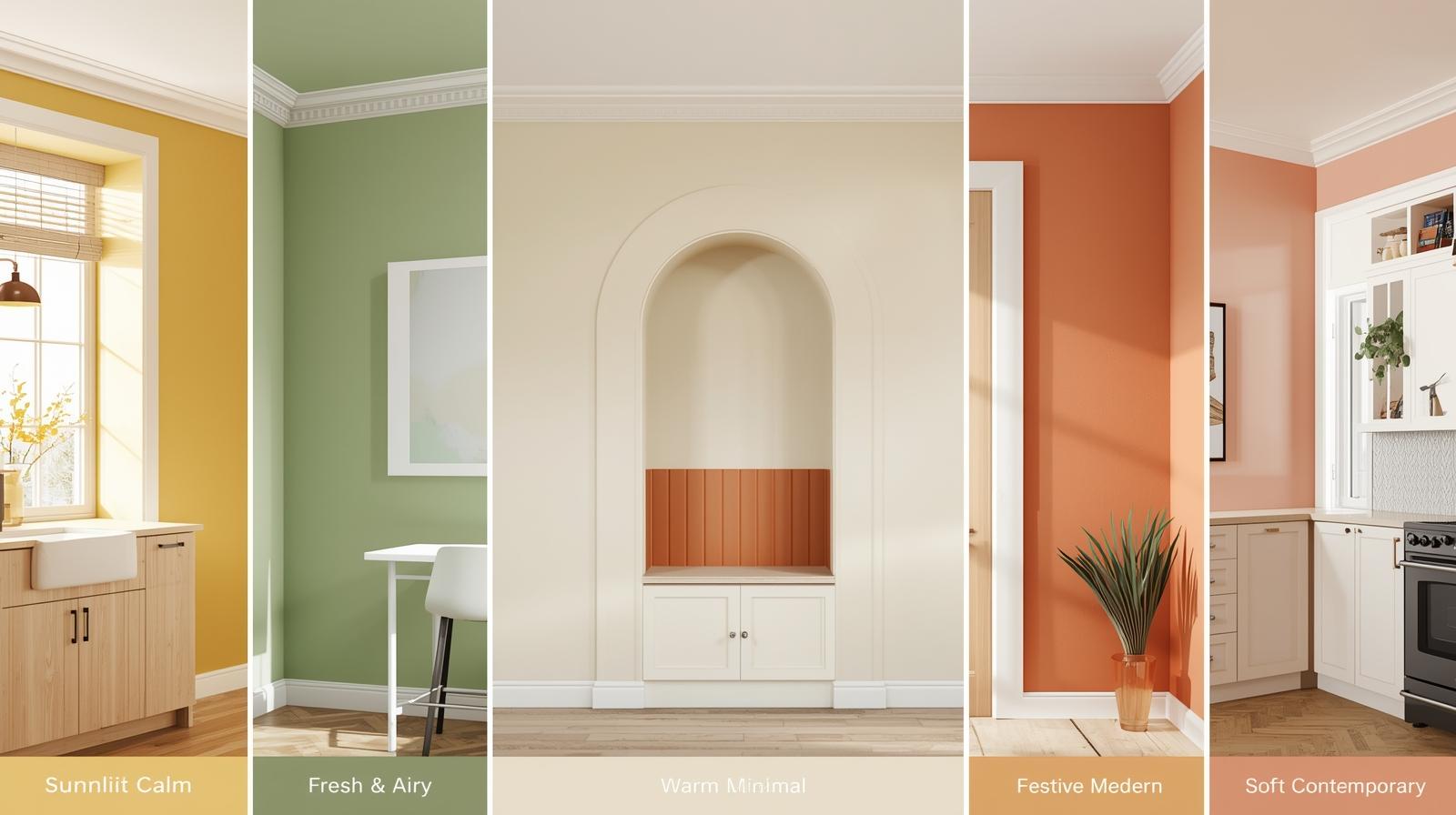
5 ready-to-use Vastu-friendly palettes you can copy
- Sunlit Calm: soft yellow walls + warm white ceiling + light oak cabinets
- Fresh & Airy: sage green walls + off-white trim + matte black hardware only (tiny accents)
- Warm Minimal: cream walls + beige backsplash + brushed steel appliances
- Festive Modern: peach walls + terracotta accent (niche/one wall) + warm lighting
- Soft Contemporary: rose-tinted neutral walls + white cabinets + light grey countertop (keep grey light)
Make it work in real kitchens
- Pick the right finish: Kitchens need scrubbable surfaces; choose a finish designed for frequent wiping.
- Use a “60–30–10” balance: 60% main wall colour, 30% cabinets/tiles, 10% accents (utensils, textiles).
- Don’t fight your countertop: Warm walls look best with warm stone; cool countertops pair better with off-white/greige.
- Test in your lighting: A shade can shift dramatically from morning to night. Paint a small patch near the stove and sink area before committing.
Pro tip: Always test a sample patch on the wall and observe it in daylight and warm night lighting.
Conclusion
Vastu Shastra is a traditional belief system, and colour guidance is generally based on cultural practices and elemental symbolism rather than on universal scientific evidence. If you treat it as a framework for creating a kitchen that feels balanced and pleasant, colour changes can be a genuinely useful, low-effort improvement, especially when combined with good lighting, ventilation, and an easy-to-clean paint finish.
Frequently Asked Questions (FAQs)
1. Can I use white colour in the kitchen according to Vastu?
Yes, white and off-white are considered safe and positive choices for kitchen walls. They promote clarity, cleanliness, and brightness. However, instead of stark white, many experts recommend warm whites or cream tones to avoid a clinical look and to complement Indian kitchen lighting conditions.
2. Is red a good colour for kitchen walls?
Red symbolises fire, which aligns with the kitchen’s elemental association. However, using bright red on all walls is not recommended as it can feel overwhelming. Instead, softer tones like coral, peach, or muted terracotta can be used as accents for a balanced look.
3. Which colour is best for a West-facing kitchen?
For a West-facing kitchen, light and warm shades such as cream, beige, soft peach, or muted yellow are recommended. These colours help maintain brightness, especially since west-facing kitchens receive stronger sunlight later in the day.
4. Can I use blue in the kitchen as per Vastu?
Blue is associated with the water element, which contrasts with the fire element of the kitchen. While deep blue may not be recommended, lighter pastel blues can be used in moderation, especially as accents rather than dominant wall colours.