


-
Living Room Colour Ideas
All Living Room Inspirations Blue Living Rooms Brown Living Rooms Grey Living Rooms Green Living Rooms Orange Living Rooms Purple Living Rooms Pink Living Rooms Red Living Rooms Yellow Living Rooms White Living Rooms
-
Bedroom Colour Ideas
All Bedrooms Inspirations Blue Bedrooms Brown Bedrooms Grey Bedrooms Green Bedrooms Orange Bedrooms Purple Bedrooms Pink Bedrooms Red Bedrooms Yellow Bedrooms White Bedrooms


Light, and Life to India's Homes.
At JSW Paints, we believe true beauty is not just about looking good, but about thinking and doing good.
thoughtful is beautiful.
That is why we have infused thoughtfulness in every drop and detail.
Best Paint Colours for a Home Study Room or Office
The colours in your study room play an important role in shaping the overall ambience. It can help you stay focused and create a setting where working and learning feel more engaging. Whether you use the room for online meetings, studying or managing daily tasks, choosing the right wall colour combination can make a noticeable difference.
This guide explores the best paint colours for home study rooms and offices, along with practical ideas to create a space that feels calm, productive and welcoming.
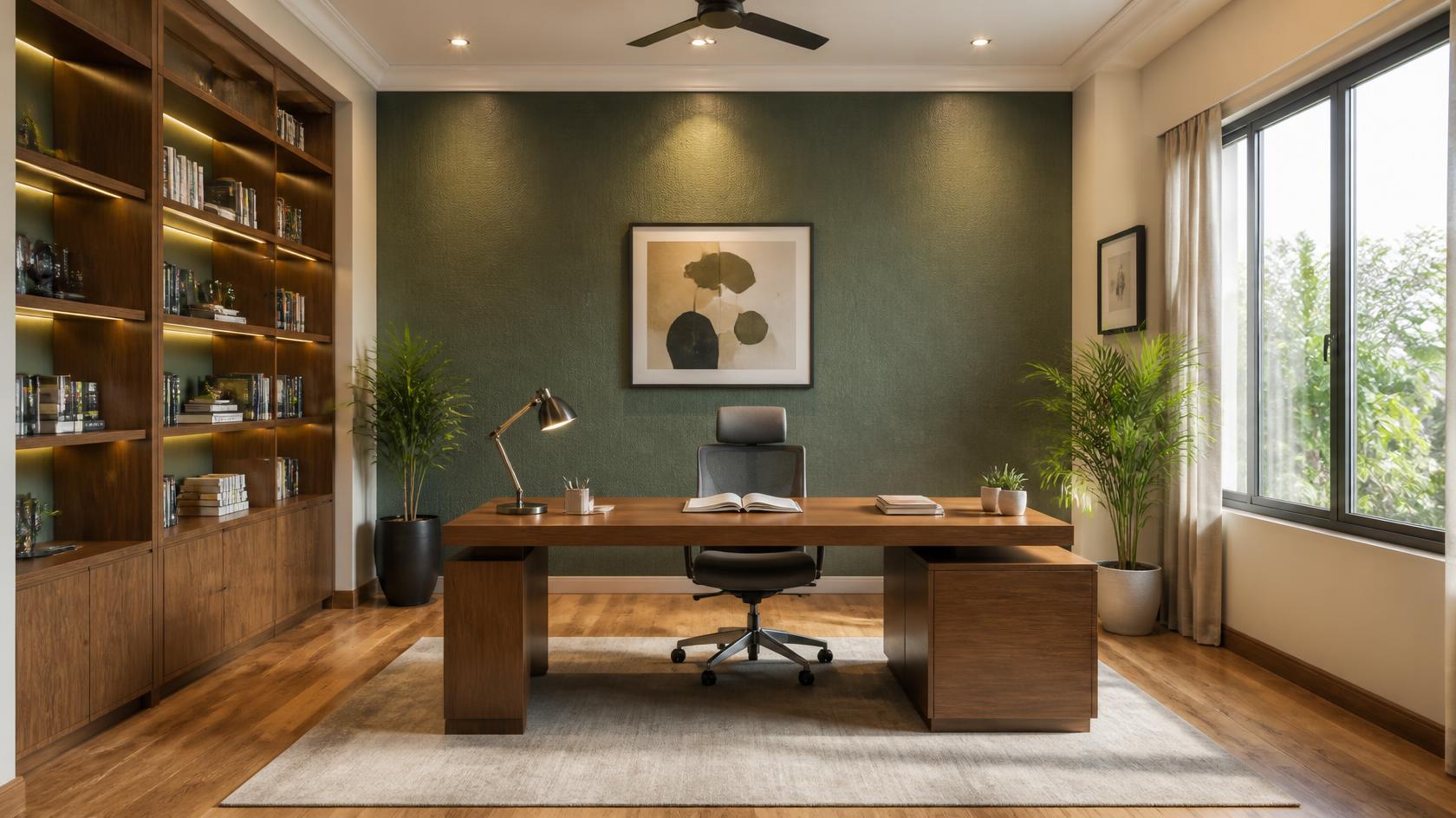
How Colour Affects Focus and Productivity
The colours around us greatly influence our mood and energy levels. Having the right wall colour helps set a purposeful tone for your entire day. On the contrary, highly vibrant or intense colours can make a workspace feel restless. They tend to draw focus away from your tasks and make it harder to maintain concentration for longer periods.
Top Choices for Wall Colours for Study Rooms
Greens That Boost Focus
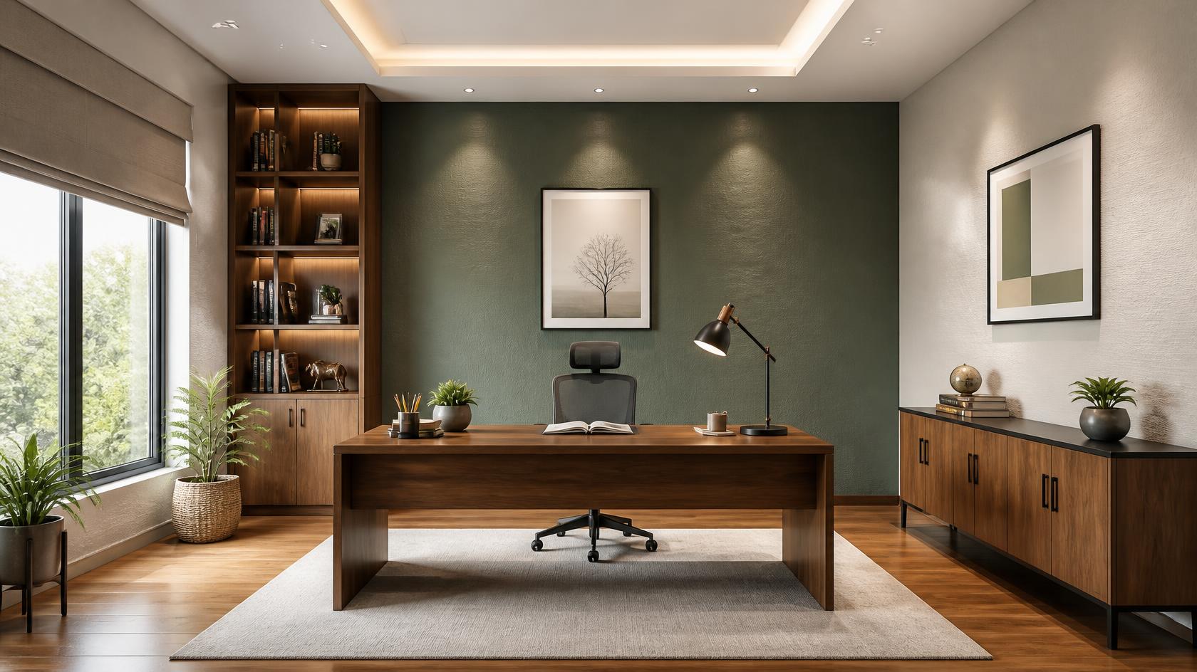
- Sage green like Misty Peaks(3512) creates a calming backdrop that helps your eyes relax between long reading sessions.
- Another green shade, Himachal Forest (3466), works perfectly on the main wall facing your desk, bringing the beauty of nature into your room.
- Olive tones such as Mossy Rock (3605) bring a rich feel to the room and pair beautifully with wooden desks.
Why it works: Green is naturally associated with balance and renewal, which helps soothe the mind during long hours of reading or writing.
Blues for Calm Concentration
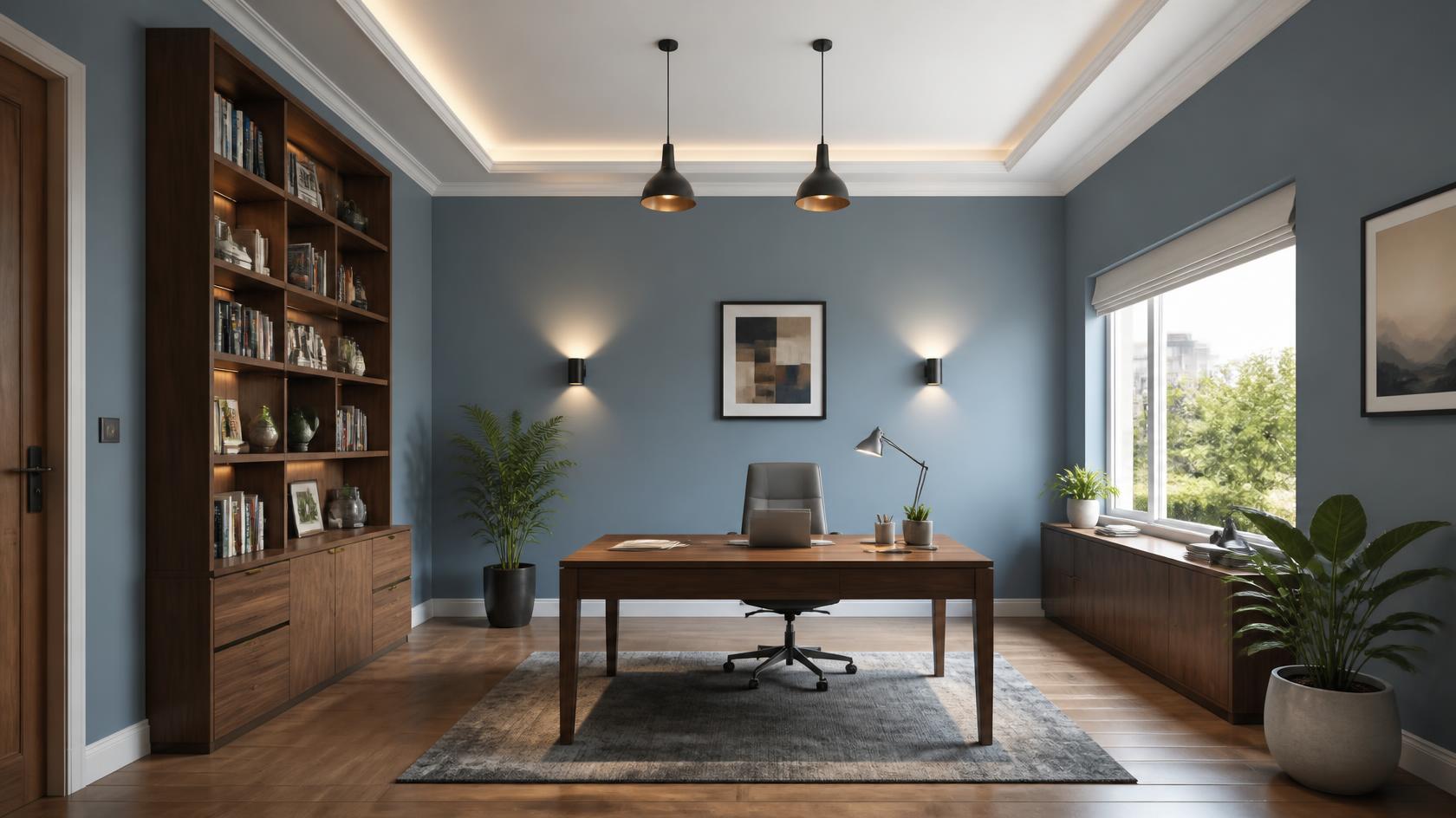
- Bright yet calming blue shade such as Barefoot Blue (2397) keeps an office feeling spacious, peaceful and uncluttered.
- A turquoise shade, such as Oceanic Ridge (3397), boosts creative energy without causing visual distractions during important meetings.
- Cool blue, like Ice blue (2405), pairs beautifully with sleek white shelves for a minimalist look.
Why it works: Blue tones promote a sense of calm and clarity, helping you stay focused when tackling complex projects.
Neutrals for a Professional Look
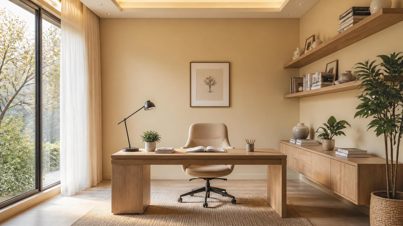
- Warm beige, like Beige Sand (2142), gives the study room a refined, inviting atmosphere that looks professional on video calls.
- Warm Tint (1037) provides a clean, contemporary backdrop that suits almost any style of furniture.
- Antique Satin (2102) and Shore Temple Sand (2112) offer a cosy warmth that makes a compact study feel spacious and bright.
Why it works: Neutral colours provide a versatile background that suits both home offices and study rooms while allowing furniture and décor to stand out.
To explore these beautiful palettes in real-time, you can use the JSW Paints AI Visualizer to view how these tones complement your home office.
Colour Ideas for Accent Wall in Study Rooms
An accent wall adds depth and personality to a room without overwhelming it.
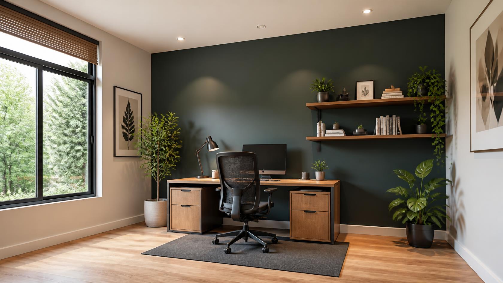
Muted Terracotta
A soft, earthy Terracotta Roof (3126) wall adds richness and a subtle creative energy to the room. It forms an inviting backdrop behind a main desk or a low bookcase.
Design tip: Place a black metal desk lamp and a few green indoor plants in front of this wall to create a modern look.
Deep Charcoal
Having a wall painted with Charcoal Matt (4318) directly behind your desk screen creates an elegant, high-contrast focal point.
Design tip: Use light-coloured wooden floating shelves on this wall to keep the look balanced.
Soft Lavender
A gentle lavender accent wall, Lavender Cloud (2335), next to a bookshelf creates a relaxing zone for studying and thinking.
Design tip: Place a comfortable armchair in a light cream fabric against this wall to design the perfect reading nook.
Two-Colour Combination Ideas for Home Offices
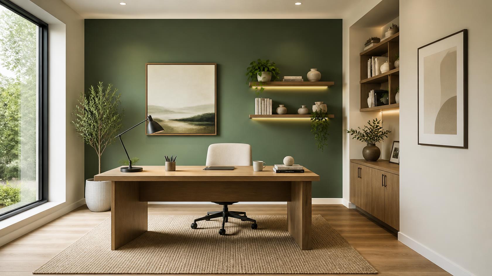
Sage Green and Light Cream
This room colour combination brings the freshness of nature indoors while keeping the workspace bright and soothing.
Expert tip: Use Green Valley (3513) on the lower half of the wall and Light Cream (2071) on the upper half to make your ceiling appear higher.
Grey and Blue
This pairing of a warm Minimal Taupe (4105) and a relaxed, understated Teal Boat (3442) colour is ideal to spark fresh ideas during the workday.
Blue and White
This colour combination of Ville Colonial (3364) and White Palace (1191) is ideal for smaller spare rooms turned into offices, creating a breezy, relaxing appearance.
Expert tip: Utilise sheer white curtains to let soft, filtered daylight enhance these shades throughout the afternoon.
Finish and Sheen: What Works in Study Rooms
The home colour combinations of your interior wall paint determine how light bounces around your home office.
Matte Finish for Zero Glare
This finish absorbs light completely, preventing any unwanted reflections or glare on your workspace walls. It also hides minor surface imperfections on older walls. Our Halo Majestic Interiors Matt offers an excellent smooth finish with low VOC.
Why it works: It creates a soft, understated look while ensuring a comfortable viewing experience for long screen sessions.
Satin Finishes for Easy Care
This texture offers a soft, low-level sheen that reflects just a hint of light. It provides a durable surface that you can easily wipe clean if it gathers dust or fingerprints. Check out our Aurus Regal Interiors Silk for rich silk texture and excellent washability.
Why it works: It balances a subtle, elegant appearance with excellent washability, making it practical for high-use home workspaces.
JSW Paints Recommended Shades for Study Spaces
Creating the perfect home study room is simple with the right colour palette. JSW Paints offers a wide range of shades, from calming greens and soothing blues to elegant greys and warm neutrals. They help you create a study or home office that reflects your personal style.
Before making your final choice, explore the JSW Paints AI Visualizer to see how different paint colours look on your walls.
FAQs on Study Room Paint Colours
Should the ceiling be painted the same colour as the walls?
A white or lighter ceiling helps reflect light and makes the study room feel more open, while matching ceilings can create a more seamless appearance in larger rooms.
How often should study room walls be repainted?
These spaces can be repainted every five to seven years, depending on wall condition, sunlight exposure and everyday wear.
Can I use dark colours in a small home office?
Dark paint colours work well as feature walls when balanced with lighter surrounding walls, good lighting and light-coloured furniture.