


-
Living Room Colour Ideas
All Living Room Inspirations Blue Living Rooms Brown Living Rooms Grey Living Rooms Green Living Rooms Orange Living Rooms Purple Living Rooms Pink Living Rooms Red Living Rooms Yellow Living Rooms White Living Rooms
-
Bedroom Colour Ideas
All Bedrooms Inspirations Blue Bedrooms Brown Bedrooms Grey Bedrooms Green Bedrooms Orange Bedrooms Purple Bedrooms Pink Bedrooms Red Bedrooms Yellow Bedrooms White Bedrooms


Light, and Life to India's Homes.
At JSW Paints, we believe true beauty is not just about looking good, but about thinking and doing good.
thoughtful is beautiful.
That is why we have infused thoughtfulness in every drop and detail.
Room Colour Combinations for Every Room in Your Home
Choosing colours for your home is more than just painting walls. Whether you prefer soft neutrals, earthy tones or modern contrasts, pairing room colours thoughtfully can make your home feel balanced and inviting.
In this practical guide, our expert will share some of the best wall colour combinations for every room in your home. From living rooms and bedrooms to kitchens and bathrooms, you'll discover colour pairings that complement different interior styles.
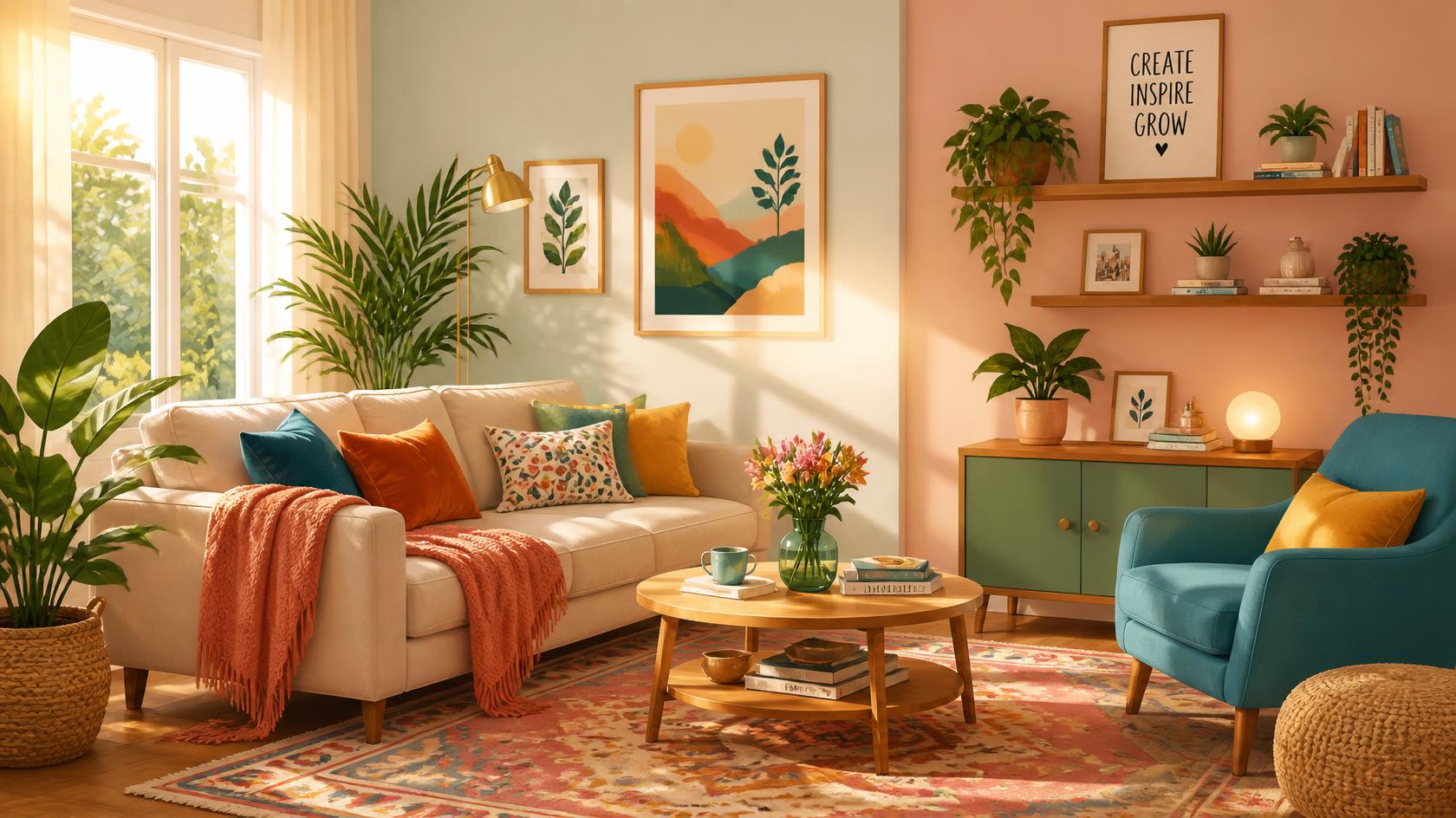
How to Choose the Right Room Colour Combination
The right home colour combination brings together the existing elements in a way that feels balanced and harmonious.
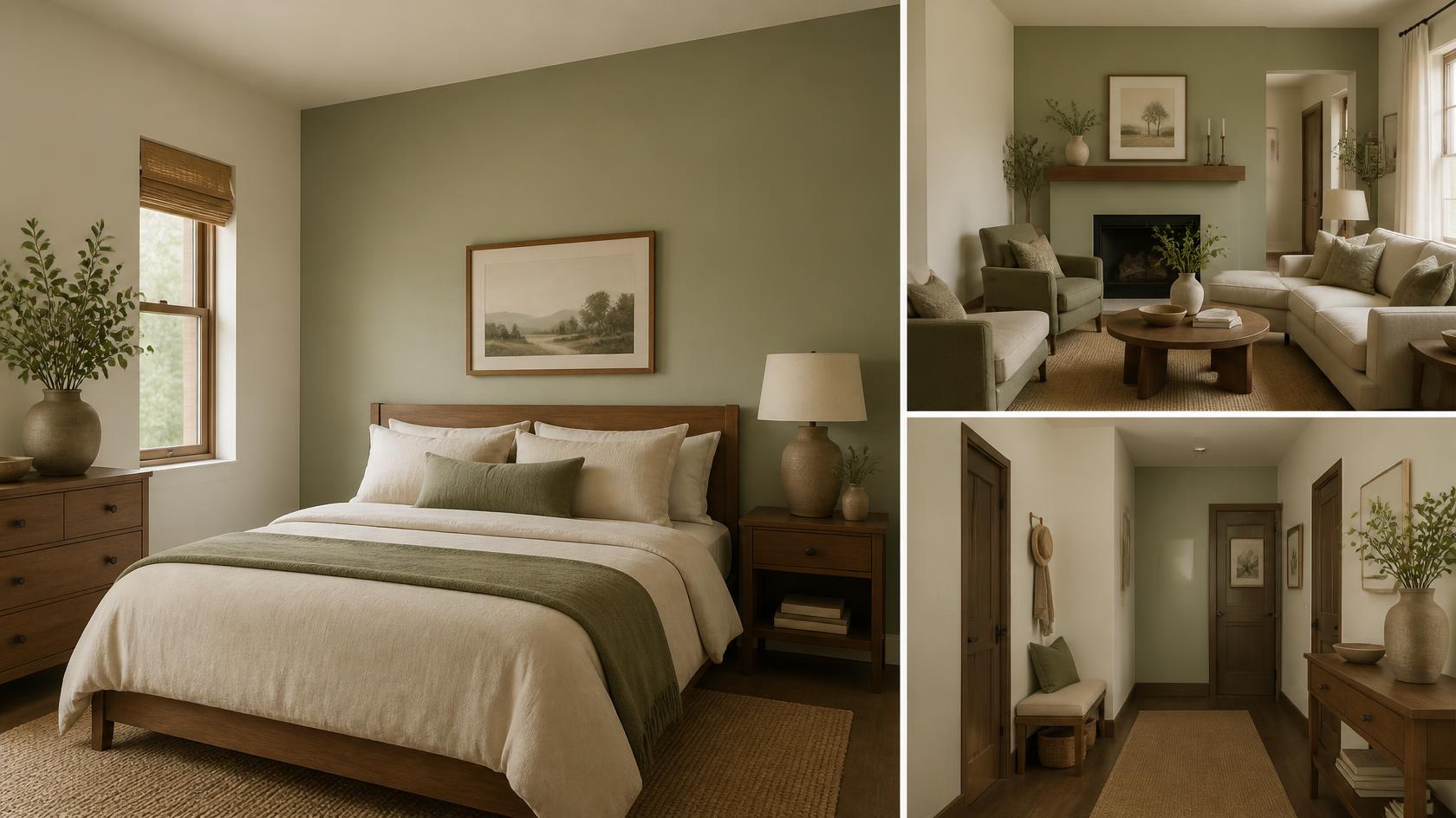
A simple rule that you can follow:A simple rule that you can follow:
- One base colour for most walls
- One supporting colour for depth
- One accent colour for personality
For instance, explore JSW Paints shades like Cream Damask (1081) paired with Pistachio Nut (2685) and Walnut Grove (3454) to create a calm, earthy atmosphere.
However, before finalising any colour combination, test a patch on the wall. See it in the morning, afternoon, and evening.
Living Room Colour Combinations For Modern Homes
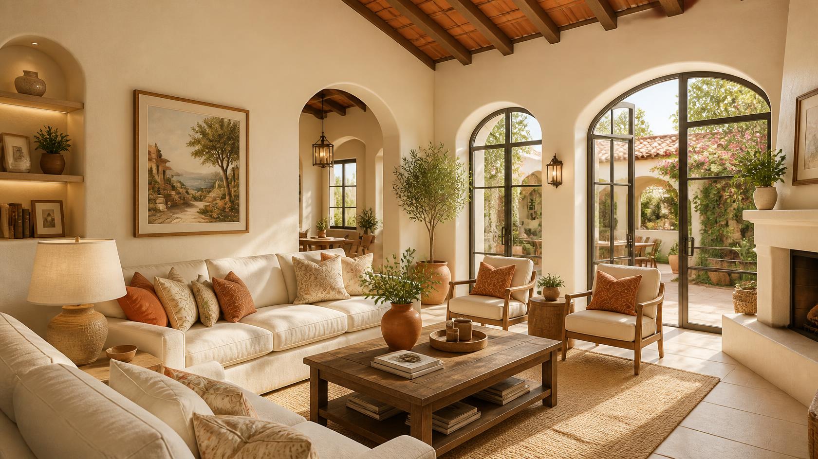
The living room is where families gather and everyday moments are shared. The right living room colour combination creates a space that feels warm, makes guests feel welcome and supports tea-time conversations.
| Mood | Colour Pairing JSW Paints Recommendations) | Works Well With |
|---|---|---|
| Warm | Light Cream (2071) and Terracotta Roof (3126) | Wood and brass accents |
| Fresh | Still Fresh (1147) and Natural Sage (2564) | Indoor plants and cane furniture |
| Elegant | Ancient Port (4372) and Arabian Sea (2386) | Gold and marble finishing interiors |
| Earthy | Smooth Sand (2122) and Soothing Olive (2727) | Jute and linen textures |
Colour Combinations for Small Living Rooms
Small living rooms benefit from light, airy colour palettes that make the space feel larger. A lighter base colour paired with a soft accent shade adds depth while maintaining a bright and open look.
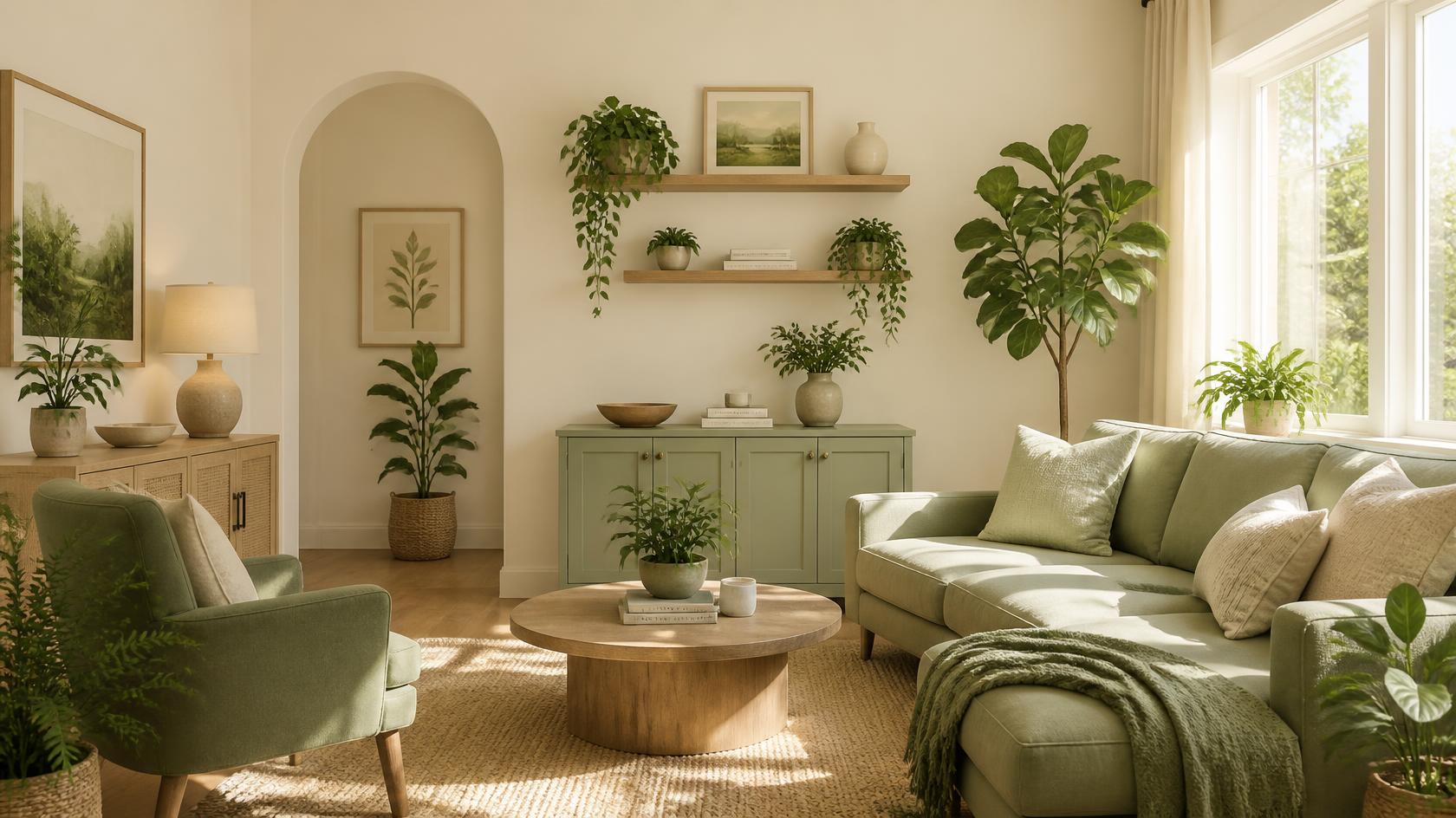
A few good options include:
- Perfect Ivory (1067) and Natural Sage (2564)
- Warm Tint (1037) and Blue Avenue (3363)
- Beige Sand (2142) and Artisan Brown (4377)
How to Style the Space
- Use the lighter shade on most walls.
- Add the darker colour behind the TV unit or sofa to create a focal point.
Expert tip: Avoid using dark colours on all four walls, as they can make compact spaces feel smaller.
Colour Palettes for Open-Plan Spaces
Open-plan spaces need a sense of flow. Start with a single base shade across the entire area, then introduce accent colours to define different zones.
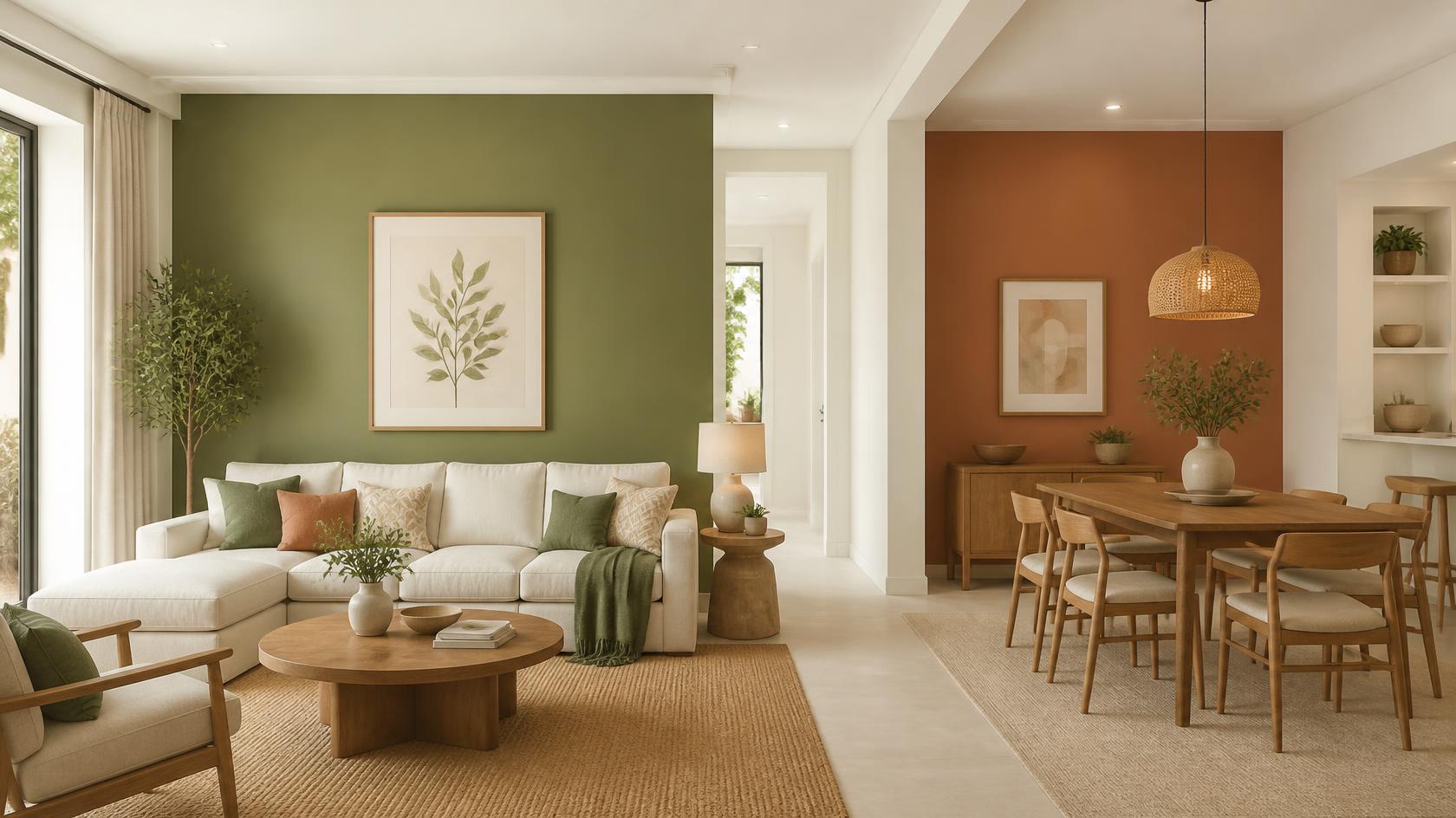
For example:
- Base: Plantation White (1137)
- Living accent: Lush Olive (3575)
- Dining accent: Terracotta (3188)
How to Style the Space
- Keep the same base colour throughout the open space.
- Introduce accent colours through one feature wall or decorative accessories.
Expert tip: Repeat the same colours in cushions, artwork or table linen to create subtle movement
Bedroom Colour Combinations for Restful Nights
The bedroom should feel calm, comfortable, and relaxing after a busy day. Soft, balanced colour combinations help create a peaceful atmosphere.
Cool Tones for Master Bedrooms
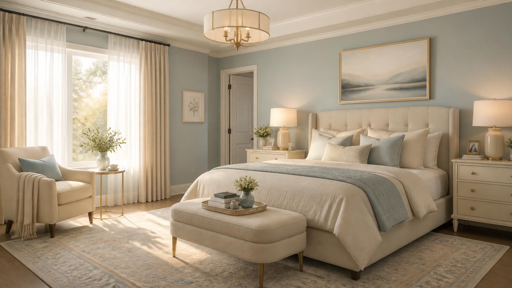
Recommended Colour Combinations
- Misty Morning (2561) with Gracious Light (1012)
- Sage Leaves (3492) with Cream Damask (1081)
- Lavender Cloud (2335) with Pearl Reflection (1134)
How to Style the Space
- Pair soft wall colours with warm wooden furniture.
- Add warm lighting through bedside lamps or pendant lights for a cosy ambience.
Expert tip: Natural materials like linen, cotton, and wood complement cool wall colours beautifully.
Warm Palettes for Children's Rooms
Children’s rooms should feel cheerful, but also calm and balanced. Instead of using bright colours across walls, use them as accents to bring in energy without overwhelming the space.
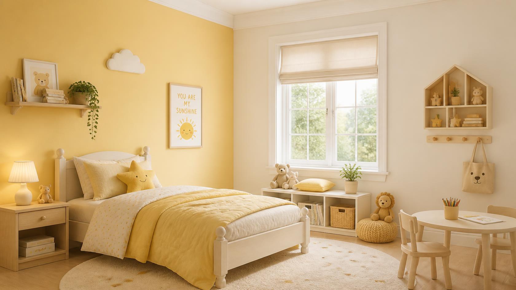
Try:
- Butter Up (2033) with Promised White (1141)
- Precious Coral (2131) with Beige Hemp (1073)
- Lilac Wisp (2332) with Sunshade Cream (1126)
How to Style the Space
- Choose neutral shades as the main wall colours.
- Add brighter colours through bedding, cushions, or study corners.
Expert tip: Use colourful accessories instead of repainting the entire room as your child's preferences change over time.
Dining Room & Kitchen Colour Pairing Ideas
Dining rooms and kitchens can carry richer, warmer colours because they are functional spaces. In Indian homes, these areas also bring together materials like steel, wood, stone, tiles and appliances. Hence, the colour combination should create balance and complement these varied textures.
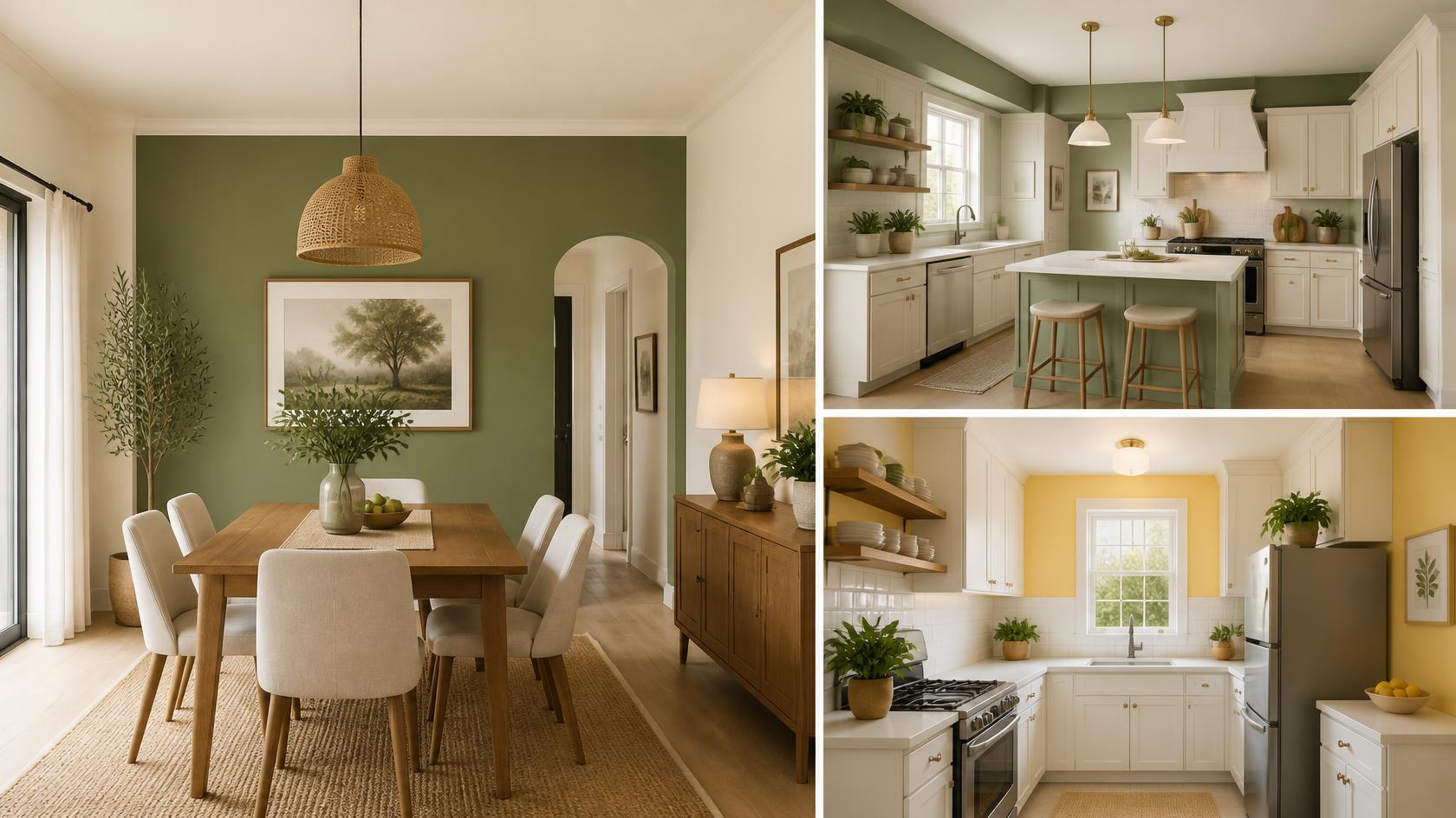
Here are a few ideas:
- Kitchen: off-white walls with Sage Bouquet (2617) accents
- Dining area: cream walls with a Lush Olive (3575) feature wall
- Compact kitchen: Yellow Lantern (2736) and white for brightness
How to Style the Space
- If the dining space is connected to the living room, avoid introducing an entirely new palette.
- Pick one colour from the living room and deepen it for the dining wall.
Expert tip: Explore kitchen colour ideas that complement your space perfectly.
How the JSW Paints AI Visualizer Helps You Choose the Right Colours
Choosing a home paint combination, hence visualising colours before painting, helps you make more confident decisions and avoid costly mistakes.
The JSW Paints AI Visualizer lets you see how different wall colours and colour combinations will look in your own space before you start painting. You can experiment with a variety of shades, compare different palettes, and explore combinations that complement your furniture and interior style. This makes it easier to find a colour scheme that suits your home and personal preferences.
FAQs on Room Colour Combinations
Which colour combination is best for Indian living rooms?
It depends on lighting, space, and style, but cream and terracotta, white and sage, beige and brown, and greige with navy usually work well for living rooms. Choose a house colour combination based on room size, light, and furniture.
Which colour makes a small room look bigger?
Warm white, ivory, pale blue, soft grey, and light beige can make a small room feel more open.
How many colours should I use in one room?
Two to three colours are usually ideal for one room. Use one base colour for walls, one supporting colour for larger elements like furniture, and one accent shade for decor.