

-
Living Room Colour Ideas
All Living Room Inspirations Blue Living Rooms Brown Living Rooms Grey Living Rooms Green Living Rooms Orange Living Rooms Purple Living Rooms Pink Living Rooms Red Living Rooms Yellow Living Rooms White Living Rooms
-
Bedroom Colour Ideas
All Bedrooms Inspirations Blue Bedrooms Brown Bedrooms Grey Bedrooms Green Bedrooms Orange Bedrooms Purple Bedrooms Pink Bedrooms Red Bedrooms Yellow Bedrooms White Bedrooms


Light, and Life to India's Homes.
At JSW Paints, we believe true beauty is not just about looking good, but about thinking and doing good.
thoughtful is beautiful.
That is why we have infused thoughtfulness in every drop and detail.
Vastu Wall Colours for Living Room to Attract Positivity
Choosing the right wall colour for your living room isn’t just about aesthetics but it also affects mood, energy, and the overall feel of your home. According to Vastu Shastra, colours influence the five elements (Panchatatva) and the flow of energy in a space. Since the living room is where families gather and guests are welcomed, selecting Vastu-approved wall colours can help invite peace, warmth, harmony, and positivity.
In this guide, we’ll cover the best Vastu wall colours for the living room, based on direction, purpose, and energy impact, along with colours you should avoid.
Top Vastu Colours That Attract Positivity in the Living Room
Here are the most widely recommended colours across Vastu experts:
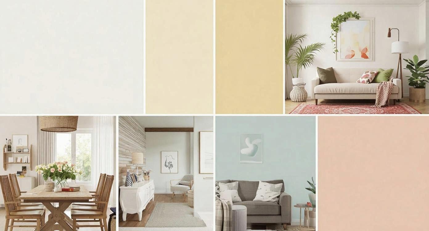
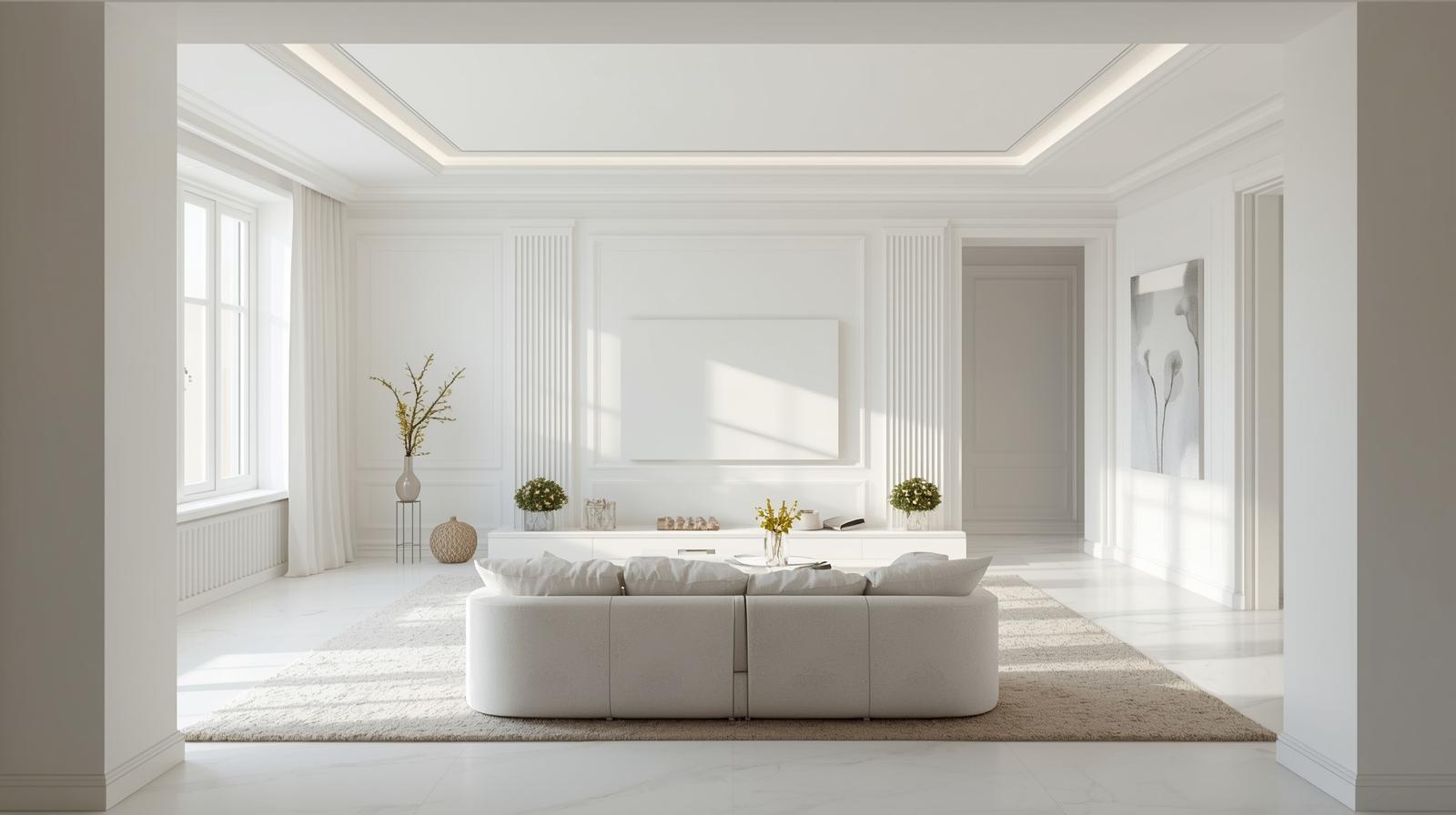
1. White - Most Auspicious Colour
White (1011- New Start) represents purity, peace, and openness. It also makes the room look bigger and brighter.
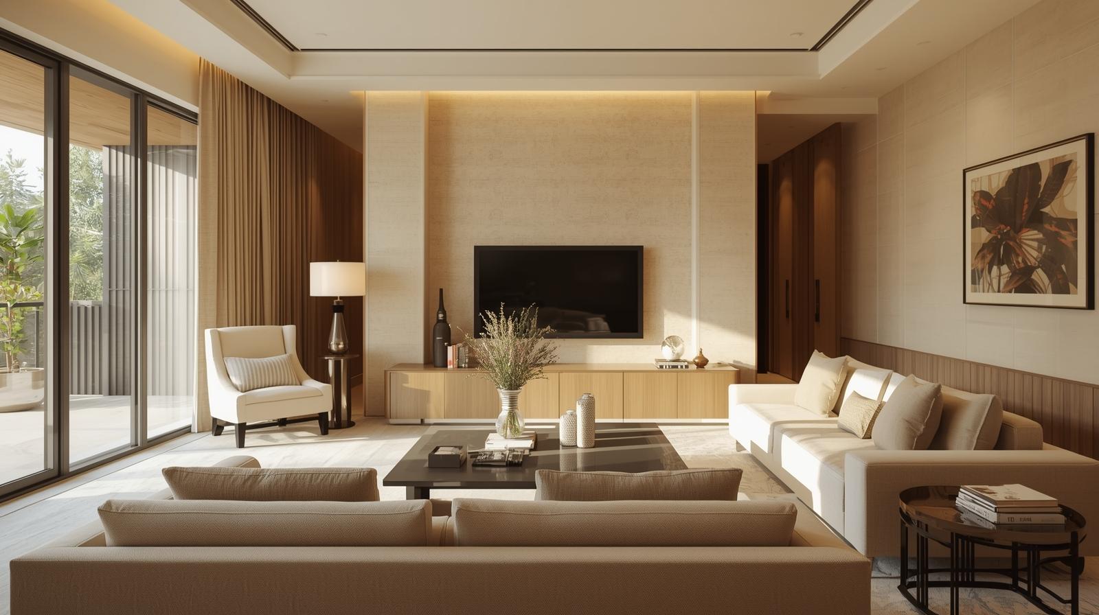
2. Cream - Warm and Balanced
Cream (1072 – Natural Sheer) gives the calmness of white but with more warmth, perfect for Indian homes.
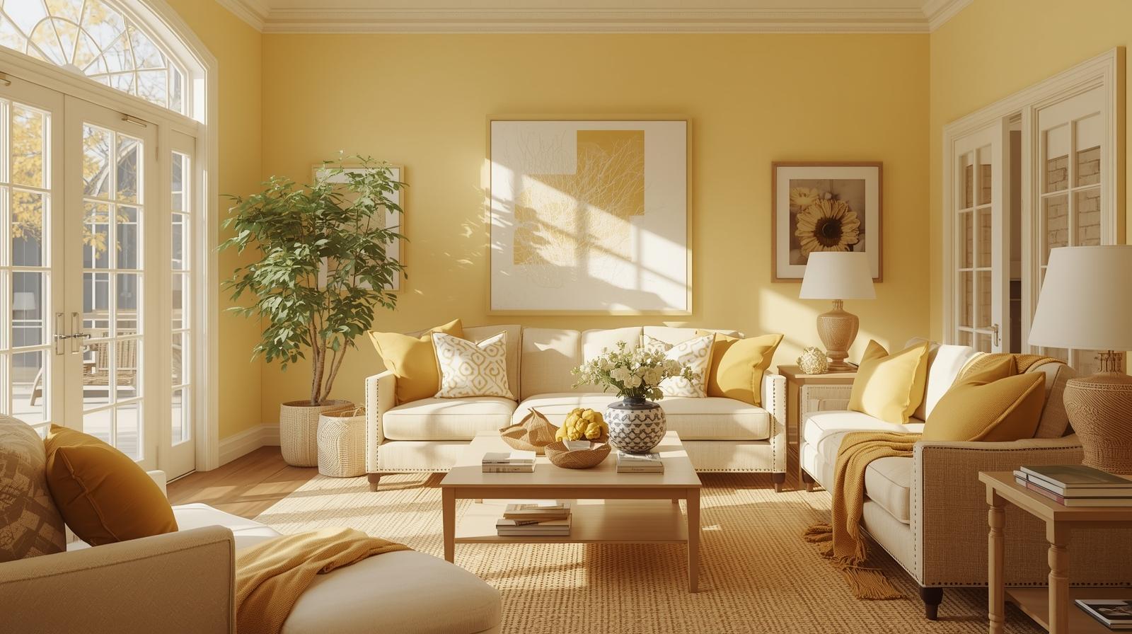
3. Light Yellow - Joy and Optimism
Yellow (2046- Morning Mimosa) is linked to happiness, intelligence, and positive family bonding.
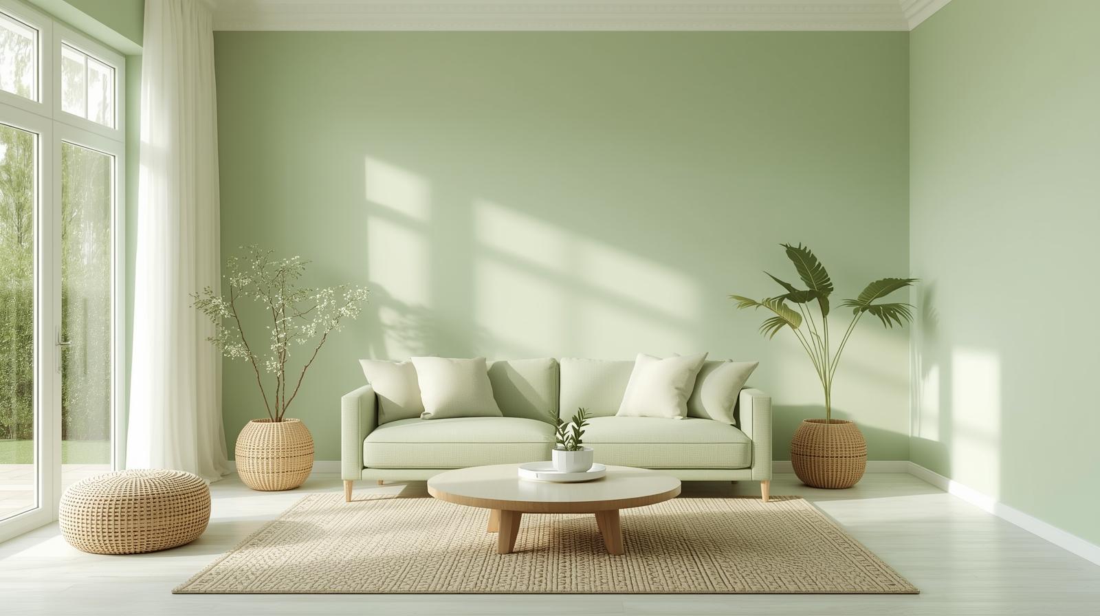
4. Light Green - Healing and Growth
Green (2643- Pleasing Green) supports harmony, emotional freshness, and a soothing environment.
5. Beige - Stability and Comfort
Beige (1065 – Organza Ribbon) is ideal if you want a neutral living room with Vastu support.

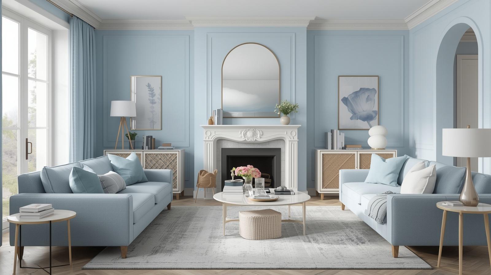
6. Pastel Blue - Calm and Clarity
Blue tones (2473 -Powder Blue) are great for relaxation, especially in high-stress households.
7. Soft Peach or Pink - Warmth and Relationships
In mild tones, peach/pink (2144- Perfect Puff) encourages affection and warmth but should not be too dark.
Why Living Room Colours Matter in Vastu
In Vastu Shastra, the living room is considered a high-energy zone because:
- People enter and exit frequently
- Conversations, emotions, and interactions happen here
- It becomes the “social energy centre” of the house
Wall colours influence:
- Mood and calmness
- Relationship harmony
- Guest comfort
- Mental clarity
- Overall energy balance
A Vastu-aligned living room colour can make the space feel lighter, brighter, and emotionally uplifting.
Vastu Wall Colours for the Living Room Based on Direction
One of the most accurate ways to select living room colours is by matching them to the direction of your living room.
Living Room in the North Direction
| Direction | Associated Energy / Element | Recommended Colours | Why It Works |
|---|---|---|---|
| North | Wealth, Growth, Water Element (Lord Kubera) | Light Green, Mint Green, Aqua, Pastel Blue, Soft White | Encourages growth, freshness, prosperity, and calm energy. |
| East | Sun, New Beginnings, Clarity | Light Yellow, Cream, Soft Peach, Light Beige, White | Creates a cheerful, uplifting, and optimistic atmosphere ideal for family interaction. |
| West | Stability, Patience, Maturity | Light Grey, Off-White, Beige, Soft Blue, Pale Yellow | Brings balance and steadiness without making the room feel dull. |
| South | Fire Element, Power, Strong Energy | Soft Pink, Light Coral, Beige, Cream, Light Terracotta (very mild) | Manages strong southern energy while keeping the space warm and inviting. |
| North-East (Ishanya) | Spirituality, Purity | White, Cream, Light Blue, Very Light Yellow | Supports peace, positivity, clarity, and divine energy. |
| South-East | Fire (Agni), Active Energy | Light Orange, Soft Peach, Warm Beige, Light Yellow | Aligns with fire energy while keeping the room pleasant and controlled. |
| North-West | Movement, Air, Social Interaction | White, Light Grey, Cream, Pastel Blue | Encourages harmony, communication, and social flow. |
Which Colours Should You Avoid in the Living Room as per Vastu?
Some colours are considered too heavy or energy-disturbing for living rooms.
Avoid these shades on large wall areas:
- Dark Red as it can increase aggression
- Black creates heaviness and emotional dullness
- Dark Grey can feel depressing if overused
- Deep Blue may feel cold and isolating
- Very Bright Neon Colours cause restlessness
Tip: You don’t need to completely ban them, but use them only as small accents, not full-wall paints.
Best Vastu Colour Combinations for Living Room
If you want a modern look while staying Vastu-aligned, try these combos:
- White + Light Green (fresh + airy)
- Cream + Beige (warm + premium)
- Light Yellow + Off-White (sunny + soft)
- Pastel Blue + White (cool + calm)
- Peach + Cream (cozy + welcoming)
These combinations also work well for AEO-style queries because they’re practical and easy to apply.
Vastu Tips to Enhance Positive Energy Along with Wall Colour
Wall colour helps a lot but for best results, combine it with these Vastu-friendly practices:
- Keep the living room clutter-free
- Use natural light wherever possible
- Place heavy furniture in the south-west
- Keep the north-east corner open and clean
- Add indoor plants like money plant or areca palm
- Use soft warm lighting for a welcoming vibe
Final Thoughts: Choosing the Right Vastu Colour for Your Living Room
The best Vastu wall colours for the living room are the ones that keep the space bright, calm, and welcoming. Shades like white, cream, light yellow, pastel blue, beige, and light green work across most directions and home styles, while darker tones should be used carefully.
If you want maximum positivity, choose colours that feel light, soothing, and balanced, because Vastu ultimately supports harmony, not harshness.
FAQs: Vastu Wall Colours for Living Room
What is the most positive colour for a living room as per Vastu?
White, cream, light yellow, and light green are considered the most positive and universally safe living room colours.
Can we use grey colour in the living room according to Vastu?
Yes, but use light grey and balance it with white or beige. Avoid dark grey for large walls.
Is the blue colour good for the living room in Vastu?
Pastel blue is good, especially for north or north-east living rooms. Avoid very dark blue shades.
Which colour attracts wealth in the living room?
For wealth and prosperity, Vastu commonly recommends:
- Light green
- Cream
- Soft yellow - especially for north-facing living rooms.