


-
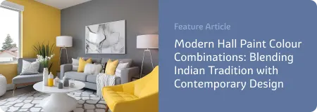
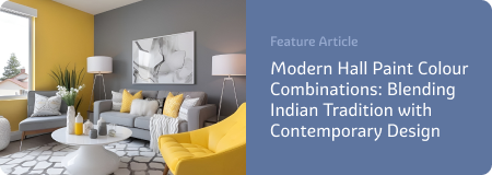
Living Room Colour Ideas
All Living Room Inspirations Blue Living Rooms Brown Living Rooms Grey Living Rooms Green Living Rooms Orange Living Rooms Purple Living Rooms Pink Living Rooms Red Living Rooms Yellow Living Rooms White Living Rooms
-
Bedroom Colour Ideas
All Bedrooms Inspirations Blue Bedrooms Brown Bedrooms Grey Bedrooms Green Bedrooms Orange Bedrooms Purple Bedrooms Pink Bedrooms Red Bedrooms Yellow Bedrooms White Bedrooms
Light, and Life to India's Homes.
At JSW Paints, we believe true beauty is not just about looking good, but about thinking and doing good.
thoughtful is beautiful.
That is why we have infused thoughtfulness in every drop and detail.
How Colours Affect Mood and Behaviour: The Psychology Behind Wall Paint Choices
When you choose a wall colour, you're not just picking a shade — you're shaping the way a space feels and how people behave in it. The link between colour and psychology is well-established: different colours can energise, calm, inspire, or even irritate, depending on how they’re used.
Whether you're painting your home, office, or any personal space, understanding how wall colours affect mood and behaviour can help you create environments that support focus, relaxation, creativity, or comfort.
The Power of Colour and Psychology
Colour isn't just visual — it's emotional and psychological. Our brains process colours as signals, often subconsciously, triggering moods, memories, and even physiological responses like heart rate or appetite. That’s why interior designers, therapists, and marketers all pay close attention to colour and psychology.
Let’s break down how common wall colours influence our mood and actions:
1. Blue: Calm, Clarity, Focus
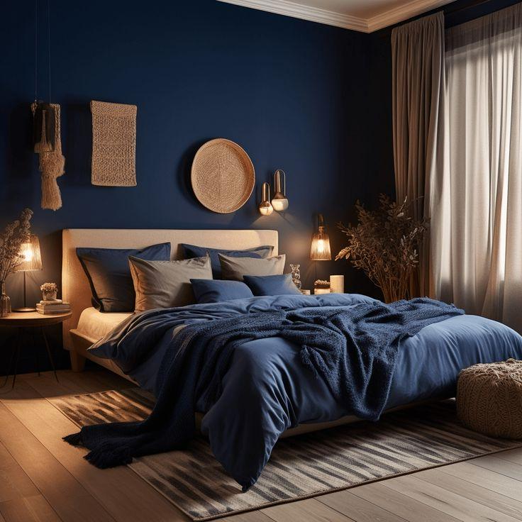
Blue is one of the most psychologically soothing colours. It’s associated with trust, calm, and mental clarity.
- Best For: Bedrooms, offices, reading nooks
- Effect: Lowers stress, supports focus, improves productivity
- Tip: Light blues feel airy and restful; darker navies can feel sophisticated but may need balancing with warm accents.
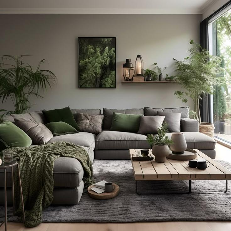
2. Green: Balance, Renewal, Peace
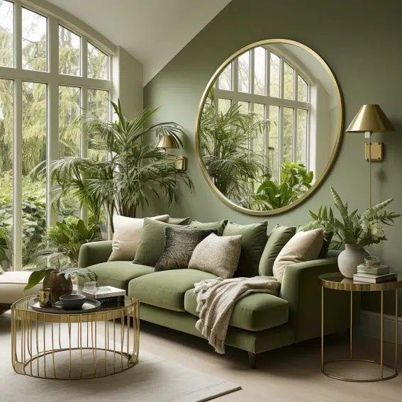
Green mirrors nature and brings a sense of harmony. It’s often used to create refreshing and restorative spaces.
- Best For: Living rooms, bathrooms, meditation areas
- Effect: Encourages calm and emotional balance
- Tip: Sage and olive tones feel modern and grounded; bright greens can add vibrancy but may be best used as accents.
3. Yellow: Energy, Optimism, Warmth
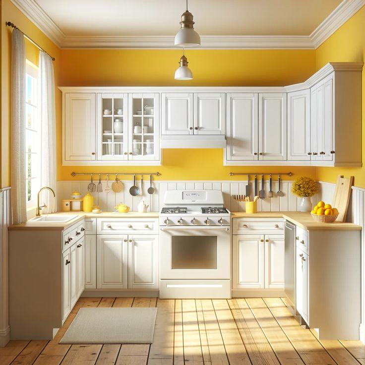
Yellow stimulates positivity and creativity. It mimics sunlight, which can make a space feel brighter and more cheerful.
- Best For: Kitchens, dining rooms, small entryways
- Effect: Boosts mood and mental energy — but too much can feel overwhelming
- Tip: Soft buttery yellows are more relaxing; bold yellows are better for accents or smaller walls.
4. Red: Passion, Power, Appetite
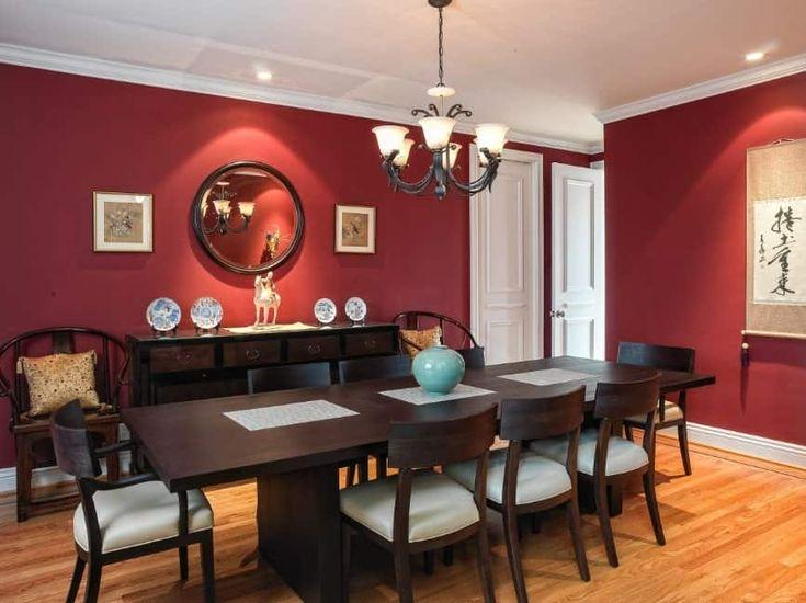
Red is intense and emotionally charged. It increases energy, attention, and even heart rate.
- Best For: Dining rooms, social spaces, accent walls
- Effect: Sparks excitement and appetite — but can feel aggressive if overused
- Tip: Deep reds like burgundy or terracotta are more refined and cozy than bright scarlet.
5. Purple: Luxury, Creativity, Spirituality
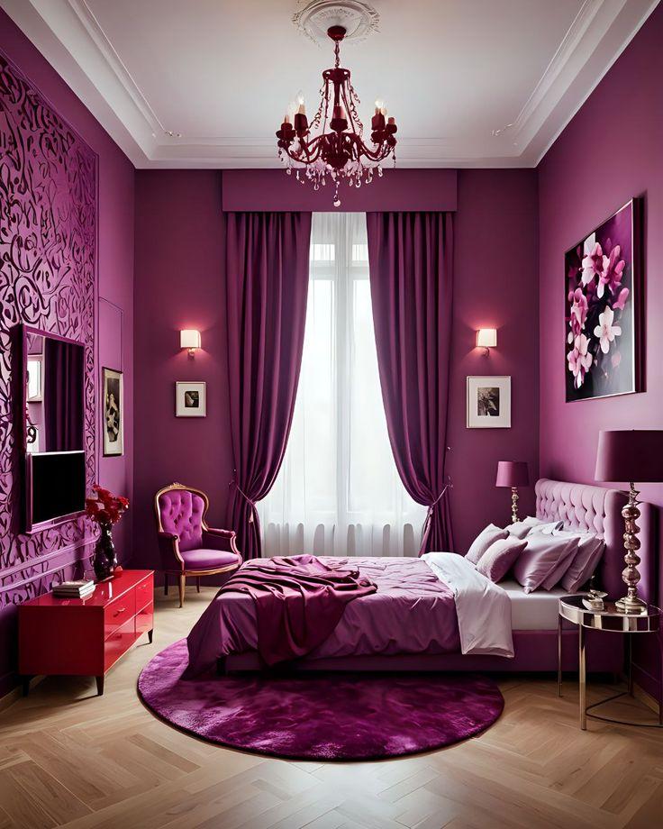
Purple combines the calm of blue with the energy of red, often associated with imagination and depth.
- Best For: Bedrooms, studios, or personal sanctuaries
- Effect: Inspires creativity and introspection
- Tip: Use lavender or muted purples for subtle elegance; avoid overly saturated purples which can feel too bold.
6. Grey: Sophistication, Neutrality, Control
Grey is modern, minimalist, and flexible. It creates calm but can also feel sterile without warmth.
- Best For: Living rooms, hallways, offices
- Effect: Encourages focus, neutrality, and understated elegance
- Tip: Pair cool greys with warm accents (like wood or brass) to avoid a cold feel.
7. White: Purity, Simplicity, Freshness
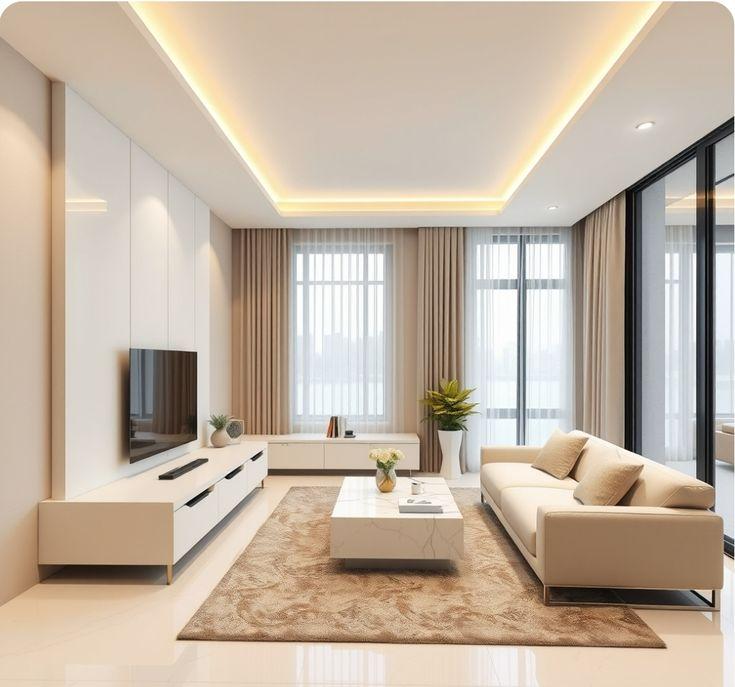
White makes rooms feel larger, cleaner, and more open — but it can also feel bland if not styled well.
- Best For: Any space — especially small or low-light rooms
- Effect: Encourages clarity, openness, and calm
- Tip: Mix textures (wood, fabric, stone) to add warmth and avoid a sterile look.
8. Black: Depth, Drama, Sophistication
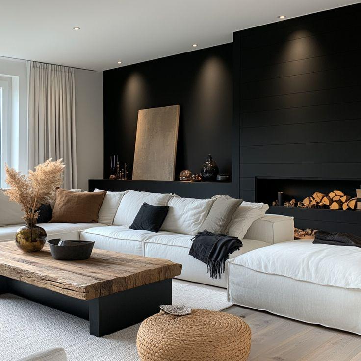
Used carefully, black walls add drama and modernity. It’s bold and commanding — not for the faint of heart.
- Best For: Accent walls, media rooms, contemporary interiors
- Effect: Adds intimacy and focus but can feel heavy
- Tip: Pair with metallics or soft lighting to balance the depth.
Final Thoughts: Paint with Purpose
Interior Wall colours do more than decorate — they shape how we feel, think, and interact with a space. By understanding the relationship between color and psychology, you can turn your home into a place that supports your lifestyle and emotional needs.
FAQs
1. Can the same colour affect people differently depending on lighting or time of day?
Yes. Natural and artificial lighting dramatically change how a colour looks and feels. For instance, a calming blue might feel chilly in a dim, north-facing room, while a warm yellow could become overpowering in bright sunlight. Always test paint swatches in the actual room at different times of day before deciding.
2. Is it better to choose calming colours for a home office or energizing ones?
It depends on your work style. Calming tones like blue and green enhance focus and reduce stress, making them great for tasks that require concentration. But if your work is creative or fast-paced, touches of energizing colours like yellow or red (in moderation) can spark motivation and engagement.
3. Can colour choices help with sleep or relaxation in bedrooms?
Absolutely. Soft blues, muted greens, and gentle purples are ideal for promoting relaxation and improving sleep quality. Avoid bright or stimulating colours like red or vibrant yellow in sleeping areas, as they can raise energy levels and interfere with wind-down routines.
4. What’s the risk of using too many colours in one space?
Overusing colour can create visual chaos and emotional confusion. It’s best to stick to a limited palette — typically one dominant colour, one secondary, and an accent — to maintain harmony. Neutrals like grey, white, or beige can help balance more intense hues.
5. Are there colours that can actually influence appetite or eating habits?
Yes. Warm colours like red, orange, and even some yellows have been shown to stimulate appetite — which is why they’re common in dining areas and restaurants. In contrast, cooler colours like blue and grey can suppress appetite, which might be useful in kitchens if you’re aiming to reduce snacking.