


-
Living Room Colour Ideas
All Living Room Inspirations Blue Living Rooms Brown Living Rooms Grey Living Rooms Green Living Rooms Orange Living Rooms Purple Living Rooms Pink Living Rooms Red Living Rooms Yellow Living Rooms White Living Rooms
-
Bedroom Colour Ideas
All Bedrooms Inspirations Blue Bedrooms Brown Bedrooms Grey Bedrooms Green Bedrooms Orange Bedrooms Purple Bedrooms Pink Bedrooms Red Bedrooms Yellow Bedrooms White Bedrooms


Light, and Life to India's Homes.
At JSW Paints, we believe true beauty is not just about looking good, but about thinking and doing good.
thoughtful is beautiful.
That is why we have infused thoughtfulness in every drop and detail.
How to Use a Paint Colour Code Chart
Choosing the right paint colour can turn an ordinary room into a warm and inviting space. Colour charts open up a world of creative possibilities, but the codes printed beside each shade can feel complicated for laymen to understand.
Learning how to decode these numbers makes choosing colours easier and removes the guesswork from decorating your interiors. This article guides you on how to read, understand and use paint colour code charts so that you can choose shades with confidence and bring your ideas to life.
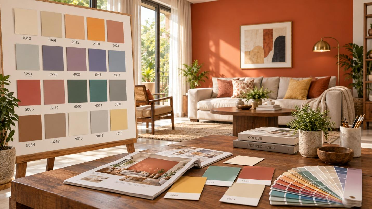
Understanding Paint Colour Codes
A paint colour code is a distinct combination of letters and numbers assigned to each shade of a brand to identify its exact tone and depth. It helps provide a clear reference when selecting paint, ensuring the shade you choose stays consistent from the colour swatch to the finished wall.
- Accurately identifies specific formulations across different manufacturing batches.
- Avoids confusion when shade names differ across paint catalogues.
- Makes it easier to reorder the same paint years later for touch-ups or renovations.
- Help decorators and painters communicate colour choices with technical precision.
- Saves time during store visits and paint tinting consultations.
Different Colour Code Systems
DIN
The German DIN colour codes organise various shades using clear physical and visual standards. It defines colours by hue, saturation and level of lightness or darkness to ensure accurate results.
NCS
The Natural Colour System describes colours based on how the human eye naturally sees them. It uses six basic paint colour references: white, black, yellow, red, blue and green.
RGB
RGB creates colours by combining different amounts of red, green and blue light. It is mainly used for screens, digital cameras and smart devices rather than physical paint.
How to Read a Colour Code Chart
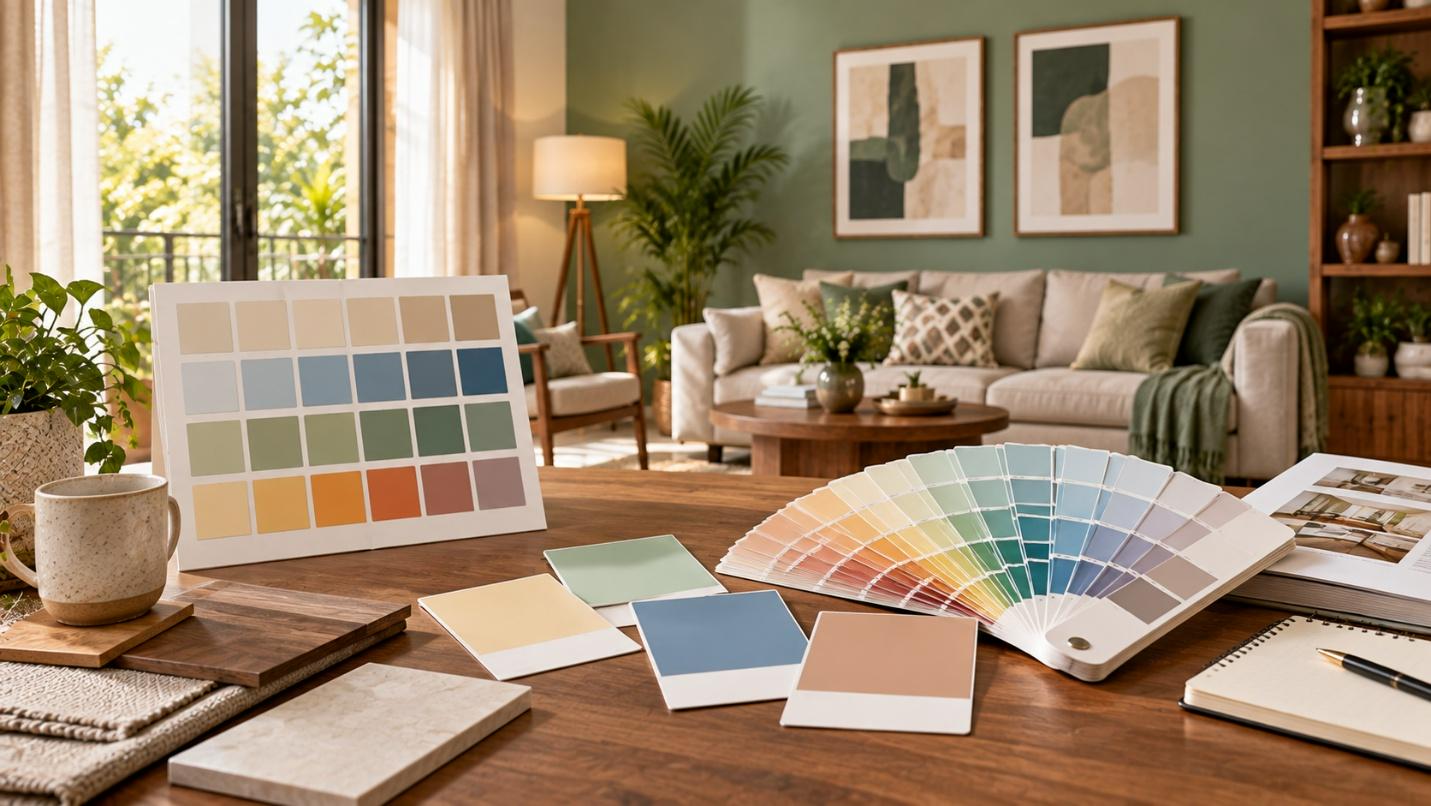
- Open the official digital shade card and browse through the organised range of colours.
- Choose your preferred colour family, from fresh whites and soft blues to warm neutrals.
- Find the shade block to see its unique four-digit code displayed below the colour name, such as warm Sunshade Cream (1126) or rich Godavari River (3408).
- Read the shade name and code together to confirm the exact colour and undertone.
- Check its position on the card, where shades usually move from lighter tones to deeper tones.
- Check the collection category, such as interior wall finishes or weather-shield exterior coatings, to make sure the shade suits your surface.
Matching Colours Using Colour Codes
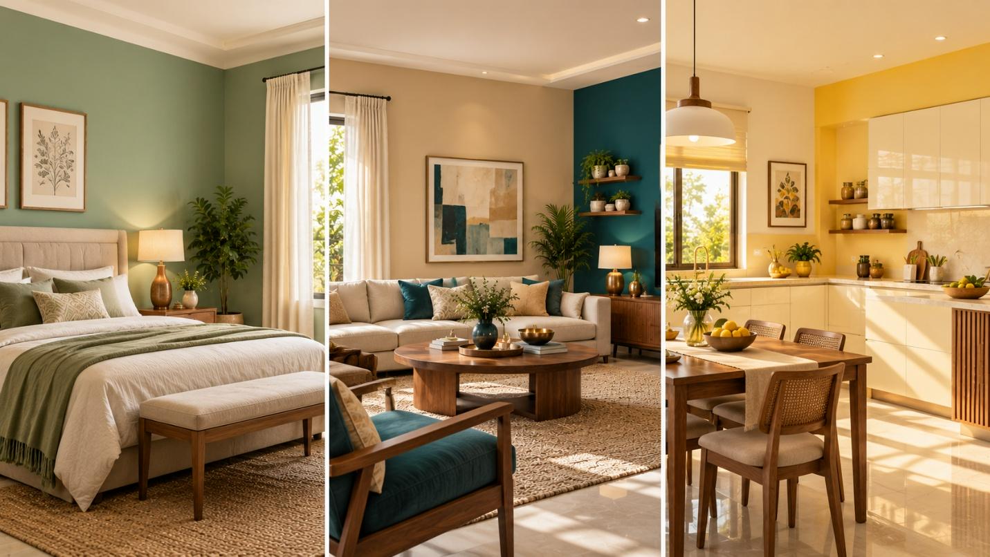
Matching colours across finishes or product lines is easier when you follow the exact colour code guide rather than the shade name alone. When moving from interior rooms to exterior areas such as balconies, colour codes help create a harmonious visual flow across your home.
For example, Pink Rules (2228) on a feature wall with Sanctuary Shade (3201) on adjoining walls creates a radiant look. Similarly, Honeycomb Yellow (2048) with Marine Drive (2385) can bring a bright yet balanced feel to a study.
Checking the code also helps keep the colour consistent when choosing different finishes, from matt ceiling paint to silk wall emulsion.
Quick tips to get the right shades
- View swatches in bright morning light and subtle evening lighting.
- Paint large samples on white boards and move them around the room.
- Place swatches against curtains, wooden flooring and upholstered furniture.
- Compare shades with white paper to spot yellow, grey or pink undertones.
- Let test patches dry fully, as wet paint can appear slightly darker.
Downloading & Printing Colour Code Charts
You can easily explore and download authentic colour charts from the JSW Paints Colorvista shade palette, interior digital shade card or exterior digital shade card. These official resources let you browse the complete shade library from your computer or mobile device.
- Visit the official website and download the high-resolution PDF of the interior or exterior shade card.
- If printing swatches at home, use a calibrated colour printer with good-quality paper.
- Combine digital shade charts with tools such as the JSW Paints AI Visualizer to preview room ideas before buying paint.
Digital vs Physical Colour Charts
| Parameter | Digital Colour Charts | Physical Colour Charts |
|---|---|---|
| Colour Accuracy | Colours may vary with screen brightness and display settings. | Paper swatches show pigment colours more accurately in natural light. |
| Convenience | Easy to access on smartphones and browse anywhere. | Fandecks are easy to carry and compare with furniture. |
| Lighting Context | Cannot show how room lighting affects the paint colour. | Lets you see how light and shadows affect the colour. |
| Availability | Available to download instantly from manufacturer websites. | Obtained from authorised paint dealers. |
Common Mistakes When Using Colour Codes
- Overlooking screen colour differences caused by varying device brightness and display settings.
- Ignoring that natural and artificial lighting can change how a shade looks throughout the day.
- Misreading colour codes by confusing similar digits across different finishes or product lines.
- Choosing a shade for an entire room based only on a small colour chip without testing a larger wall patch.
Conclusion
A paint colour code makes choosing shades for your home simpler and more enjoyable. Understanding how colour-matching guides work gives you complete control over your home decor choices.
For smooth interior walls that bring out your chosen colours with clarity, explore the Halo Majestic Interiors emulsion paints range. You can also use the JSW Paints AI Visualizer to review how different shades look in your own home and finalise your colour combination with confidence.
FAQs
Can two different brands have the same colour code?
No, since paint codes are specific to each brand, the same code number can represent different shades across manufacturers.
Will a colour code look identical in matt and gloss finishes?
The pigment formula remains the same, but gloss finishes reflect more light, making the shade look brighter than matt finishes.
How accurate are digital shade swatches on mobile devices?
Digital swatches offer a useful preview, but screen settings can affect their appearance, so always check your choice with physical samples.