


-
Living Room Colour Ideas
All Living Room Inspirations Blue Living Rooms Brown Living Rooms Grey Living Rooms Green Living Rooms Orange Living Rooms Purple Living Rooms Pink Living Rooms Red Living Rooms Yellow Living Rooms White Living Rooms
-
Bedroom Colour Ideas
All Bedrooms Inspirations Blue Bedrooms Brown Bedrooms Grey Bedrooms Green Bedrooms Orange Bedrooms Purple Bedrooms Pink Bedrooms Red Bedrooms Yellow Bedrooms White Bedrooms
Light, and Life to India's Homes.
At JSW Paints, we believe true beauty is not just about looking good, but about thinking and doing good.
thoughtful is beautiful.
That is why we have infused thoughtfulness in every drop and detail.
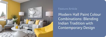
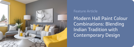
Gold Colour Combinations for a Stylish yet Elegant Wall Look
Gold is more than just a metallic accent — it's a statement. When used right, gold can transform a wall from plain to polished, simple to striking. But here's the key: gold shines brightest when paired with the right colour. Whether designing a feature wall or incorporating gold through accents like wall art or trim, combining it with the right tones creates a stylish yet elegant finish.
Let’s look at some of the best gold wall colour combinations that blend sophistication with modern design.
1. Gold and White
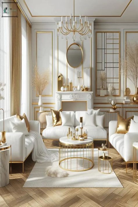
This is a go-to combo if you’re after clean lines and classic elegance. A white wall with gold accents — whether through stencilling, trim, or decor — feels light, refined, and upscale without being flashy.
Why it works:White keeps the space bright and open, while gold adds warmth and visual interest. The contrast is subtle but impactful.
How to use it:Think white walls (1191 White Palace) with gold-framed mirrors, sconces, or even delicate gold patterns. For a more detailed look, try gold panel moulding on white paint.
Best for: Bedrooms, entryways, home offices.
2. Gold and Deep Navy
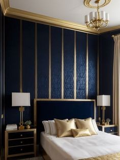
Pairing gold with a rich navy blue creates a high-end, hotel-style atmosphere. The dark blue background allows gold to pop without overwhelming the space.
Why it works:The deep, cool tone of navy enhances the warmth of gold. It’s a classic pairing that always feels refined.
How to use it:Paint an accent wall navy (5197 Plans of Departure) and add gold shelving, wall sconces, or artwork.
Best for: Living rooms, formal dining areas, and statement walls.
3. Gold and Charcoal Grey
This pairing is sleek, subtle, and perfect for a modern interior. Charcoal grey tones down the glitz of gold, making it feel more mature and contemporary.
Why it works:The neutral depth of grey sets the stage for gold to shine — not in a loud way, but in a balanced, thoughtful way.
How to use it:Charcoal grey walls (4013 Distant View) with gold photo frames, a gold clock, or minimalist gold shelves. Brushed or matte gold works best here for a softer finish.
Best for: Hallways, lounges, urban-style apartments.
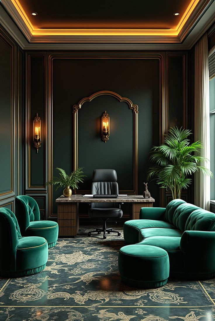
4. Gold and Emerald Green
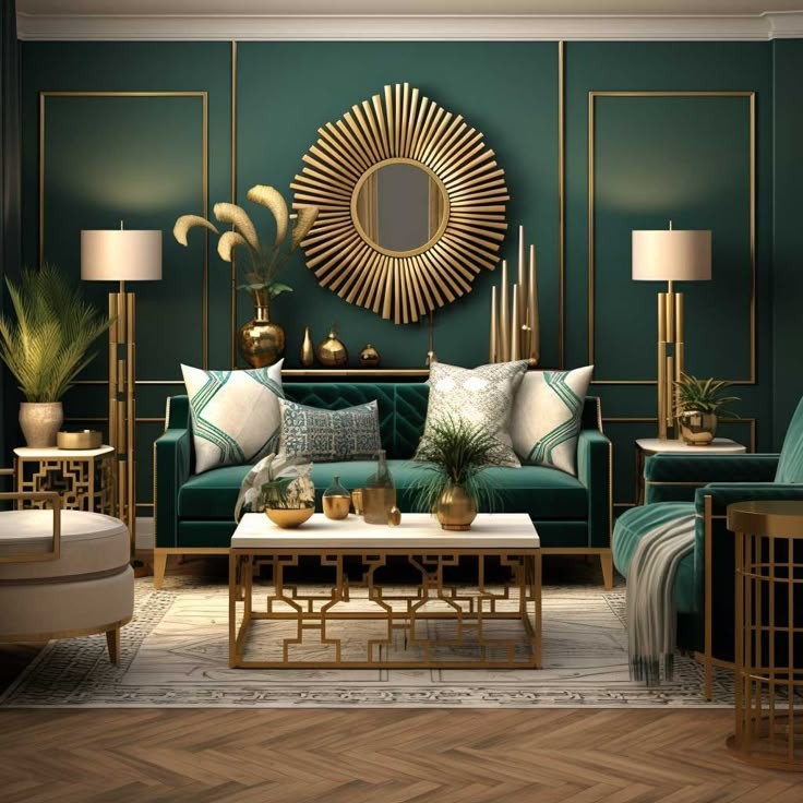
Emerald green walls with gold accents bring a luxe, nature-inspired vibe that feels both rich and calming. The deep green adds personality, while gold elevates the look.
Why it works:Green and gold feel natural together, just as lush forests with golden sunlight. It’s a pairing rooted in richness and harmony.
How to use it:Try emerald green paint (5257 In The Groove) with gold trim, sconces, or floating shelves. Even something as simple as gold curtain rods against a green wall adds charm.
Best for: Reading rooms, dining spaces, and glam bedrooms.
5. Gold and Black
If you're not afraid to go bold, a black and gold combo creates a powerful and stylish wall statement. It’s dramatic, moody, and completely modern.
Why it works:Black absorbs light and makes gold details really pop. The contrast is striking and instantly adds character.
How to use it:Go for black walls (4208 Dark Constellation) with gold stripes, abstract gold wall art, or gold-finished light fixtures. If painting a wall, go for black backgrounds with gold floral or geometric designs.
Best for: Statement walls, media rooms, bold entryways.
6. Gold and Soft Beige or Taupe
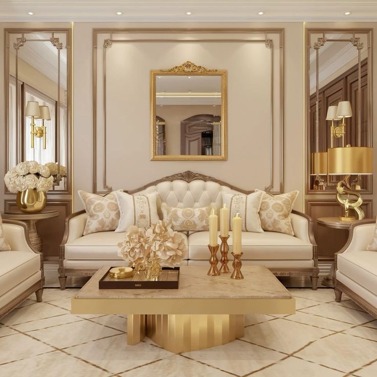
For a warmer, more neutral palette, pair gold with beige or taupe. This gives you elegance without intensity, perfect if you prefer a softer look.
Why it works:These tones blend naturally, and gold adds a bit of shine to the earthy warmth of beige or taupe.
How to use it:Beige walls (1095 Wisp of Mist) with gold-framed art, or subtle gold patterns on a taupe base. Go for warm, brushed gold to keep the vibe relaxed and cozy.
Best for: Living rooms, bedrooms, and transitional areas.
7. Gold and Teal or Peacock Blue
This colour pairing brings in a touch of drama with a splash of cool tone. Teal (5225 Good Time) or peacock blue (5215 Peacock Strut) walls paired with gold accents create an artistic, upscale look.
Why it works:Teal’s vibrancy balances gold’s richness. The result is energetic but still elegant.
How to use it:Paint a feature wall in teal and hang gold metal art. Or mix both colours in a bold pattern.
Best for: Studios, creative spaces, dining nooks.
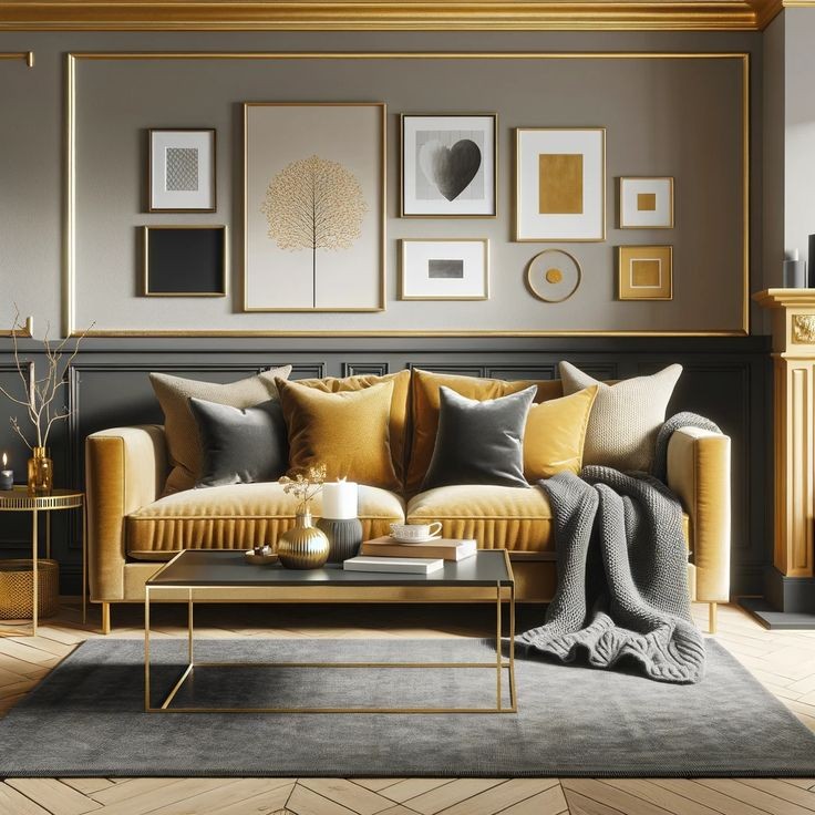
8. Gold on Gold (Toned Down)
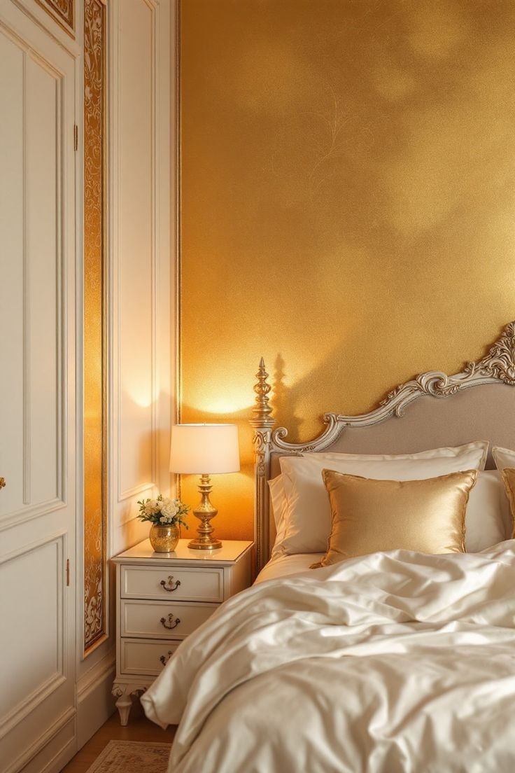
Gold doesn’t always have to be a secondary colour. If used creatively, you can layer different shades and textures of gold for a monochromatic, luxe look.
Why it works:When done in variation — matte golds, antique finishes, brushed metals — it feels cohesive, not flashy.
How to use it:Try to have a subtle pattern and add gold-framed mirrors or soft gold lighting. Just keep it toned down — less shine, more texture.
Best for: Glam bedrooms, boutique-style powder rooms.
Tips for Using Gold on Walls Elegantly- Use it in accents: Gold works best when it's not overused. Focus on trims, patterns, or a few standout accessories.
- Choose the right finish: Brushed or antique gold feels more elegant than high-gloss metallics.
- Play with texture: Mix smooth gold elements with rougher or matte wall finishes for depth.
- Balance with natural materials: Wood, marble, and stone pair well with gold, keeping the look grounded.
Conclusion
Gold on walls doesn’t have to be loud or over-the-top. With the right colour combinations, it can feel stylish, elegant, and modern. Whether you're designing a peaceful bedroom, a statement hallway, or a luxurious dining room, gold adds that subtle wow factor that makes a space feel complete.
Start with small touches, test a few swatches, and let your space reflect your style. A little gold, paired with the right tone, can go a long way.