


-
Living Room Colour Ideas
All Living Room Inspirations Blue Living Rooms Brown Living Rooms Grey Living Rooms Green Living Rooms Orange Living Rooms Purple Living Rooms Pink Living Rooms Red Living Rooms Yellow Living Rooms White Living Rooms
-
Bedroom Colour Ideas
All Bedrooms Inspirations Blue Bedrooms Brown Bedrooms Grey Bedrooms Green Bedrooms Orange Bedrooms Purple Bedrooms Pink Bedrooms Red Bedrooms Yellow Bedrooms White Bedrooms

Light, and Life to India's Homes.
At JSW Paints, we believe true beauty is not just about looking good, but about thinking and doing good.
thoughtful is beautiful.
That is why we have infused thoughtfulness in every drop and detail.
Colour Psychology for Festive Decor: Shades That Feel Warm and Welcoming
The festive season brings endless celebrations and gatherings. It is also when many homeowners clean and sometimes repaint their homes in warm, welcoming colours for a vibrant, festive look.
The right colour palette can instantly transform your space and uplift the mood. Here is a simple guide to choosing warm, welcoming shades that bring festive energy to your home.
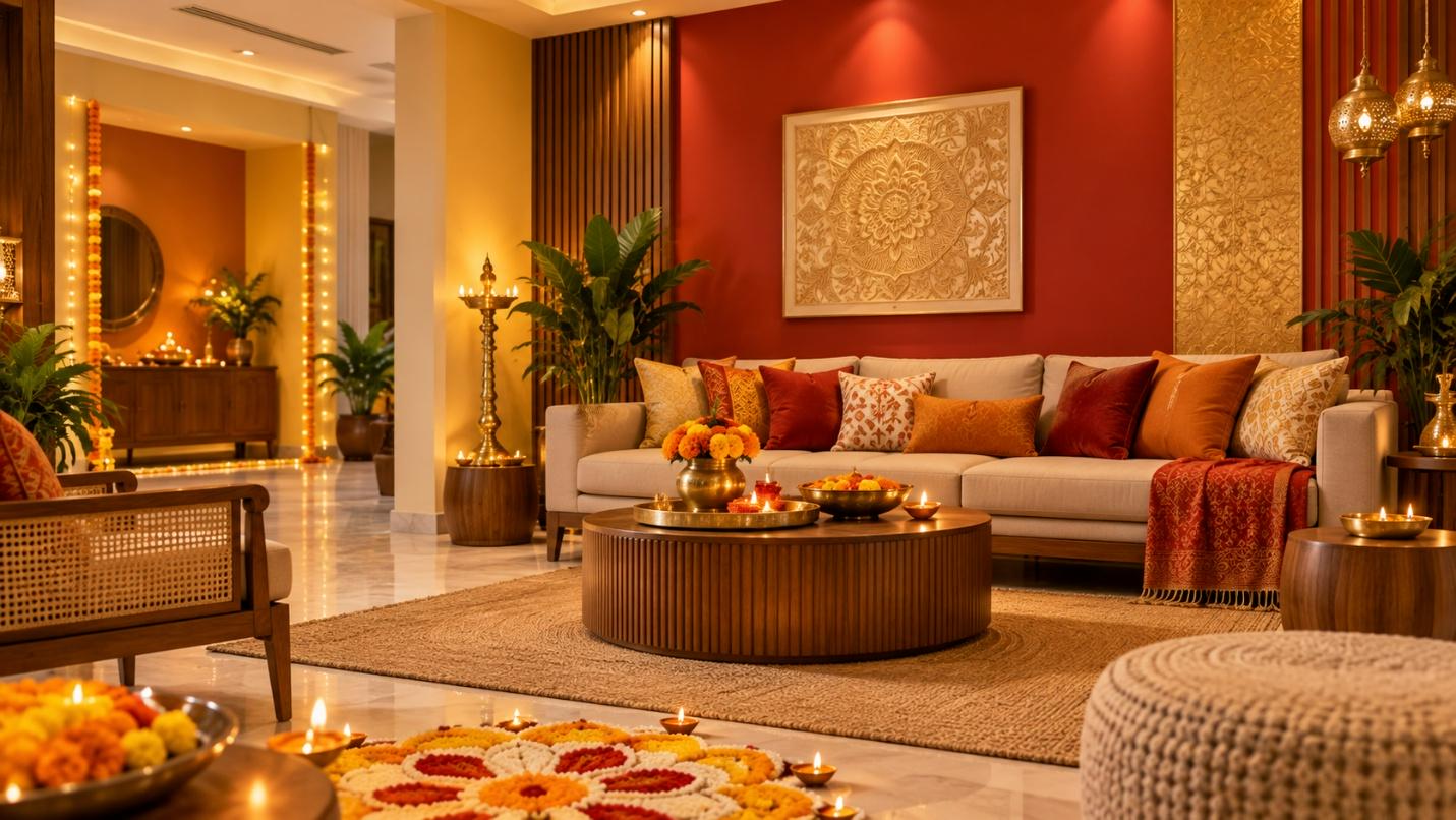
Understanding Colour Psychology
Colour psychology refers to the scientific study of colour and its impact on our mood, emotions and decision-making abilities. You can use this knowledge to set the tone of a particular area in your home, like the living room, dining area or entryway.
Warm Colours: Their Emotional and Festive Associations
Red
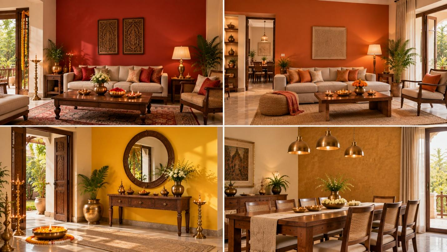
Emotional Association: Red is a strong festive colour associated with excitement and love. It instantly brings vibrant energy into your home during celebrations.
Festive Association: Using red paint in your festive interior design sparks conversation and stimulates appetite, making it an ideal choice for living rooms and dining areas where family and guests gather to celebrate.
Shades in Focus: You can opt for shades like Liquid Clay (3177) or Red to Amaze (5127) to achieve this effect.
Orange
Emotional Association: Orange is a warm colour associated with warmth, friendship and enthusiasm. Seeing this colour can help people feel more confident even in unfamiliar surroundings.
Festive Association: Because orange is associated with warmth and friendliness, you can use it in living rooms where you host Diwali parties and other gatherings.
Shades in Focus: Consider shades like Accent Orange (5064) or Orange Mace (5054) to create a warm, friendly atmosphere.
Yellow
Emotional Association: Yellow is associated with feelings of cheerfulness, comfort, and confidence. Psychologically, it can help new guests feel more relaxed and confident when they visit for the first time.
Festive Association: In festivals, the colour yellow is associated with prosperity, blessings and new beginnings. So using it in your entryway can make guests feel like they are about to start a new journey of friendship and enjoyment.
Shades in Focus: Golden Yellow (5035) or Summer Time (2027) can instantly brighten your front entrance.
Gold
Emotional Association: Emotionally, colour psychology associates gold with generosity, warmth and quiet confidence. So, using it in your home can make your guests feel more welcome.
Festive Association: In festivals, gold is associated with abundance, luxury, and auspiciousness. Using this colour in spaces like your dining room can therefore create a royal festive home ambience.
Shades in Focus: Shades like Javelin Gold (S002) and Patina Gold (3056) can help achieve this grand effect.
How to Combine Warm Colours For a Welcoming Atmosphere?
Entryways
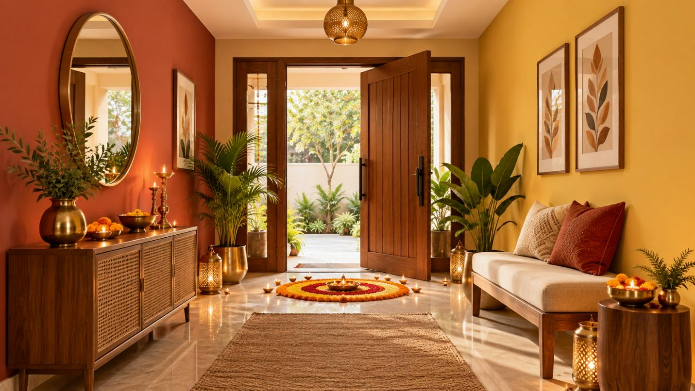
Your home’s entryway is the first thing that your guests will see when they enter. So ensuring a positive atmosphere from the outset is important. You can pair the red and yellow colours to create a warm, welcoming effect.
How to Combine These Colours: Use Liquid Clay (3177) paint on the wall to the left of the door. On the opposite wall, use the Summer Time (2027) yellow paint to add warmth and balance the rich vibrance of the red walls.
Décor Ideas: Pair the red wall with cream-coloured furniture or plain oakwood or pinewood shoe cabinets to balance the intensity.
Living Rooms
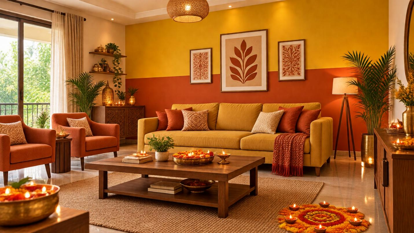
During festive occasions, your living room is where guests and loved ones often gather. So using a bright combination of orange and yellow paints will help them feel more welcome and at ease.
How to Combine These Colours: Use the Golden Yellow (5035) on the top half and the Accent Orange (5064) on the bottom half of the main wall. Keep the other three walls in a warm neutral tone to let the feature wall shine.
Décor Ideas: Use yellow sofas with burnt orange cushions to create a pop of colour and visual contrast with the accent wall. Similarly, place orange armchairs near the orange walls to create a gradient-like effect.
Dining Areas
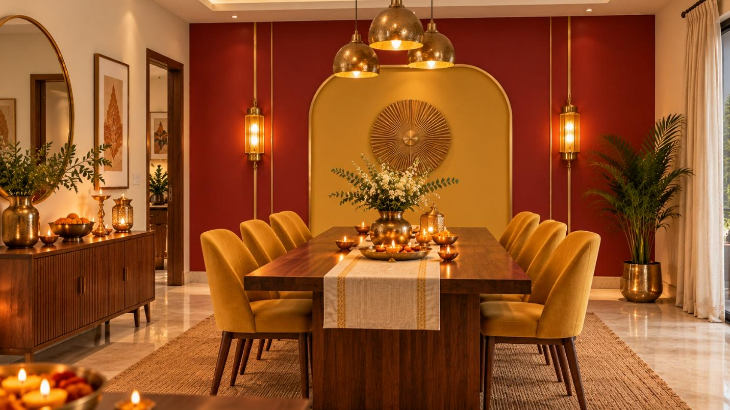
The dining area is where you will gather for a hearty meal after the festivities. Hence, it should be a space that whets your appetite and sparks conversation. You can achieve this with red and gold for a blend of rich vibrance and royal elegance.
How To Combine These Colours: Paint the wall behind or beside the dining table in Red to Amaze (5127). Add Javelin Gold (S002) as a geometric block, framed panel, or stencil design on top of the red wall, or paint the wall trim/molding in gold. Use a Perfect Ivory (1067) shade on the other three walls.
Décor Ideas: Use a solid walnut wood dining table to balance the vibrance of red and yellow, and use mustard yellow coloured chairs for a pop of colour. Complement this setup with warm yellow wall lamps.
To get a more in-depth idea of how these colours will look, use the JSW Paints AI Visualizer on our website.
FAQs
Which festive wall colour gives positive energy?
You can use festive wall colours like red, yellow, orange and gold for a burst of positivity, vibrance and warmth to your home. Explore JSW Paints’ full range of colours for more ideas.
Which festive colours complement a red dining room?
Some festive colors that complement a red dining room include gold, tawny orange and yellow. You can layer this with brass items, a solid wooden table, and orange-or yellow-gradient textured chairs.
Which metal items can I use for festive orange living rooms?
You can use metallic items like copper, gold and brass to complement the vibrance and warmth of orange living rooms. These items will also add a luxurious touch to the space.