

-
Living Room Colour Ideas
All Living Room Inspirations Blue Living Rooms Brown Living Rooms Grey Living Rooms Green Living Rooms Orange Living Rooms Purple Living Rooms Pink Living Rooms Red Living Rooms Yellow Living Rooms White Living Rooms
-
Bedroom Colour Ideas
All Bedrooms Inspirations Blue Bedrooms Brown Bedrooms Grey Bedrooms Green Bedrooms Orange Bedrooms Purple Bedrooms Pink Bedrooms Red Bedrooms Yellow Bedrooms White Bedrooms

Light, and Life to India's Homes.
At JSW Paints, we believe true beauty is not just about looking good, but about thinking and doing good.
thoughtful is beautiful.
That is why we have infused thoughtfulness in every drop and detail.
Cherry Red in Interiors: Styling Tips and Ideas
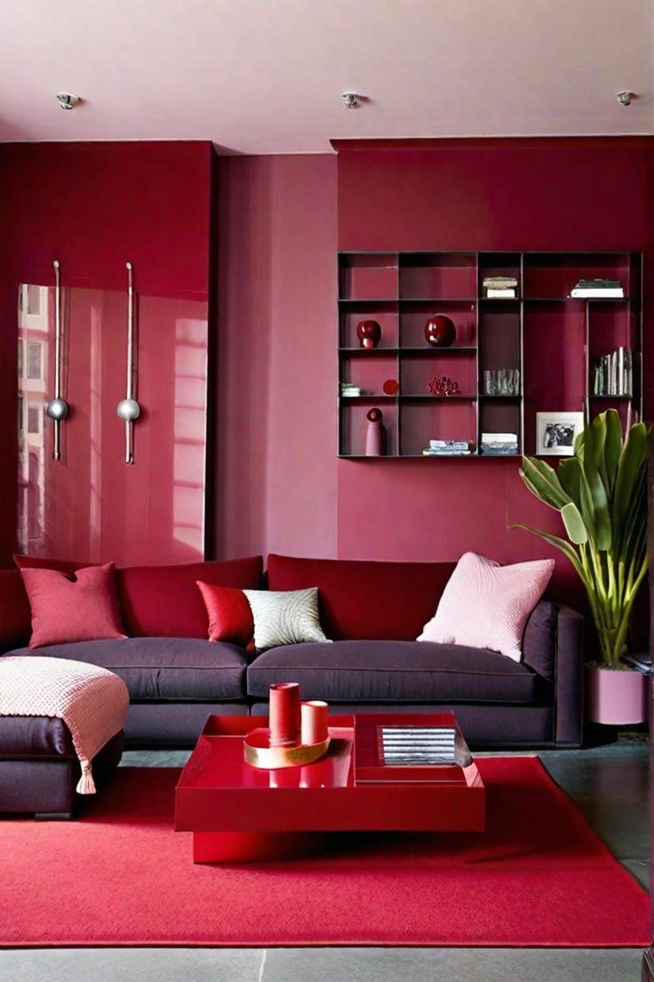
Cherry red isn’t a subtle colour — it’s bold, vibrant, and full of attitude. But when used right, it can bring incredible warmth, drama, and sophistication to a space. Whether you're looking to energize a neutral room or create a signature statement, cherry red can be your secret weapon.
This colour isn’t just bright red — it has depth, like the juicy richness of a ripe cherry. It sits somewhere between crimson and scarlet, offering both vibrancy and elegance. In the world of interiors, cherry red works best when it’s intentional. Use it to spark energy in a dull space or add a sultry edge to classic décor.
Why Cherry Red Works
Cherry red is emotionally charged. It stimulates conversation, appetite, and creativity. It’s associated with passion, confidence, and power — so it’s no surprise that it can completely transform a room’s mood. The key is balance. Too much and it becomes overwhelming; too little and it might not hit the mark.
Best Places to Use Cherry Red:
- Dining Room – to stimulate appetite and conversation
- Living Room – for a bold, welcoming energy
- Accent Walls – to ground and dramatize the space
- Home Office – in moderation, to boost motivation
- Entryways – to make a striking first impression
Cherry Red Colour Combinations + Styling Tips
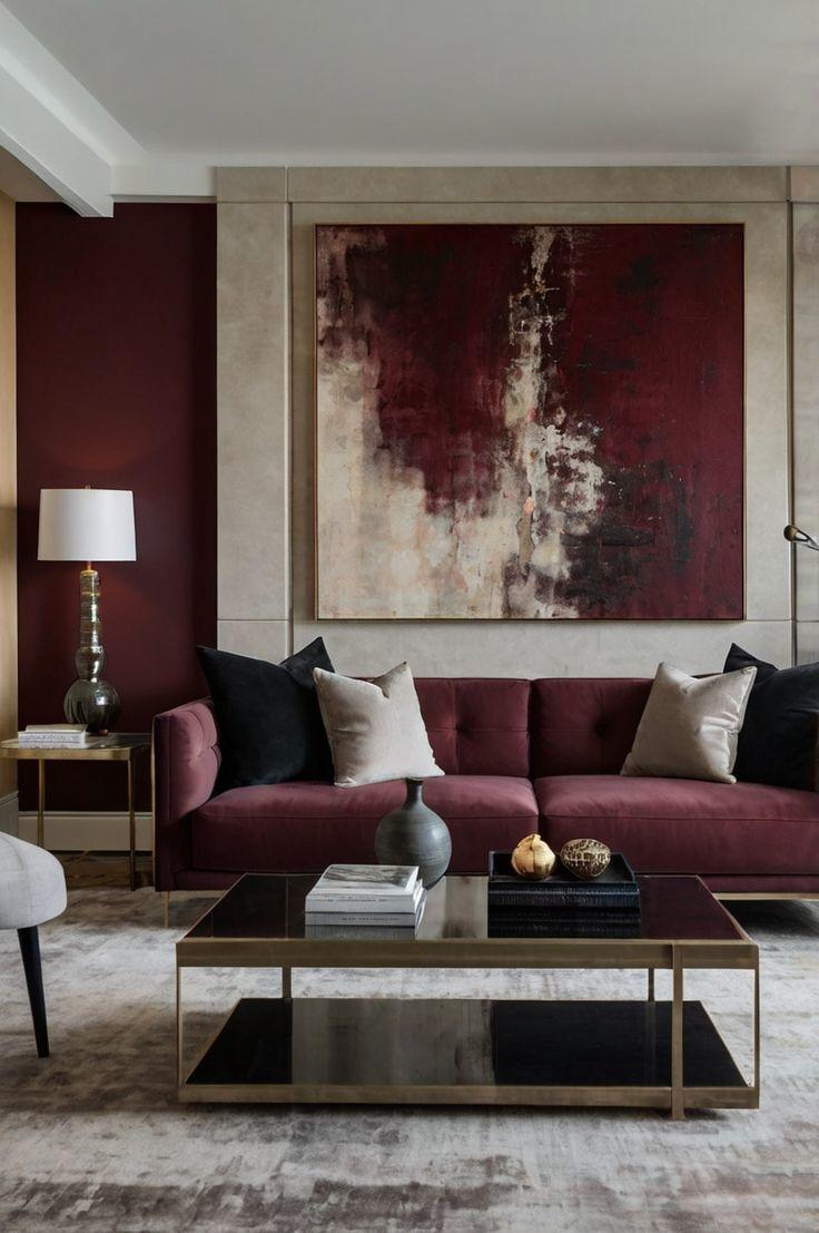
1. Cherry Red + Charcoal Grey
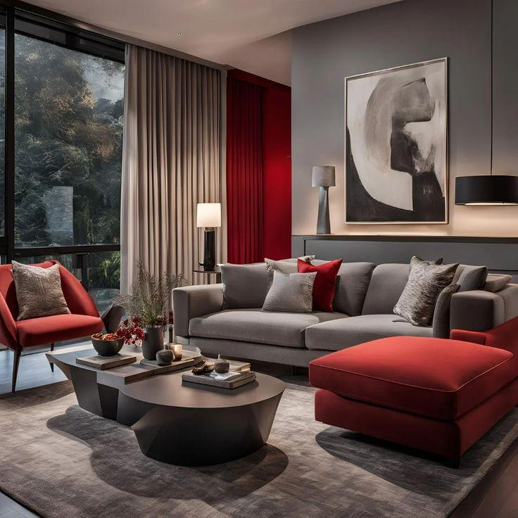
Why it works: The richness of cherry red (5106 P.O. Red) pops against the sophistication of charcoal (4203Equinox Now), creating a modern and grounded palette.
Styling Tips:
- Use cherry red as an accent wall or in upholstery like a velvet sofa or armchair.
- Incorporate charcoal in rugs, cabinetry, or trim.
- Add warm metals like brass or copper to soften the contrast.
2. Cherry Red + Blush Pink
Why it works: This unexpected combo adds a playful, fashion-forward edge. Blush (3235 Far Pavilions) softens cherry red’s (5124 High Flyer) intensity, giving the space a chic, romantic vibe.
Styling Tips:
- Try cherry red in cushions or artwork, and blush on walls or bedding.
- Use natural textures like rattan, linen, or terrazzo to keep things grounded.
- Keep lighting warm to enhance the pink undertones and prevent it from looking too candy-like.
3. Cherry Red + Navy Blue
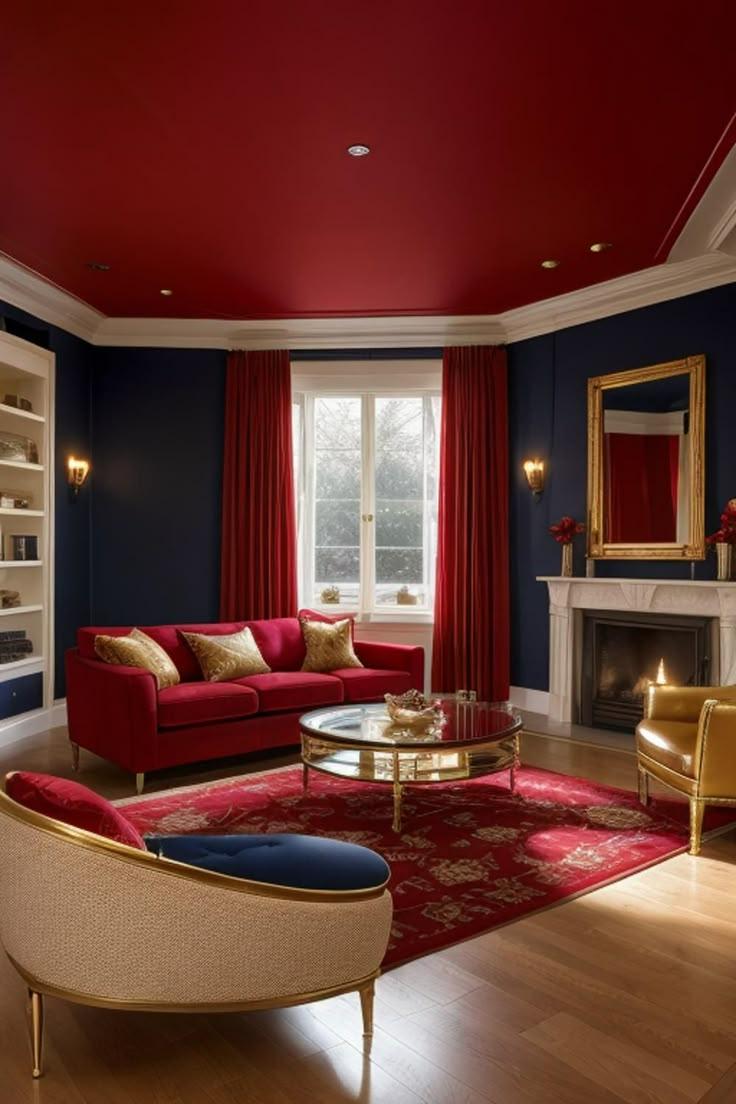
Why it works: The boldness of red (5126 Run the Show) pairs with navy’s (5208 Oxford Blue) classic depth to create a timeless, high-contrast look that’s both powerful and elegant.
Styling Tips:
- Consider navy walls with cherry red decor (like vases, lamps, or textiles).
- Add white or cream accents to prevent the room from feeling heavy.
- Use polished wood tones or gold hardware for a luxe finish.
4. Cherry Red + Soft Beige
Why it works: Beige (1102 Canvas White) tones mellow out cherry red’s (5137 Burgundy Sway) intensity and make the room feel more natural and cozy.
Styling Tips:
- Cherry red throw pillows or artwork on a beige sofa or neutral wall can be incredibly effective.
- Introduce textured materials like jute, wool, or wood to add visual warmth.
- Keep the palette minimal and let cherry red be the hero.
5. Cherry Red + Forest Green
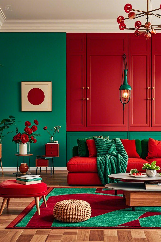
Why it works: These complementary colours cherry red (S010 Sporty Red) and forest green (3458 Tibet Green) creates tension in the best way. The result feels moody, bold, and rich.
Styling Tips:
- Perfect for dining rooms or moody libraries.
- Use red in gloss or satin finishes for drama, and green in matte finishes for depth.
- Break it up with black or brass accents to add structure.
Practical Styling Tips
- Start Small: If you’re new to bold colours, begin with accessories — cushions, vases, or framed prints.
- Control the Finish: Glossy cherry red reads glamorous and modern, while matte or velvet textures feel more classic and grounded.
- Mind the Light: Natural light enhances cherry red’s vibrancy. In darker rooms, pair it with warm lighting to avoid looking too stark or aggressive.
- Balance with Neutrals: Offset cherry red’s intensity with plenty of white, cream, or greys to avoid colour fatigue.
Conclusion
Cherry red isn’t for the cautious — it’s for those who design with intent. It brings energy, elegance, and bold personality to a space. Whether you're looking to transform a whole room or just want a standout accent, cherry red makes a statement that’s impossible to ignore.
If you’re ready to paint with passion, JSW Paints offers a stunning range of cherry red shades that balance richness with refinement
FAQs
1. Is cherry red too bold for small rooms?
Not necessarily. In small spaces, cherry red can create a jewel-box effect, making the room feel intentional and dramatic. Stick to one statement wall or well-chosen accents to avoid overwhelming the space.
2. What décor styles pair well with cherry red?
Cherry red can adapt to several styles. It fits perfectly in modern, glam, eclectic, and even mid-century interiors. The trick is in the pairing — modern spaces benefit from cleaner lines and monochrome touches, while vintage styles love rich textures and golds.
3. Can cherry red work in minimalist interiors?
Yes, if used strategically. In minimalist spaces, cherry red can serve as a high-impact accent in an otherwise restrained palette. Think a single red chair in an all-white room, or a cherry-toned pendant light over a concrete table.
4. What’s the difference between cherry red and other reds in interiors?
Cherry red has more depth and a hint of cool undertones compared to scarlet or tomato red. It’s less harsh than bright red, making it more versatile for interiors — bold, but with elegance and warmth.