

-
Living Room Colour Ideas
All Living Room Inspirations Blue Living Rooms Brown Living Rooms Grey Living Rooms Green Living Rooms Orange Living Rooms Purple Living Rooms Pink Living Rooms Red Living Rooms Yellow Living Rooms White Living Rooms
-
Bedroom Colour Ideas
All Bedrooms Inspirations Blue Bedrooms Brown Bedrooms Grey Bedrooms Green Bedrooms Orange Bedrooms Purple Bedrooms Pink Bedrooms Red Bedrooms Yellow Bedrooms White Bedrooms

Light, and Life to India's Homes.
At JSW Paints, we believe true beauty is not just about looking good, but about thinking and doing good.
thoughtful is beautiful.
That is why we have infused thoughtfulness in every drop and detail.
Burnt Orange Colour Combinations to Elevate Your Interiors
Burnt orange isn’t just a colour—it’s a statement. Bold, earthy, and full of warmth, burnt orange instantly energizes a space while keeping it grounded. Whether you’re using burnt orange paint on your walls or incorporating it through furniture and décor, the right colour combination can transform your interiors from basic to bold.
In this blog, we’ll walk you through some of the most stylish and effective ways to work with burnt orange in your home. Whether you're aiming for a cozy, retro vibe or a modern, earthy look, burnt orange brings personality and character to any space.
Why Use Burnt Orange in Interior Design?
Burnt orange sits perfectly between rustic charm and retro cool. It’s vibrant without being too loud and warm without feeling overwhelming. It evokes a sense of comfort and nostalgia while still feeling fresh and design-forward.
Burnt orange sits perfectly between rustic charm and retro cool. It’s vibrant without being too loud and warm without feeling overwhelming. It evokes a sense of comfort and nostalgia while still feeling fresh and design-forward.
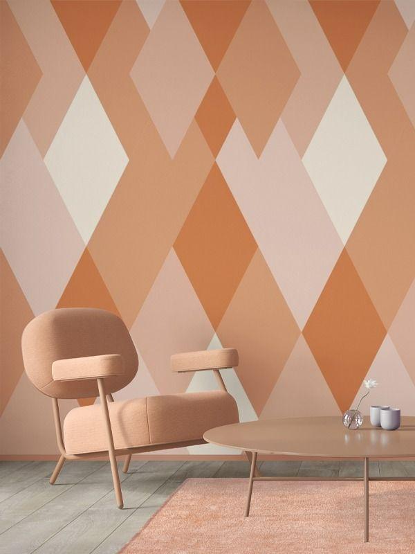
You can use burnt orange on feature walls, accent furniture, textiles, or even as a bold statement through artwork or tilework. Its flexibility makes it a powerful tool for any room in your home.
Best Burnt Orange Colour Combinations for a Cohesive Look
1. Burnt Orange and Deep Navy – Bold and Balanced
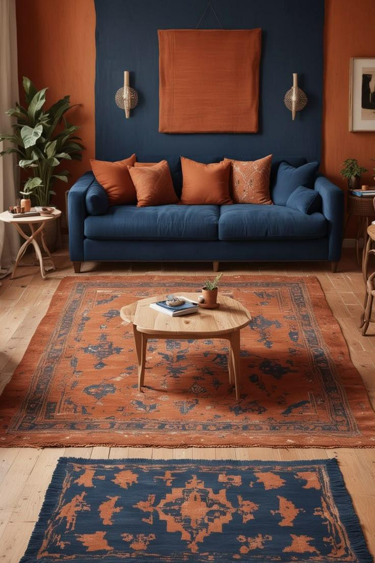
One of the most striking burnt orange combinations is pairing it with deep navy blue (5208 – Oxford Blue). The rich warmth of burnt orange (5073 – Blazing Ember) stands out beautifully against navy’s cool, calm backdrop.
Where it works: Living rooms, dining rooms, accent walls
Why it works: Navy grounds burnt orange and creates a rich contrast that feels both bold and balanced.
2. Burnt Orange and Charcoal Grey – Contemporary and Sleek
Pair burnt orange (5077 – Rusty Hue) with charcoal grey (4333- Resolute) for a modern, urban aesthetic. The cool neutrality of grey tones down the brightness of burnt orange while highlighting its richness.
Where it works: Kitchens, lofts, or home offices
Why it works: It’s edgy, sophisticated, and works especially well in minimalist or industrial spaces.
3. Burnt Orange and Forest Green – Earthy and Inviting
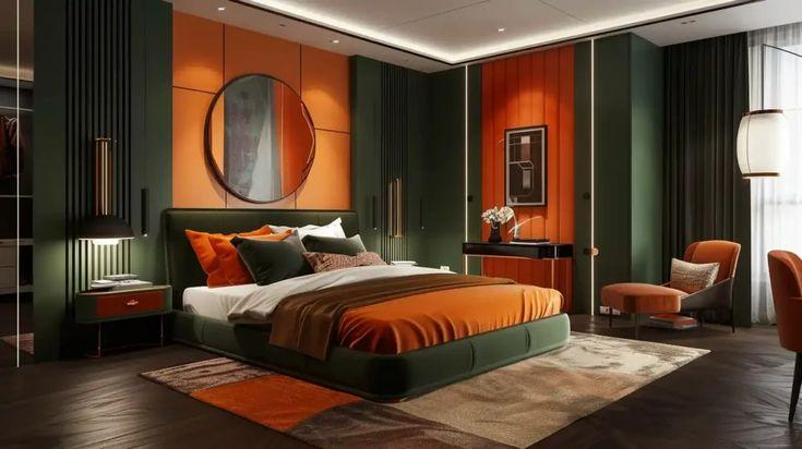
Burnt orange (5063 – Sunrise Edge) and forest green (5278 – A Story Ends Here) create a palette straight from nature. Together, they feel rooted, organic, and comforting—ideal for relaxed interiors.
Where it works: Bedrooms, entryways, or dining nooks
Why it works: The two warm-toned, nature-inspired colours offer harmony and visual depth.
4. Burnt Orange and Cream or Ivory – Warm and Serene
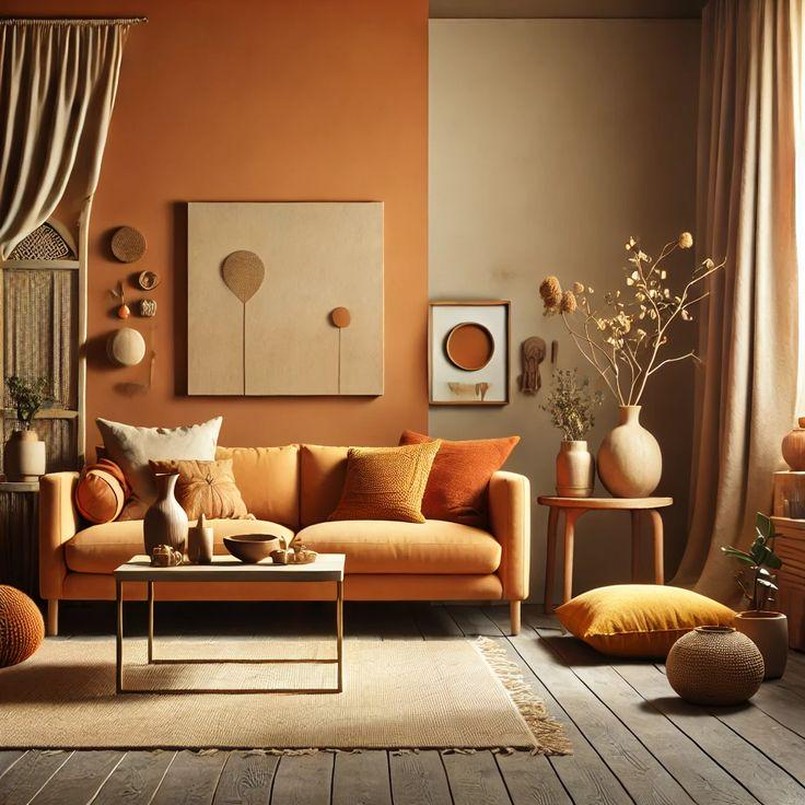
If you prefer a softer look, pair burnt orange (5052 – Mandarin Orange) with creamy whites or ivory tones (2072 – Honeyed Spice). This creates a clean, airy feel while allowing burnt orange to take the spotlight.
Where it works: Bedrooms, living areas, or transitional-style spaces
Why it works: Cream adds lightness and makes burnt orange feel more approachable and versatile.
5. Burnt Orange and Blush Pink – Playful and Modern
Blush pink adds a fun (2204 – Even Blush), youthful twist to burnt orange (5061 – Sharp Angle). This pairing feels unexpected and fresh, ideal for more personal spaces like vanity areas or modern bedrooms.
Where it works: Bathrooms, reading corners, or creative studios
Why it works: Both colours share warm undertones, making them blend well while still offering contrast.
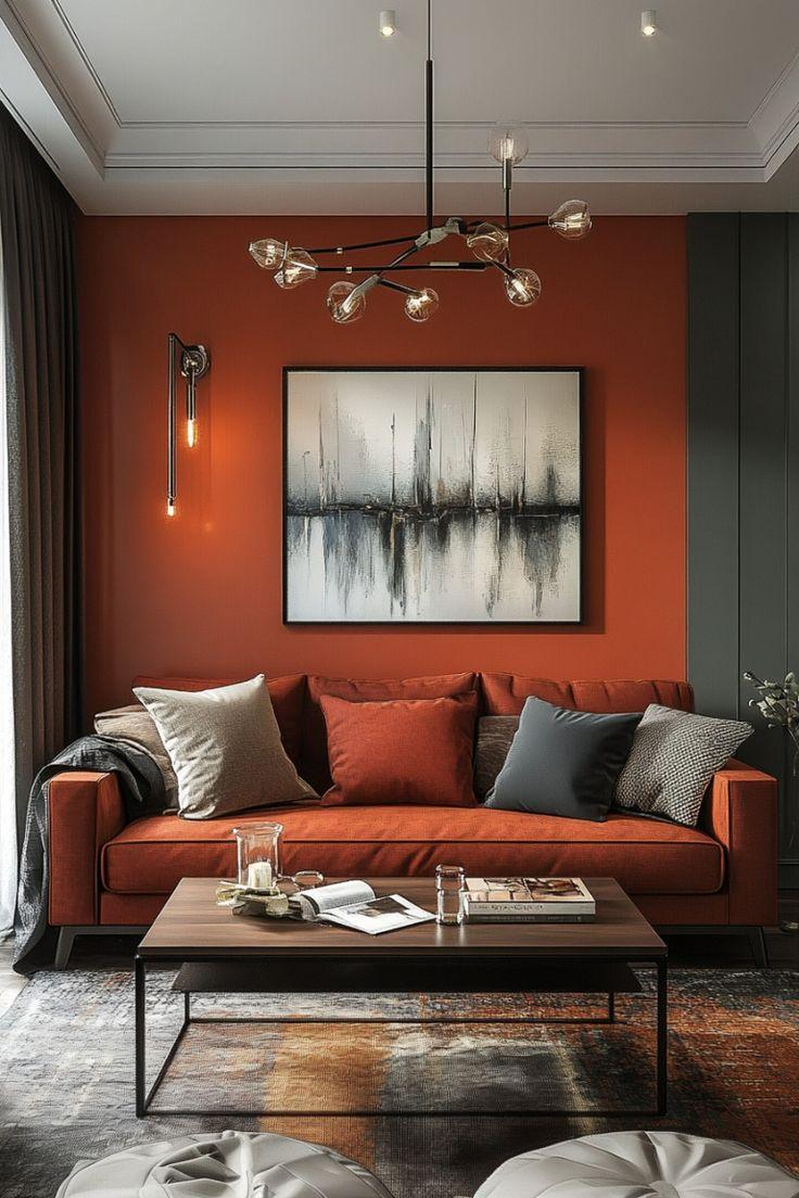
6. Burnt Orange and Black – Bold and Refined
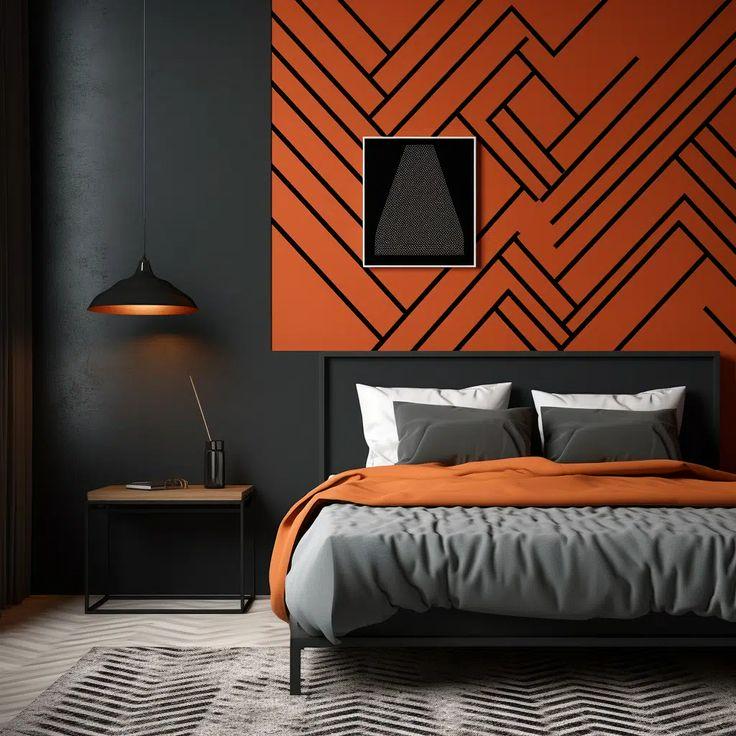
Want something dramatic? Pair burnt orange (5076 – Fired Earth) with black (4338 – Nadir). The contrast is high-impact and ideal for statement-making interiors.
Where it works: Dining rooms, kitchens, or statement walls
Why it works: Black gives structure and intensity, while burnt orange keeps things warm and lively.
Final Thoughts
Burnt orange is more than just a seasonal trend—it’s a timeless tone that brings depth, warmth, and personality to your space. Whether you’re using it in bold swathes of paint, on furniture, or as accent decor, burnt orange pairs beautifully with a range of complementary colours.
Stick with blues and greys for contrast, creams and blush tones for softness, or greens for a grounded, earthy balance. No matter how you style it, burnt orange brings a confident, cozy vibe that instantly elevates your interiors.