


-
Living Room Colour Ideas
All Living Room Inspirations Blue Living Rooms Brown Living Rooms Grey Living Rooms Green Living Rooms Orange Living Rooms Purple Living Rooms Pink Living Rooms Red Living Rooms Yellow Living Rooms White Living Rooms
-
Bedroom Colour Ideas
All Bedrooms Inspirations Blue Bedrooms Brown Bedrooms Grey Bedrooms Green Bedrooms Orange Bedrooms Purple Bedrooms Pink Bedrooms Red Bedrooms Yellow Bedrooms White Bedrooms


Light, and Life to India's Homes.
At JSW Paints, we believe true beauty is not just about looking good, but about thinking and doing good.
thoughtful is beautiful.
That is why we have infused thoughtfulness in every drop and detail.
Bedroom Wall Colours as per Vastu Shastra for Peace and Positivity
A bedroom is more than just a sleeping space; it’s where the mind rests, the body recovers, and daily stress finally drops its guard. That’s why, in Vastu Shastra, the bedroom is associated with emotional stability, calmness, and personal well-being.
In modern interiors, one of the easiest ways to apply Vastu-inspired principles is through wall colours, since they influence brightness, mood, and comfort without requiring structural changes.
This blog explains bedroom wall colours according to Vastu Shastra, along with direction-specific recommendations, colours to avoid, and practical styling tips to help you create a space that feels peaceful, balanced, and personal.
Bedroom colours in Vastu: a quick foundation
Vastu Shastra is built around the concept of balance between the five elements, earth, water, fire, air, and space, along with the home’s orientation and energy zones.
In bedroom design, Vastu-inspired guidance typically aims to support:
- Better rest and relaxation
- Reduced mental clutter
- Emotional calm
- Harmony between partners (in master bedrooms)
Colour becomes important here because it affects how the room feels at different times of day, especially in Indian homes where bedrooms are often a place to relax and unwind.
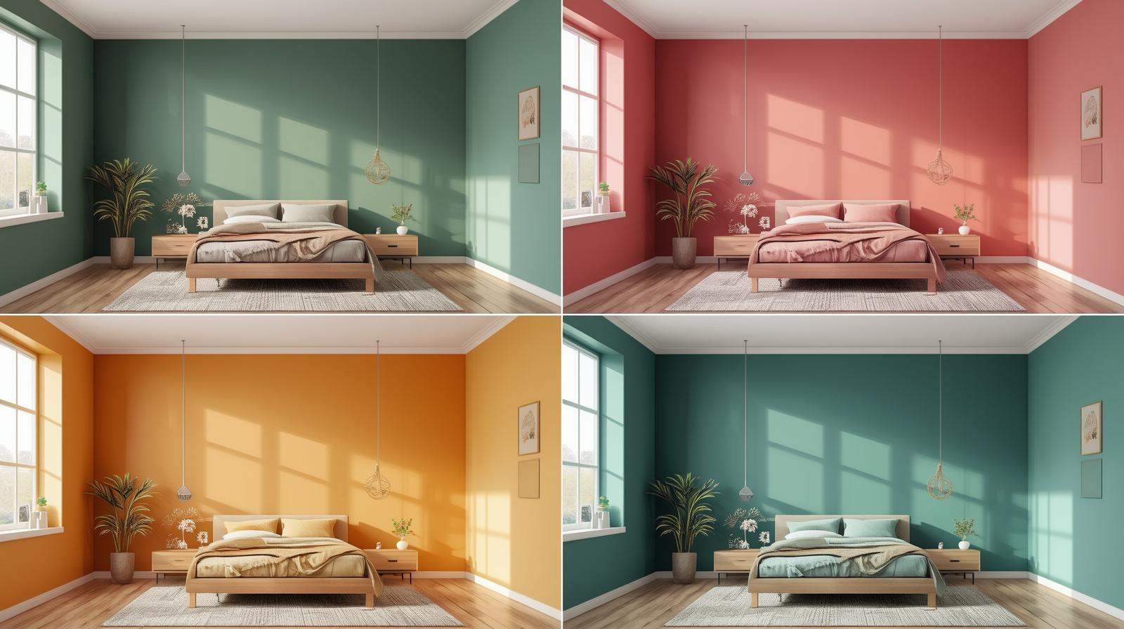
Best bedroom wall colours as per Vastu Shastra
These colours are commonly suggested in Vastu-based interior guidance because they are soft, balanced, and visually restful.
1) Light blue: calm and sleep-friendly
Light blue (2415- Clear Waters) is widely considered one of the most soothing colours for bedrooms. It’s linked to serenity and is often recommended for spaces meant for rest.
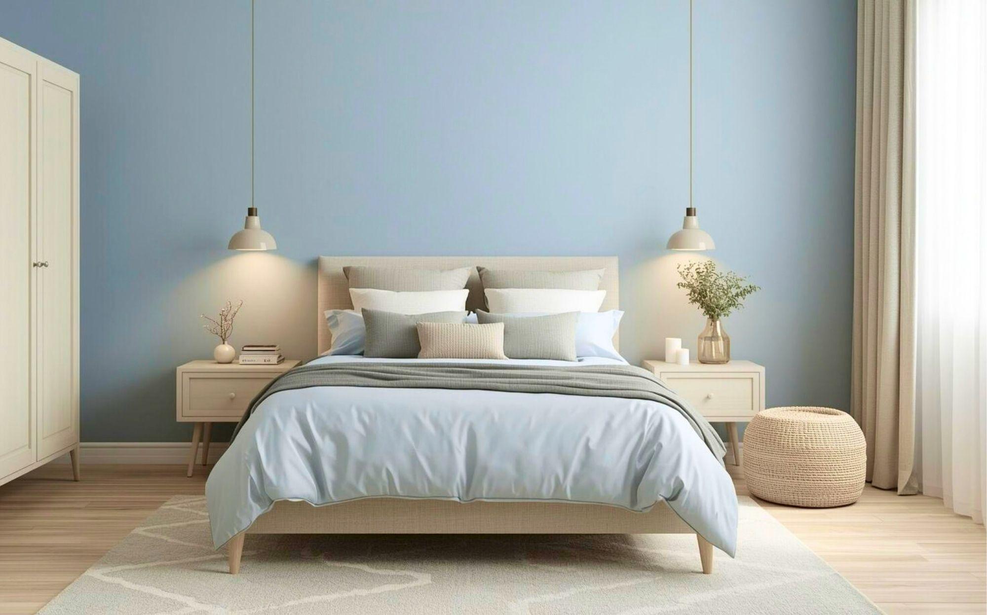
Best for: people who want a peaceful, airy bedroom
Works well with: white furniture, grey accents, light wood, soft warm lighting
2) Soft green: freshness and emotional balance
Green (2625 -Splash of Rain) is often associated with nature, renewal, and balance. In Vastu-inspired design, it is commonly recommended for bedrooms because it feels calming without becoming dull.
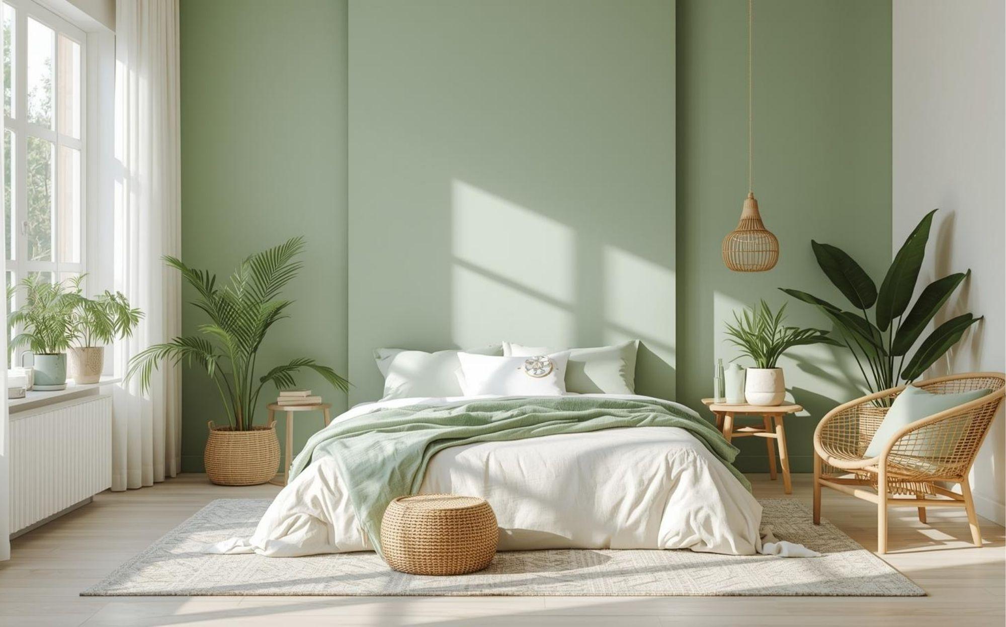
Best for: bedrooms with plenty of sunlight
Works well with: beige, cream, rattan, indoor plants
3) White, cream, and off-white: clarity and comfort
Neutral shades like white and cream (Splash of Rain -2625) are frequently recommended for bedrooms because they create a clean, open feeling. They also work well in smaller bedrooms.
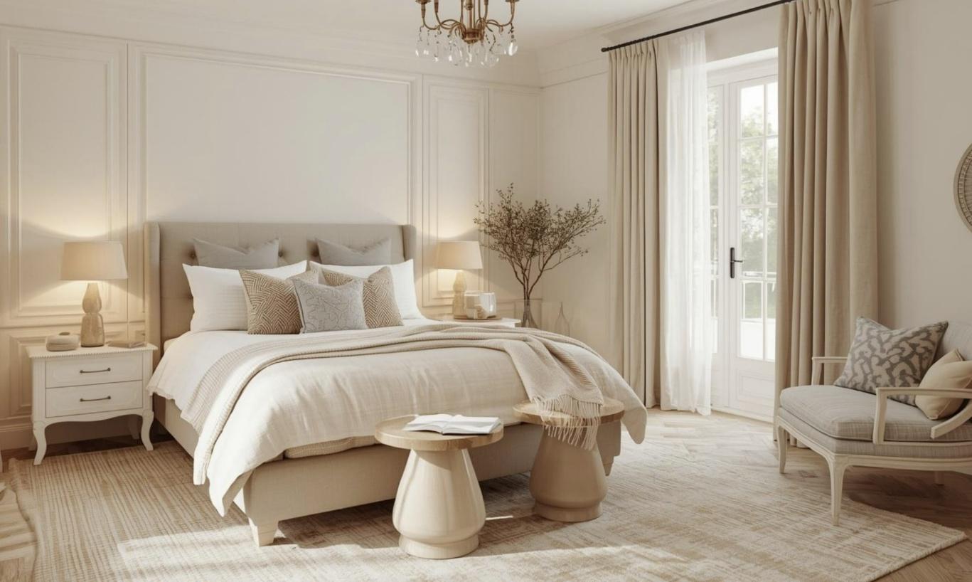
Best for: compact rooms, rental homes, minimal interiors
Pro tip: choose warm whites (not harsh bright white) for a softer vibe
4) Pastel pink: warmth and harmony
Light pink (2213-Perfect Prep) shades are often recommended in Vastu for bedrooms, especially for couples, because they feel warm, comforting, and emotionally soft.
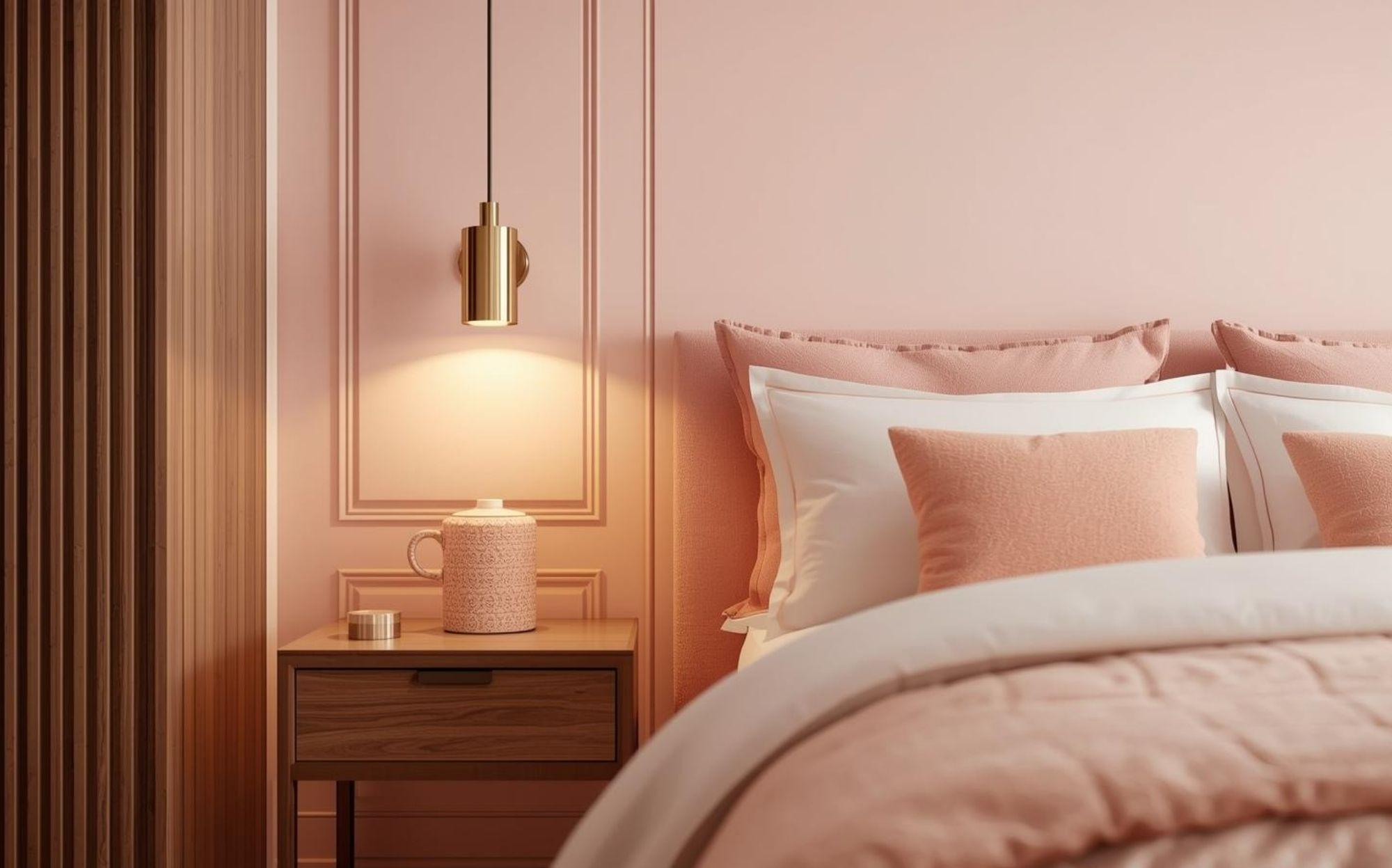
Best for: master bedrooms.
Works well with: gold accents, warm lighting, walnut wood.
5) Lavender and soft lilac: gentle and relaxing
Lavender (2274-Tutu Toile) is a popular modern choice that also fits Vastu-inspired principles when used in lighter tones. It feels peaceful, slightly luxurious, and non-overstimulating.
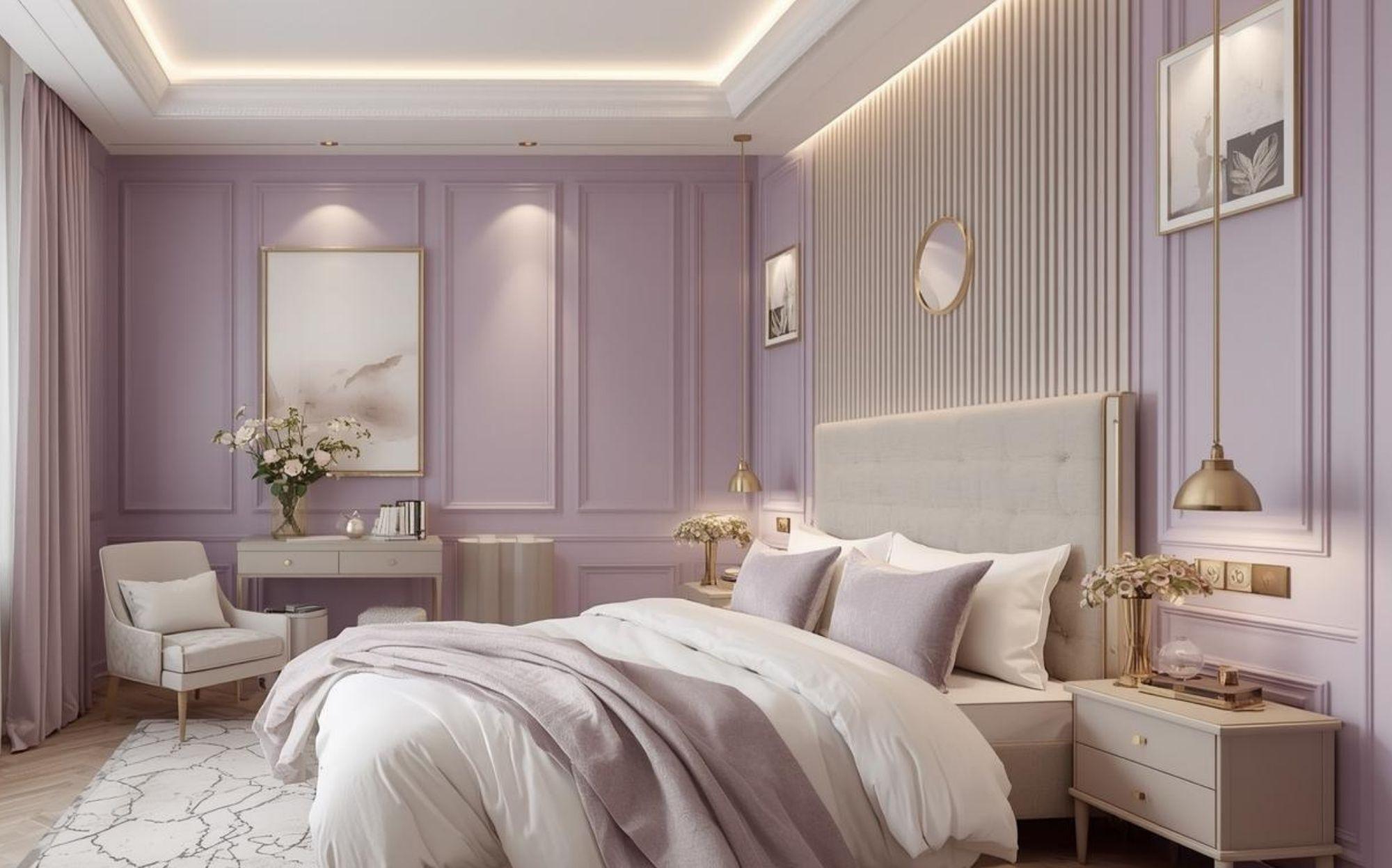
Best for: contemporary bedrooms
Works well with: off-white, beige, light grey, soft metallic décor
6) Beige and light earthy tones: grounding and stable
Earthy tones (3031- Desert View) are linked to stability and comfort. Soft beige, sand, or muted taupe shades are excellent for bedrooms where you want warmth without heaviness.
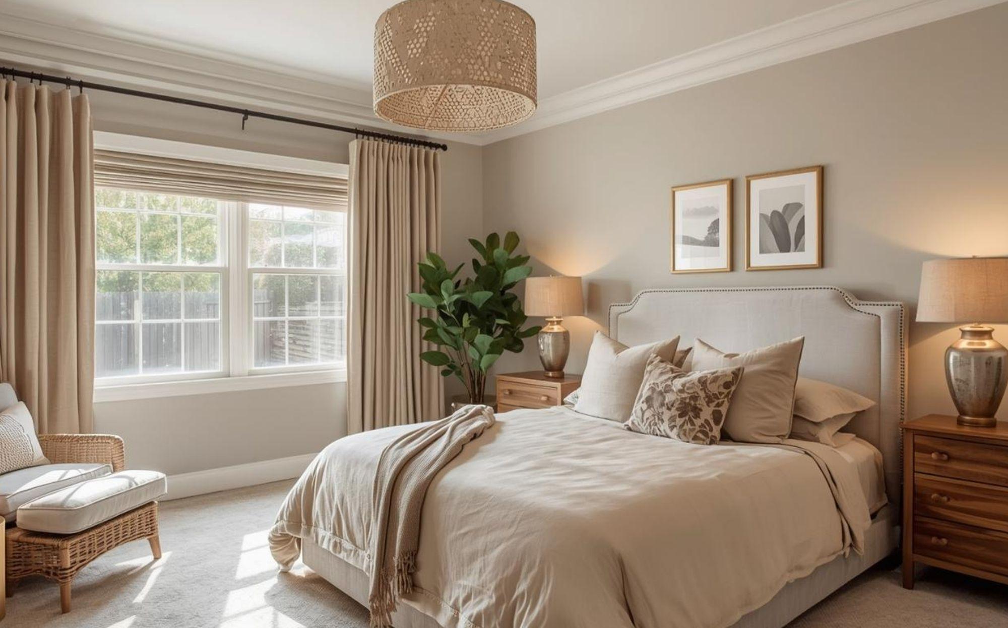
Best for: bedrooms with limited sunlight.
Ideal for: older adults or anyone who prefers warm interiors.
Direction-wise bedroom wall colours as per Vastu
| Direction | Vastu Energy Theme | Recommended Calming Colours | Avoid |
|---|---|---|---|
| South-West | Stability & Grounding | Beige, Cream, Light Brown, Soft Earthy Tones, Muted Peach | Bright Red, Neon Shades |
| North | Calmness & Prosperity | Off-White, Light Green, Pastel Blue, Very Light Grey | Dark heavy tones |
| East | Freshness & Morning Light | Soft Green, Light Yellow, Cream, Pastel Peach | Over-saturated warm tones |
| West | Balance & Warm Evenings | Beige, Warm Off-White, Light Peach, Soft Brown | Deep orange tones |
| North-East | Spiritual & Light Energy | White, Cream, Very Light Blue, Pastel Green | Dark or heavy colours |
| South-East | Fire / Restlessness | Soft Peach, Warm Beige, Light Cream | Bright Orange, Strong Red |
Colours to avoid in the bedroom for practical reasons
Vastu-based colour guidance usually discourages heavy, overly intense shades in bedrooms because bedrooms are meant for rest, not stimulation.
1) Bright red
Red is strongly linked to fire and intensity. In bedrooms, it may feel too energising.
2) Black and very dark grey
These shades can feel heavy and reduce brightness. They also make a room look smaller.
3) Neon shades
These colours are visually overstimulating and often clash with the restful purpose of a bedroom.
4) Very bright orange
Orange can be uplifting, but in large quantities, it may feel too “active” for sleep spaces.
Best colour combinations for a Vastu-friendly bedroom
If you want something more modern than plain pastels, these combinations work beautifully:
- Cream + pastel green (fresh, balanced)
- Off-white + light blue (calm, airy)
- Beige + soft pink (warm, romantic)
- Beige + soft pink (warm, romantic)
- Light grey + lavender (contemporary, peaceful)
- Warm white + sand tones (minimal and grounding)
Vastu tips for bedroom walls
To strengthen the “peace and positivity” effect, Vastu-inspired bedroom design often includes:
- Keep the bedroom clutter-free
- Avoid aggressive wall art
- Use soft lighting instead of harsh white LEDs
- Avoid mirrors facing the bed (commonly advised in Vastu)
- Choose calming décor and breathable fabrics
These tips are not about superstition, they’re also aligned with modern interior psychology: the bedroom should feel visually quiet.
How to choose the right bedroom shade
Before finalising your paint shade, ask:
- Does the room get morning or evening sunlight?
- Is the bedroom small or spacious?
- Do you want the room to feel cooler or warmer?
- Are you painting all walls or just one accent wall?
- Will your curtains and furniture complement the shade?
Pro tip: Always test a sample patch on the wall and observe it in daylight and warm night lighting.
Final takeaway
In Vastu Shastra, bedroom colours are chosen to support calmness, emotional comfort, and stability. Whether you follow Vastu strictly or simply use it as a guiding philosophy, the key is to choose shades that feel soft, breathable, and restful.
With the right interior paint finish and lighting, even a small bedroom can feel more peaceful, brighter, and more positive, without major renovation.
Frequently Asked Questions
What is the best bedroom wall colour as per Vastu?
Light blue, soft green, beige, cream, pastel pink, and lavender are commonly recommended for bedrooms in Vastu.
Which colour should be avoided in the bedroom as per Vastu?
Bright red, black, very dark grey, and neon shades are generally discouraged.
Can we use white colour in the bedroom according to Vastu?
Yes. Warm white, off-white, and cream are considered safe and peaceful choices.
Which direction is best for the bedroom according to Vastu?
South-West is traditionally considered ideal for the master bedroom.