


-
Living Room Ideas
All Living Room Inspirations Blue Living Rooms Brown Living Rooms Grey Living Rooms Green Living Rooms Orange Living Rooms Purple Living Rooms Pink Living Rooms Red Living Rooms Yellow Living Rooms White Living Rooms
-
Bedroom Ideas
All Bedrooms Inspirations Blue Bedrooms Brown Bedrooms Grey Bedrooms Green Bedrooms Orange Bedrooms Purple Bedrooms Pink Bedrooms Red Bedrooms Yellow Bedrooms White Bedrooms


Light, and Life to India's Homes.
At JSW Paints, we believe true beauty is not just about looking good, but about thinking and doing good.
thoughtful is beautiful.
That is why we have infused thoughtfulness in every drop and detail.
Sage Green Colour Combinations for Wall Paint and Kitchen Cabinets
Sage green is having a major moment. This muted, earthy green colour strikes a perfect balance between soft and sophisticated. Whether you’re painting a feature wall or refreshing your kitchen cabinets, sage green brings a calm, natural energy into any space. But like any standout shade, it needs the right partners to truly shine. Choosing the right sage green colour combination is the key to making the most of this trending hue.
In this blog, we’ll break down the best sage green colour combos for walls and kitchen cabinets—so you can nail the look.
Top Sage Green Colour Combinations for Walls
1. Sage Green and White – Clean and Timeless
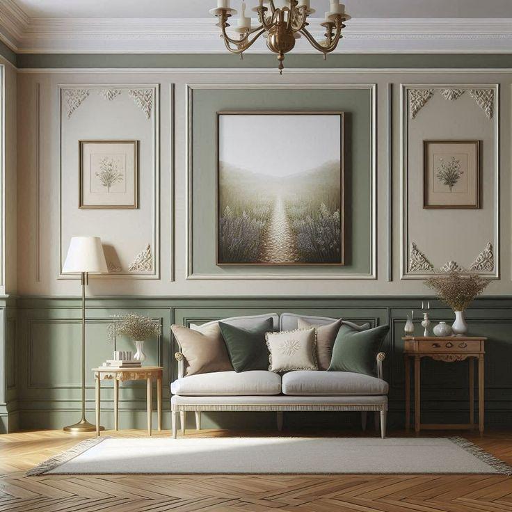
This is the classic sage green wall paint combo. Crisp white (1011 New Start) keeps things light and airy while letting sage green (3554 Nature’s Bounty) take center stage. Use sage on one wall and balance it with white trims, ceilings, or surrounding walls. This pairing works well in bedrooms, living rooms, and hallways.
Try this combo when: You want a clean, minimalist space with a bit of colour.
2. Sage Green and Charcoal Grey – Moody and Modern
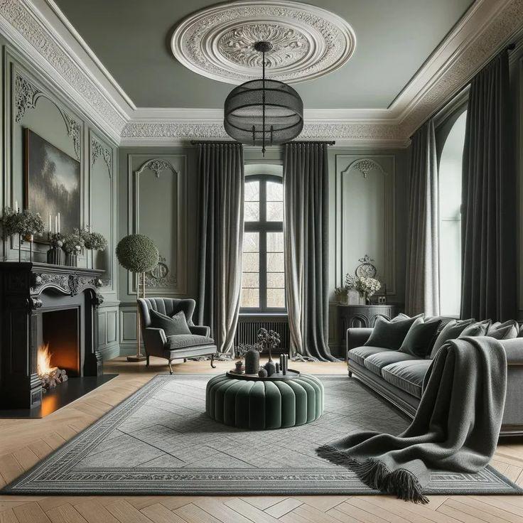
Pairing sage green paint (3512 Misty Peaks) with charcoal grey (4334 Ageless) creates a bold yet elegant vibe. It’s great for creating contrast without being overwhelming. Use charcoal on accent pieces—like a feature wall, fireplace, or large artwork—and sage green (as the main wall colour.
Try this combo when: You're after a contemporary look with depth and character.
3. Sage Green and Terracotta – Warm and Earthy
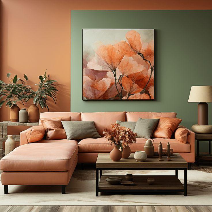
Earth tones love each other. Sage green wall paint (3524 Blade Valley) paired with terracotta or rust (3074 – Bronzed Gate) creates a grounded, welcoming space. This combo is perfect for boho, Mediterranean, or southwest-inspired interiors.
Try this combo when: You want your space to feel cozy, warm, and a little eclectic.
4. Sage Green and Soft Beige – Calm and Neutral
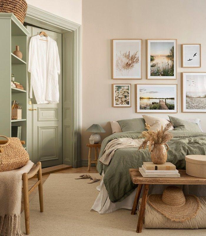
For a relaxed and neutral aesthetic, soft beige (1072 Natural Sheer) or taupe works wonders with sage green (2644 – Stepped Terrace). It’s a gentle palette that feels effortless and lived-in, especially in bedrooms or reading nooks.
Try this combo when: You’re aiming for a peaceful, understated look.
5. Sage Green and Navy Blue – Sophisticated Contrast
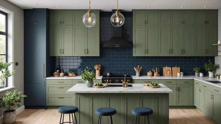
Deep navy (5217 Sleep Walker) brings a bold contrast to sage green (3555 – Monsoon Green), making the overall palette look more tailored and high-end. Use this combo in formal dining rooms, office spaces, or entryways to make a quiet statement.
Try this combo when: You want a refined, structured look that’s not too loud.
Sage Green Kitchen Cabinet Combinations
Sage green isn’t just for walls—it’s an excellent choice for kitchen cabinets. Whether matte or satin, this colour adds softness and elegance to kitchen design without feeling sterile or cold.
1. Sage Green Cabinets + White Walls
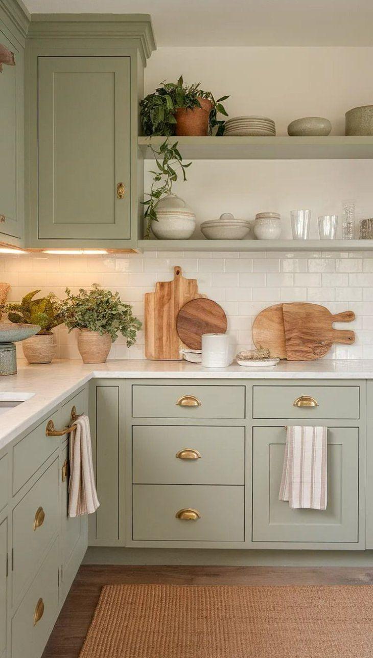
Keep it classic with sage green kitchen cabinets (2684 – Sunflower Seeds) and white walls (1035 Camphor Scent) or backsplash. This combination feels fresh and timeless. Add brass hardware or wooden countertops for a hint of warmth.
Try this combo when: You want a light, bright kitchen with a soft splash of colour.
2. Sage Green Cabinets + Wooden Elements
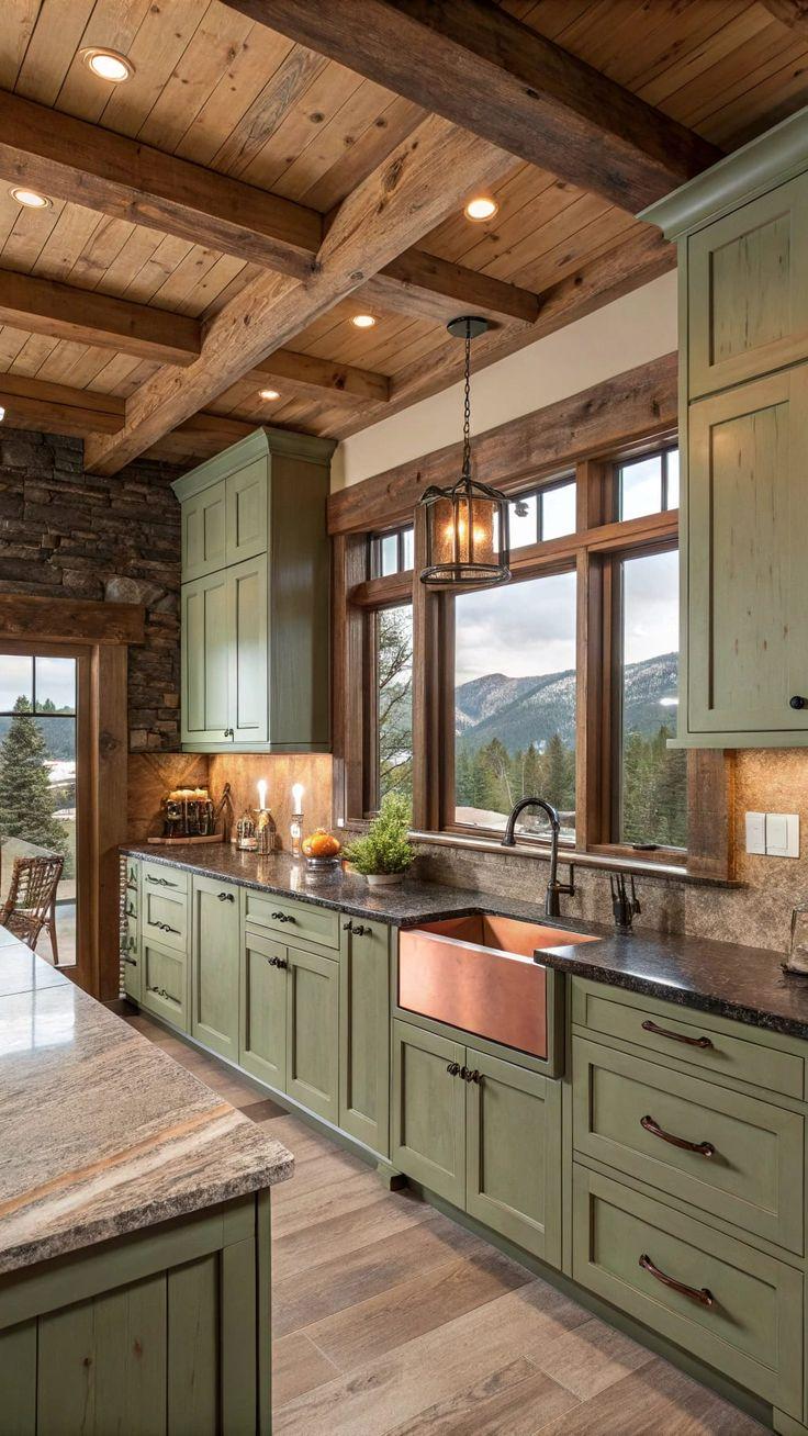
Wood and sage green are a natural match. Combine sage green kitchen cabinets (3523 Starting Drizzle) with oak, walnut, or birch for a rustic-modern kitchen. Open wood shelving or a wooden island adds contrast and texture.
Try this combo when: You’re after a cozy, organic kitchen that still feels modern.
3. Sage Green Cabinets + Black Accents
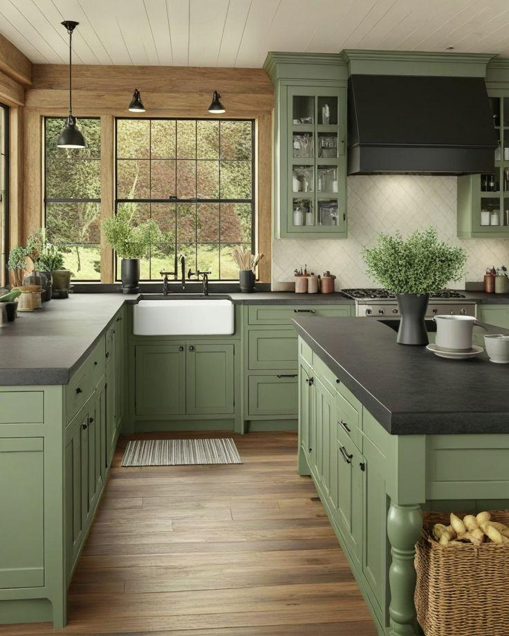
Want an edgier kitchen? Add matte black handles, fixtures, or light fittings to sage green cabinets. It gives a sharp, contemporary feel without being too stark.
Try this combo when: You want a modern kitchen with bold, graphic lines.
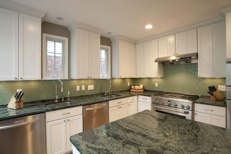
4. Sage Green Cabinets + Marble or Stone
Pair sage green (3604 Fern Fround) with natural stone countertops—like marble or granite—for a touch of elegance. Choose veined white or grey marble to keep the palette cohesive and light.
Try this combo when: You want a high-end kitchen with earthy charm.
5. Sage Green Cabinets + Grey or Taupe Walls
For a soft, tonal look, match your sage green kitchen cabinets with warm greys (1038 Matt Grey) or taupe on the walls. It keeps the colour palette understated while still feeling thoughtful and curated.
Try this combo when: You’re creating a relaxed, neutral kitchen with subtle contrast.
Final Tips for Working with Sage Green
- Lighting matters. Sage green can look cooler or warmer depending on the light. Always test samples in your actual space before committing.
- Think about finish. Matte finishes give a more muted, cozy effect, while satin or semi-gloss makes sage feel more modern.
- Don’t overdo it. Sage green looks best when it’s balanced with neutrals or contrasting shades, not competing with lots of bright colours.
Conclusion
Sage green colour combinations offer endless possibilities—whether you’re painting walls or revamping your cabinets. It’s one of those rare shades that feels fresh yet timeless. The right sage green colour combo can completely transform your space.
Ready to bring nature indoors? Start with a soft sage green paint, pair it wisely, and let your walls or kitchen cabinets set the tone.