


-
Living Room Colour Ideas
All Living Room Inspirations Blue Living Rooms Brown Living Rooms Grey Living Rooms Green Living Rooms Orange Living Rooms Purple Living Rooms Pink Living Rooms Red Living Rooms Yellow Living Rooms White Living Rooms
-
Bedroom Colour Ideas
All Bedrooms Inspirations Blue Bedrooms Brown Bedrooms Grey Bedrooms Green Bedrooms Orange Bedrooms Purple Bedrooms Pink Bedrooms Red Bedrooms Yellow Bedrooms White Bedrooms


Light, and Life to India's Homes.
At JSW Paints, we believe true beauty is not just about looking good, but about thinking and doing good.
thoughtful is beautiful.
That is why we have infused thoughtfulness in every drop and detail.
Turquoise Colour Combinations for Walls and Furniture
Turquoise is bold, refreshing, and full of personality. It’s a unique blend of blue and green that brings energy into a space without being overpowering. Whether you're working with turquoise walls, furniture, or both, this colour adds life and style when paired with the right tones.
It’s also incredibly flexible—it can lean beachy, modern, vintage, or boho depending on what you combine it with. Below are some of the best turquoise colour combinations for walls and furniture to help you build interiors that feel intentional, balanced, and vibrant.
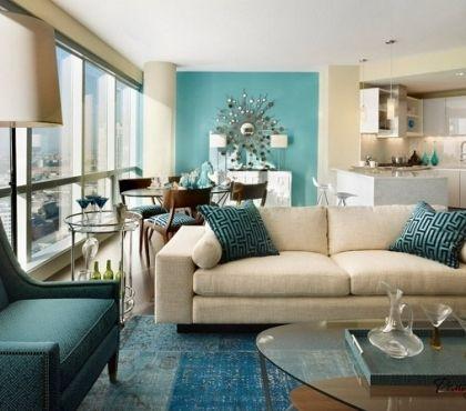
1. Turquoise + White
Pairing turquoise with white makes it look classic. White tones down turquoise’s intensity while keeping the space bright and open. Use white as your trim (1023 – Frosted Rain), ceiling, or furniture base if your walls are turquoise (2466 – Flight of Pigeons). Or flip it: white walls with turquoise furniture like a sofa or cabinets.
You can pair with coastal or modern interiors, bathrooms, kitchens, or anywhere you want a clean, spacious vibe. White calms turquoise down and lets it shine without making the space feel busy or heavy.
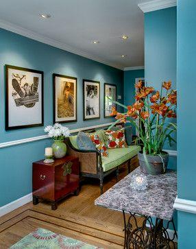
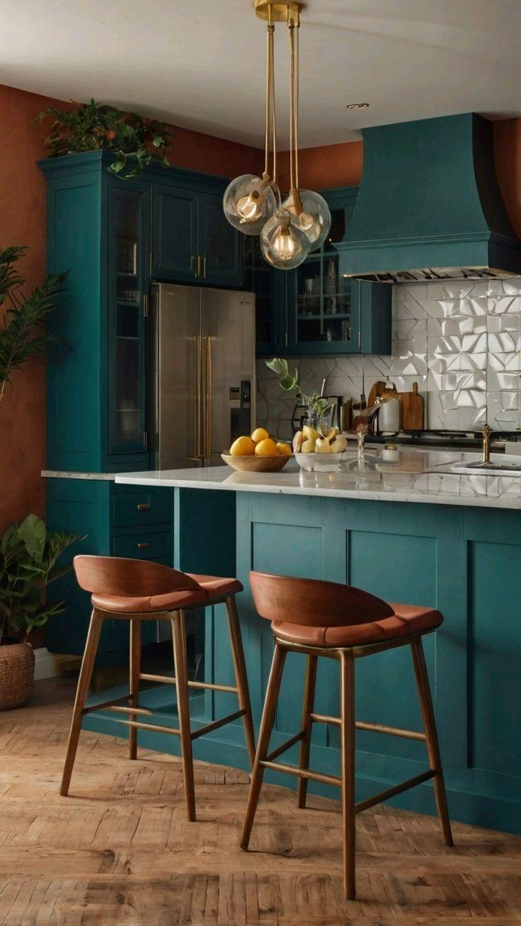
2. Turquoise + Warm Wood Tones: Natural and Grounded
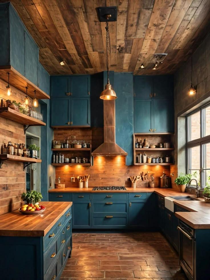
Wood brings warmth and texture to turquoise’s cool tone. Whether it's mid-tone oak floors, walnut cabinets, or natural wooden furniture, the earthy undertones of wood help balance turquoise’s vibrancy.
You can use this combination in living rooms, bedrooms, or dining areas. A turquoise accent wall (3397 – Oceanic Ridge) paired with a walnut dining table or wooden bookshelf looks relaxed and inviting. The natural warmth of wood tones down turquoise’s boldness and adds depth to the space.
3. Turquoise + Mustard Yellow: Bold and Eclectic
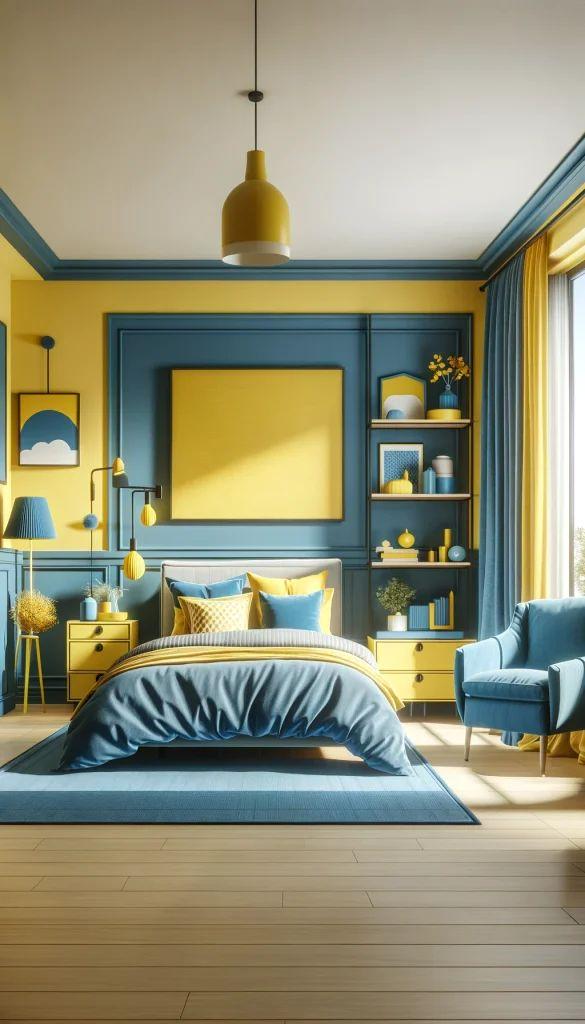
Want a look that’s full of energy? Pair turquoise (3375 – Blue Masonry) with mustard yellow (2028 – Mid Day High). These two saturated shades can create a striking, retro-inspired interior when used in moderation. For example, a turquoise couch with mustard cushions or a turquoise wall with a mustard armchair makes a confident statement.
You can use it in creative spaces, lounges, or studios with a vintage or boho twist.
The warm mustard cuts through the cool of turquoise, giving the space a playful, bold edge.
4. Turquoise + Charcoal Grey: Modern and Sleek
For a more urban or minimal look, combine turquoise (3407 – Meandering Bank) with charcoal grey (4207- Cosmic Depth). Grey tones down turquoise’s intensity without clashing, giving the overall design a grounded and modern feel. Use charcoal in furniture, textiles, or as a contrasting wall colour.
You can use it in office spaces, contemporary bedrooms, or open-plan living rooms.
Charcoal provides just enough contrast while letting turquoise stay the focus. The result is sleek, calm, and balanced.
5. Turquoise + Terracotta or Clay: Earthy and Warm
Pair turquoise (5215 – Peacock Strut) with terracotta tones like clay, rust (5077 – Rusty Hue), or burnt orange to create a grounded, Mediterranean feel. The warm undertones in terracotta provide a natural counterbalance to turquoise’s cool energy.
You can use it in living rooms, outdoor-inspired spaces, or boho-style bedrooms.
Terracotta warms things up and adds an earthy richness that pairs surprisingly well with turquoise.
6. Turquoise + Soft Pink or Blush
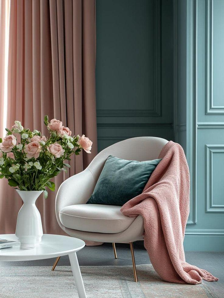
Turquoise (3435 – Tropical Torpor) and blush pink (2216 – Feel Unique) create a fun, refreshing contrast. Blush tones soften turquoise while still letting it pop. This mix brings in a youthful, lighthearted feel without being over-the-top.
You can use this combination in bedrooms, creative offices, or dressing areas. A turquoise wall with blush bedding or pink-accented furniture is both stylish and cheerful.
It’s a warm-cool contrast that keeps the energy high but still soft and approachable.
7. Turquoise + Navy Blue
Pairing turquoise (3396 – Safe Harbor) with navy (5206 – Alright with me) creates a bold, high-contrast look. Navy brings a sophisticated depth to the space, while turquoise adds brightness and energy. Use this combo to build dimension in rooms where you want richness without darkness.
Use this combination in formal dining rooms, statement living rooms, or bold entryways. Navy adds depth and drama, and turquoise adds life. Together, they’re rich without being overpowering.
8. Turquoise + Cream or Beige
If you prefer a more neutral, toned-down look, try turquoise (3414 – Ooty Hills) with cream or beige (1073 – Beige Hemp). These warm neutrals reduce the sharpness of turquoise and make the room feel more lived-in and relaxed.
Use this combination in bedrooms, family rooms, or any space where comfort is the goal. A beige sofa against a turquoise wall is a simple but strong look. Cream and beige let turquoise stand out without feeling cold or clinical.
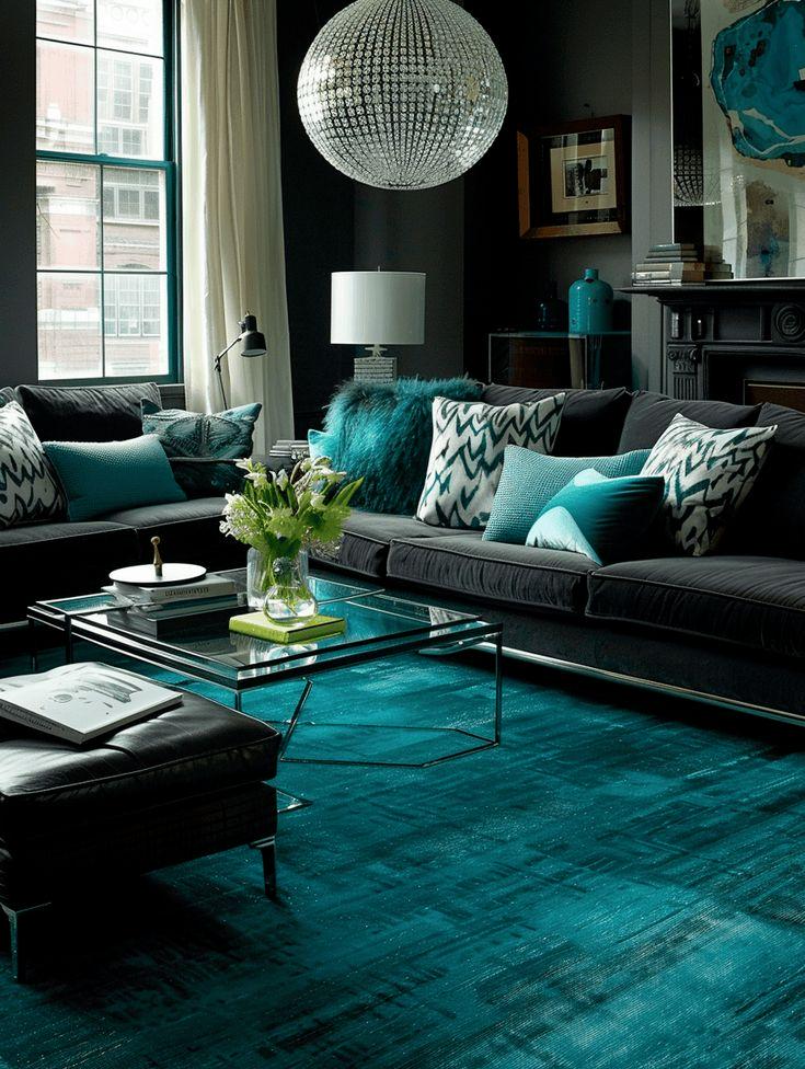
9. Turquoise + Black

Black accents (4338 – Nadir) in a turquoise (3418 – Nilgiri Blue) space bring structure and boldness. This pairing feels fresh and modern when done with care. Think black frames, light fixtures, or minimal furniture pieces set against turquoise walls or upholstery.
This colour combination works best in bathrooms, kitchens, or modern loft spaces. Try turquoise cabinetry with black handles for a sleek effect. Black outlines turquoise and makes it pop, creating a strong visual contrast.
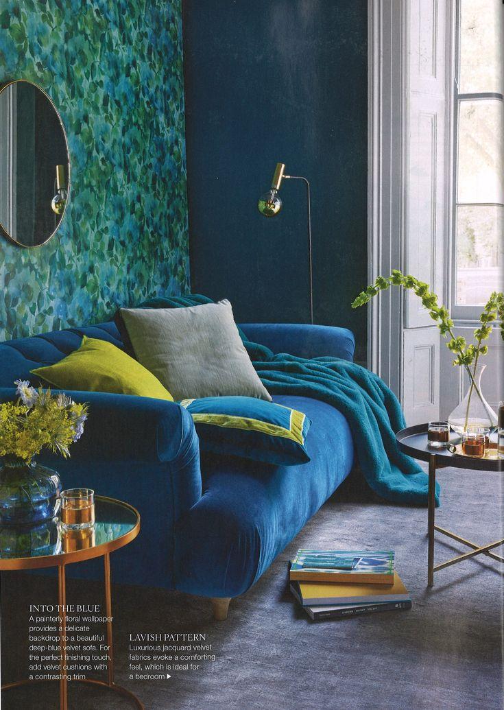
10. Turquoise + Olive or Sage Green
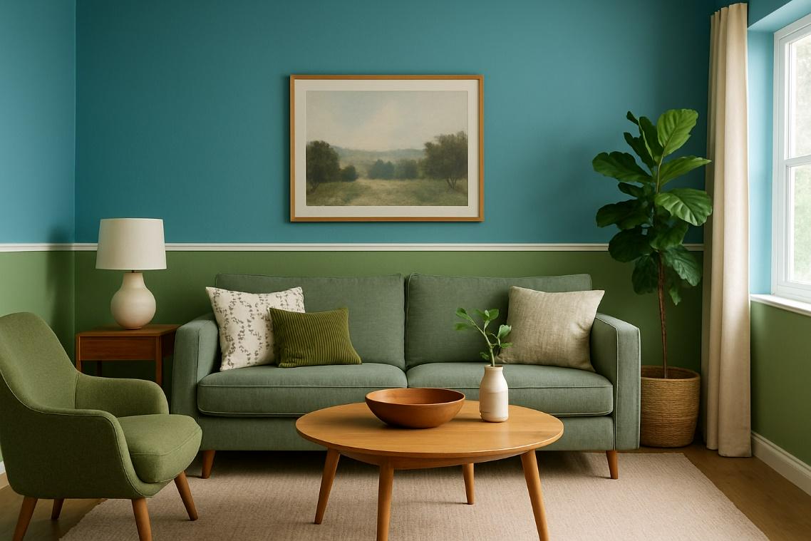
Pairing turquoise (3415 – Tea Plantation) with more muted greens like sage (3607 – Pigment Green) or olive creates a soothing, nature-inspired palette. These greens soften turquoise and build a colour story that feels cohesive and calm.
Use this combination in eco-themed spaces, nature-inspired bedrooms, or reading nooks. These shades sit near each other on the colour wheel, so they naturally complement each other without clashing.
Conclusion
Turquoise is one of the most versatile colours for interiors. Whether you're using it on walls, furniture, or both, the right pairing can completely change the mood of your space—from energetic and playful to calm and modern.